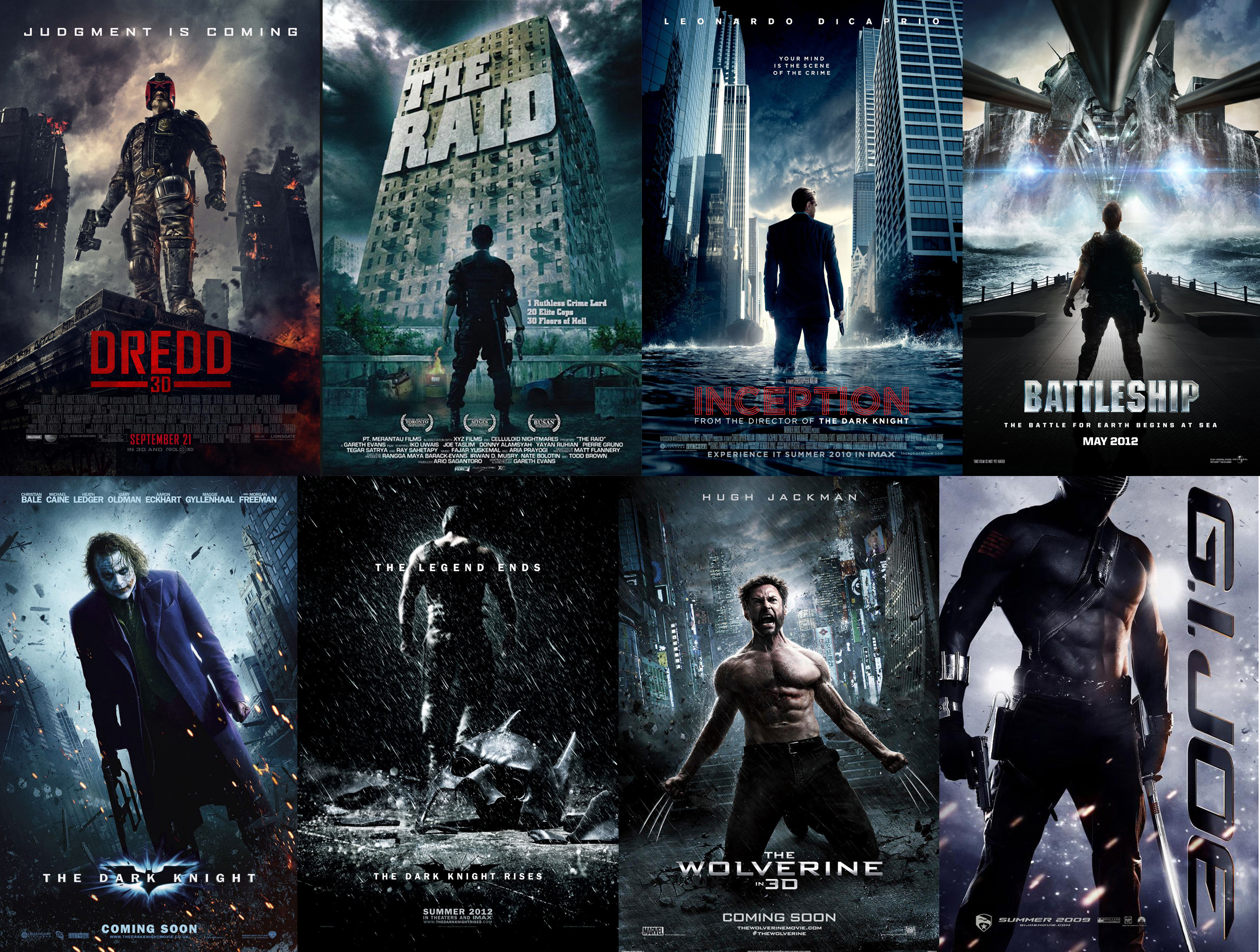
I’ll be the first person to admit that I have my gaze set firmly in the past when thinking about pop culture art and design. The packaging, ad campaigns and poster designs, all of the branding that I love to examine, catalog and collect. I know a big part of this is because of my nostalgia, looking back to my childhood to what I consider the heyday of innovative and interesting artwork and design. And I know that this can become a trap, where I’m blinded to great modern work because it’s doing something different than what I might prefer. In my defense though, there are what seem like unending trends in graphic design these days that have made the landscape truly mind numbing and boring. In particular I’ve noticed this with a lot of modern poster design for films and DVDs, which I’ve mentioned before bugs me to no end. I mean seriously, is it just me or do the following posters all blend into one giant mess of bland, sad, white noise?
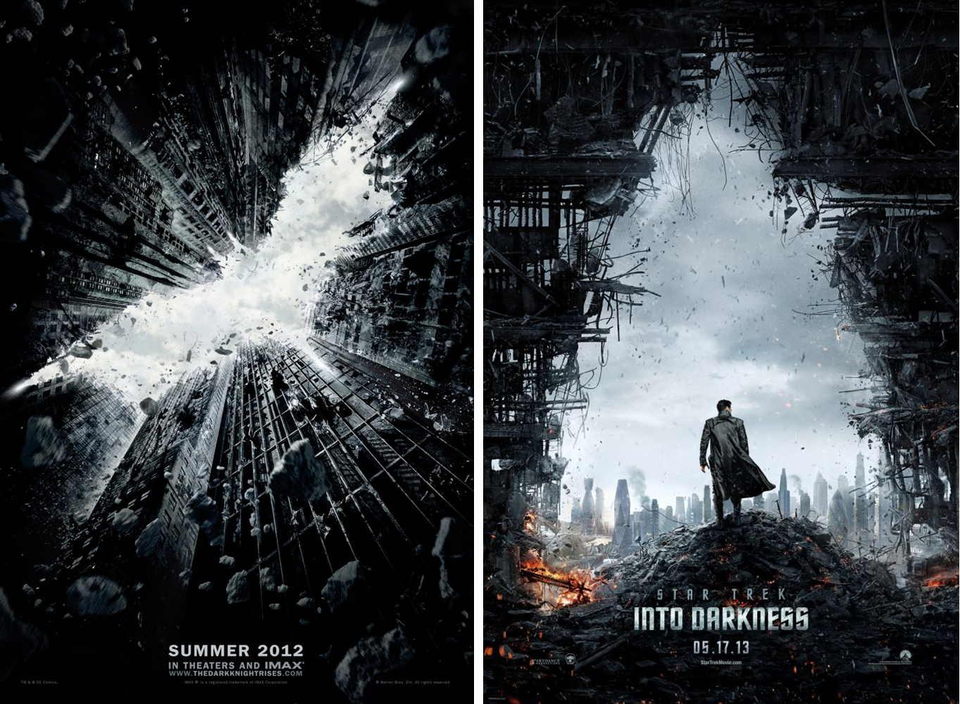
I would certainly not lay this at the feet of the films themselves as there are some really great movies in this bunch (as well as some truly horrible films.) All I know is that if I walked into a theater with a wall of these posters all lined up and had to pick a movie based only on this imagery I’d be confounded as to which one to pick. They’re all the same. Even when the campaigns are a little more successful in terms of good design, you quickly see so many other designers jump on the bandwagon, diluting interesting concepts and bringing it all back down into the pool of white noise, boring static…
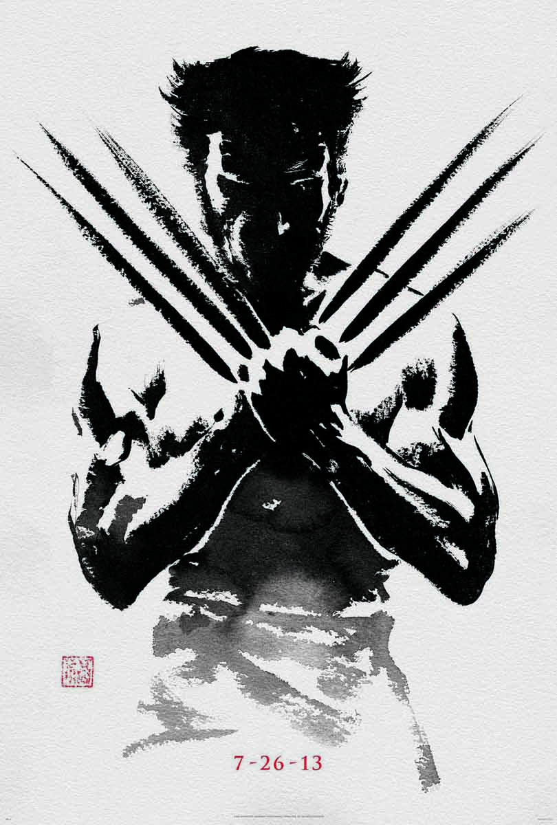
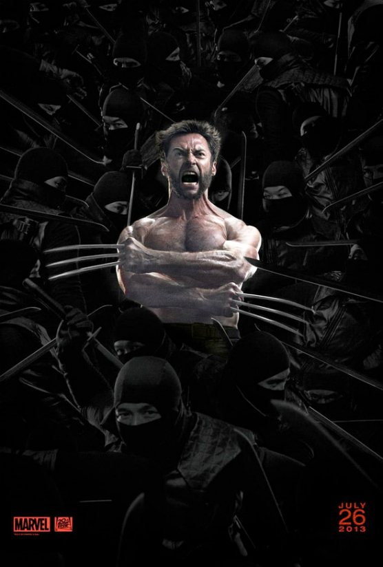
Obviously this isn’t always the case. There is still some great poster design out there in the mainstream, for instance the campaign that was recently run for the 2013 release of The Wolverine…
Simple, beautiful and tied into the story of the film (what little coherent story there was in that very horrible movie), the artwork in the above poster is a breath of fresh air even though it was the cream in an ad campaign that was rife with other horrible designs like this argument for banning the “brightness/contrast” function in Photoshop…
So, does this mean that the art of design died sometime in the late 80s? Of course not, it’s all about trust for creative vision and the lack of which exists in the large movie studio system. These companies have millions of dollars riding on marketing and design campaigns and when attempting to sell their product to as large an audience as possible they can so very easily lose sight of the merits true art, favoring instead to stay the course of design by committee honed by market research and focus groups.
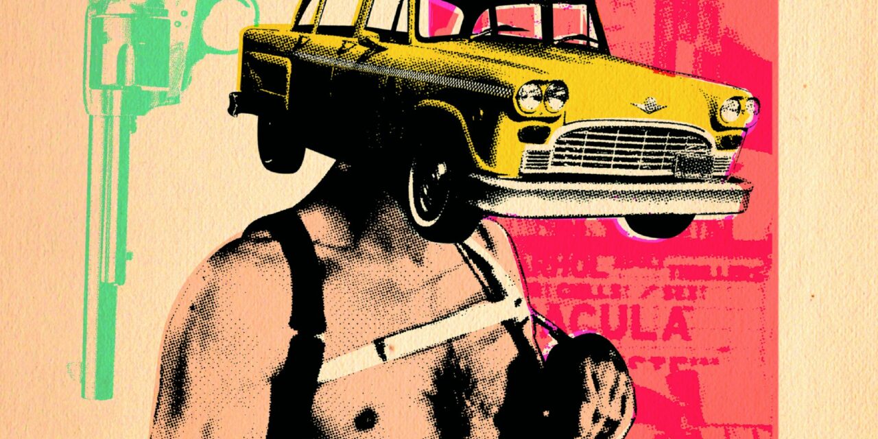
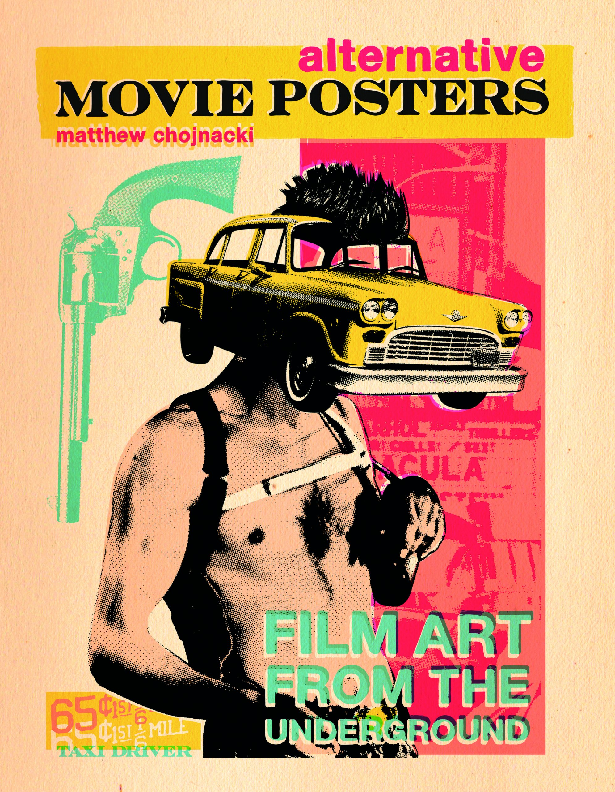
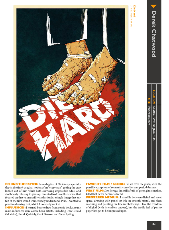
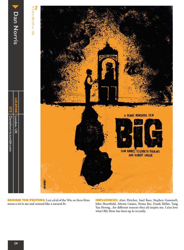
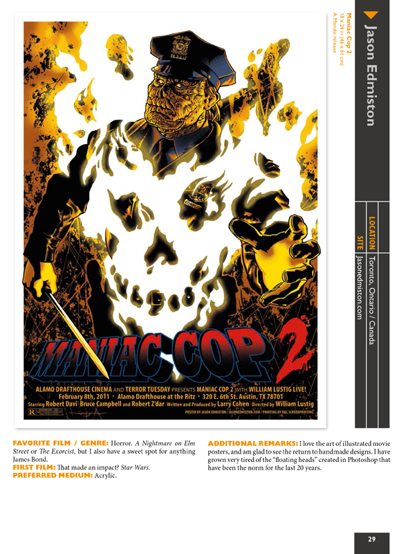
But there is a fascinating response to this bland design in film art, and in his new book Matthew Chojnacki explores this phenomena. Alternative Movie Posters: Film Art from the Underground dives into the limited run screen prints, glycees and digital prints created for revival and festival screenings of movies that have been cropping up over the last decade. There’s been a movement to bring the intimacy and limited edition of band gig posters to the film world where thousands of artists celebrate screenings with interesting conceptual designs.
For those of us that don’t want to do battle with the shopping cart at Mondo (trying to land a copy of their popular, insanely fast selling screen prints), or who can’t afford to keep up with all of the amazing artwork with these alternative posters, Chojnacki’s book is a great archive highlighting the work of over a hundred different artists from all over the world. Much like he did with his previous book, Put the Needle on the Record, he really does an amazing job curating this collection of independent artwork. Whether it’s double page spreads highlighting a specific artist or using these opposing pages to compare and contrast between artists, focusing on a particular style, medium, or similar concepts, there was a lot of care put in the arrangement of the designs.
There are over 200 posters spanning the gamut of the past 80 years of film, from stark expressionistic takes on M through to unbelievably creative spatial collages for The Dark Knight Rises. For lovers of film and design Chojnacki’s Alternative Movie Posters is a welcome raft in the sea of uninspired corporate design. Not every piece of artwork in the book will win you over, but all of them go a long way to recapturing a time when studios actually seemed to care about producing and commissioning true works of film inspired art.
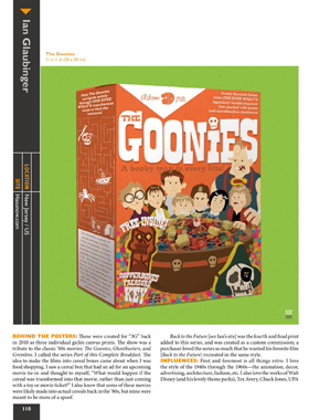
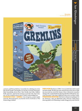
Each work is accompanied by artist commentary including poster specific inspiration, the art, films and other artists that influence their work, as well as what they use to create and their thoughts on film. The book also annotates each piece with biographical info and how to contact the artists to find further work or commission some of your own. Though the book doesn’t focus on any specific genre or era of film, for children of the 80s there is a lot of work focusing on the films we grew up loving. Tron, Robocop, The Dark Crystal, Gremlins, Goonies, Labyrinth, The Burbs, The Lost Boys, Ghostbusters, Beetlejuice, Big and a ton more…
I also love that Chojnacki didn’t limit himself to work being released in America, the roster of artists is truly international and an interesting mix of well known and up and coming designers. I was just as excited to spot artwork from folks I recognize like Joe Simko, Tim Doyle and Jason Edmiston, as I was to be introduced to folks like Gary Pullin (contributing outstanding Teen Wolf and Street Trash posters), Laurie Shipley (with a great Revenge of the Cheerleaders piece), Rocco Malatesta (with a great eye for minimalism and spacial conceptualization in his Raging Bull piece) , and Ryan Luckoo (who did a phenomenal job with the Dark Knight Rises.)
If you have a film buff, artist, or designer on your Christmas list this year, do yourself a favor and pick up Matthew Chojnacki’s Alternative Movie Posters: Film Art From the Underground (and while you’re at it, pick up a copy of Put the Needle on the Record too.) You won’t be sorry you did!

