I have my sister Beth to thank for introducing me to music in the early 80s. It started with her giving me a copy of Weird Al’s first album on cassette, and then continued on for years while she endured my constant presence in her room where I’d sit Indian-style in front of her turntable, endlessly flipping through her albums and studying the artwork intensely. Beth was eight years older than me and as far as I was concerned she knew everything there was to know about being cool. The record covers, the artwork and design choices made by the bands, photographers, artists and the graphic designers who worked on their albums, was just as important as the music was in helping to define my sister’s personality. After my sister passed late last year my mother encouraged me to take some of her stuff, things that reminded me of her, but I couldn’t bring myself to do it. All I really wanted was her phone because it held her collection of music, and that was all I wanted since it was stuff that I know was running through her head. On a trip back down to visit my parents this past July my mom surprised me with a stack of Beth’s old records that she found in her closet. I couldn’t have taken them from my sister’s house, but I’m glad my mom could because it gave me another chance to feel like I was seven years old again, sitting in my sister’s room and trying to decipher her code for being cool.
This isn’t the sort of thing that I typically open up about on the site, but it’s an example of how visceral and personal music and all the trappings that surround it can be. As we break new ground funneling our personal collections of albums and singles onto tiny devices and phones I think we’re losing an important aspect of the music. Album covers, specifically the sleeves on 45 singles, added another dimension to the music we loved and gave the musicians an opportunity to explore their ideas even further through art and we’re limiting the size of that canvas to half of a credit card. I’ve been reading Vincent Price’s autobiography I Like What I Know (which is really an excuse to examine his love of art), and he mentions that his first real exposure to the artwork of the world masters was in a book that featured most of the paintings crammed down to the size of a postage stamp. For him it was the definition of frustration, and he was only liberated when he was first able to travel abroad and see these works first hand in the museums of Eastern Europe. Liberated is actually an understatement as he describes being devastated by the beauty and intricacy of Rembrandt’s full canvases. While I hesitate to claim that seeing the full-size album artwork will devastate the viewer to provide some special appreciation and insight into the music that an iPod screen won’t afford, I do think it’s a shame how we’re marginalizing the work none the less.
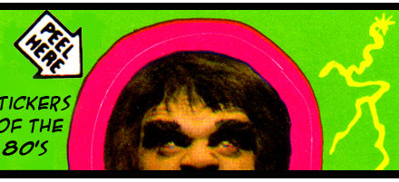
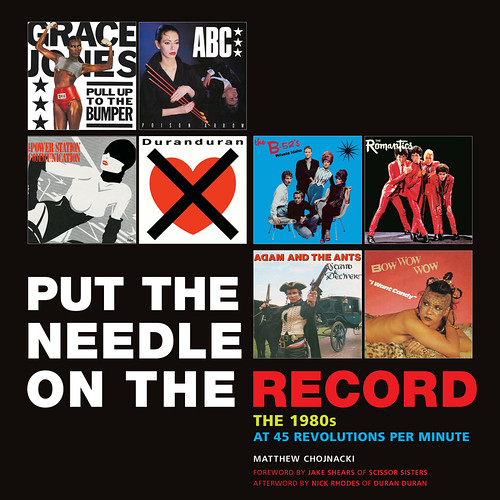
This is one of the reasons that I’m excited about the release of Matthew Chojnacki’s new book, Put the Needle on the Record: The 1980s At 45 Revolutions Per Minute, which celebrates the 45 sleeve artwork of musicians like Kate Bush, the Smiths, Cyndi Lauper, Madonna, the B-52’s, Prince and more…
Chojnacki, who culled the images of the covers from his own extensive collection, has done an excellent job of chronicling the styles, artwork and design of 80s music. The book is set up so that each cover is featured on it’s own page with commentary on the art provided by Chojnacki as well as the artists, musicians and executives that worked on them. There’s some interesting anecdotes on the covers, for example, the hullabaloo surrounding the Smith’s third single off of their debut album, “What Difference Does it Make”…
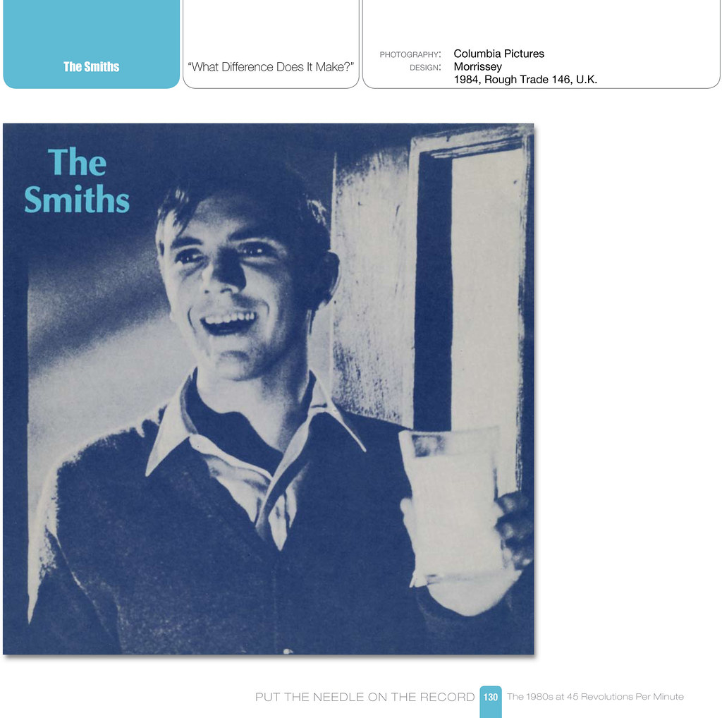

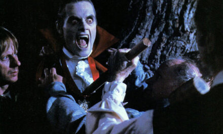
The band initially wanted to use a still of Terrance Stamp from the 1965 thriller The Collector, but after the actor objected they reshot the cover staging a note-perfect parody of the still in question. I find this fascinating as the whole situation is almost a shorthand for describing the tone of a lot of the band’s music, which tends to play with juxtaposition of dark lyrics beautifully sung over very pop-y hooks and melodies. This dueling tonality is reflected in the band’s response at replacing a still from a disturbing film (featuring Stamp’s character Frederick standing at a door with chloroform, about to subdue a woman he’s kidnapped and held captive – which closely echoes the lyrics to the song) with a similar shot that is so much more wholesome and cheeky (in which Morrissey is holding a glass of milk and looks slightly less depraved.) Add to that the title of the song, and it almost seems as if the whole thing were planned.
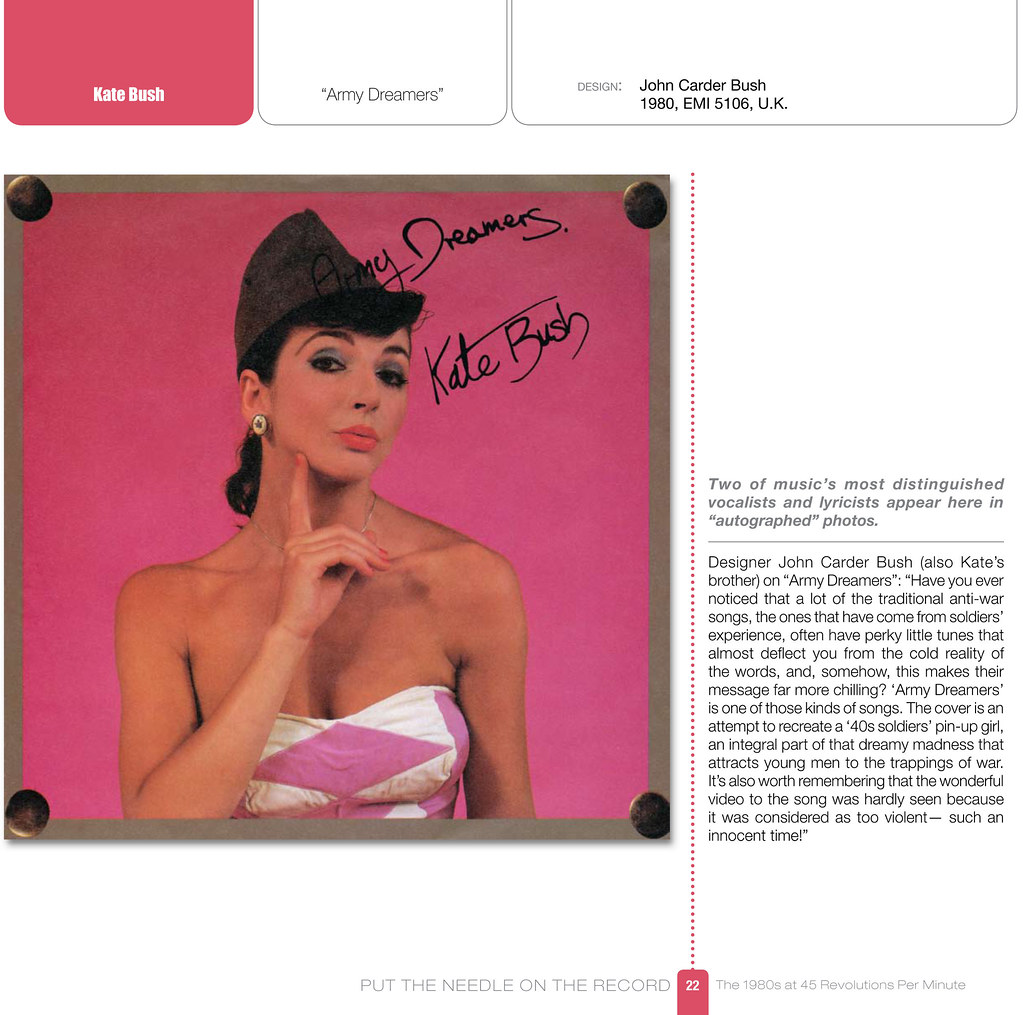
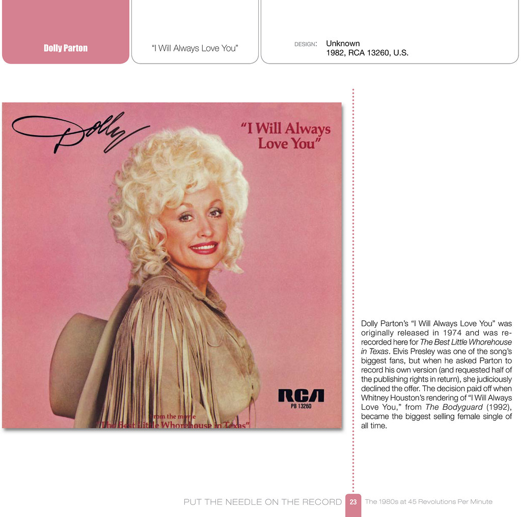
Chojnacki also does a great job of pairing up covers, displaying them in two page spreads, so that you can see the similarities in style and design choices that ultimately defined the era. Whether it’s focusing on the disinterested, heavily made up (almost clownish) portraits of New Wave icons like Pat Benatar and Gary Numan, or showcasing the eerie similarities between the covers of two popular female musicians that couldn’t be further apart in style (Kate Bush & Dolly Parton)…
…Chojnacki is really paying a lot of attention to the layout of the book which I find really exciting.
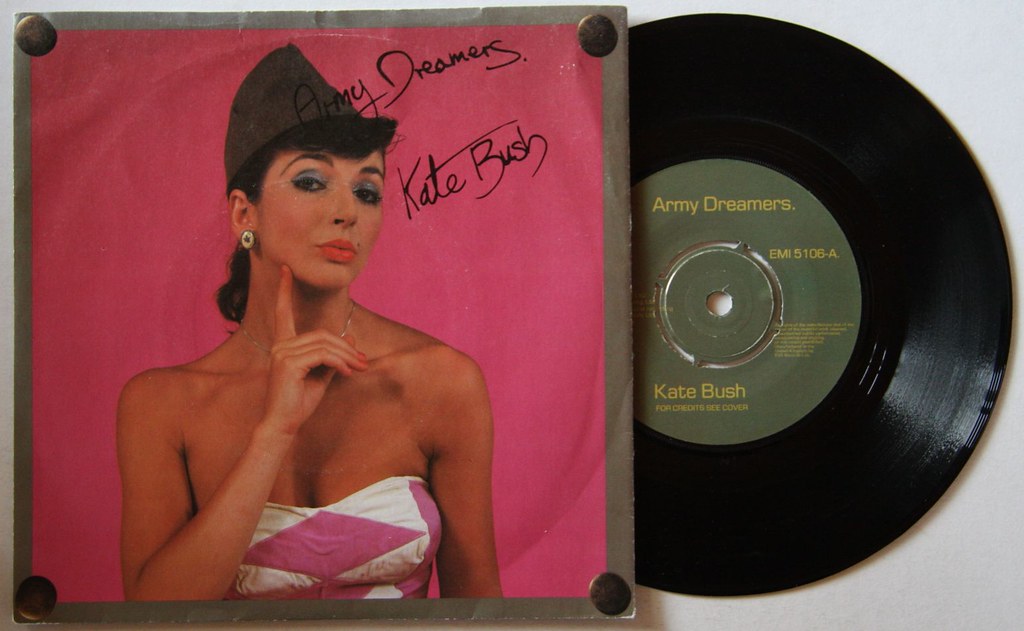
Speaking of that Kate Bush cover to her single Army Dreamers, this is yet another great example of how the artwork can really accentuate the music. Whereas the album that the single is derived from has a much more general tone playing off of Bush’s overall personality as a musician, the single offers the opportunity to switch gears and focus on the message of the song. Playing off of the idea of a mother welcoming home her son who has been killed in action, the cover features Bush made up to resemble a 40’s era WWII bombshell. I think it’s ingenious how John Carder Bush (Kate’s brother and the graphic designer of the cover) pulls out a bit to feature the photo actually pinned to a piece of corkboard, metaphorically showcasing her as a “pinup”. Again, like the Smith’s, the image is a little silly and upbeat with the inviting pink background, while the song features dreadfully depressing lyrics accompanied by up beat music. The design was actually taken another step further with the actual vinyl record which featured a dull military drab green center sticker that plays off of the tone of the lyrics.
All in all, I’m really excited about this book and the chance to flip through a bunch of this artwork from the eighties. Not only does it give an opportunity to relive the art and design of the era, it also helps to highlight some wonderful songs, helping to put them more in the context of how they were envisioned when they were released. I know these graphic designers and artists put a lot of thought into the covers, and Put the Needle on the Record is the perfect way to explore their work. Having just come off of illustrating and designing the cover to a friend’s debut album (The Serenaders My One and Only You), I can attest to time and effort that goes into the process…