
I almost didn’t make my Peel Here deadline this week, but I did plenty of last minute scanning at the zero hour so here we go.
In the continuation of my two-month long celebration of my Garbage Pail Kids collection I present another complete set of stickers, this time the original 4th series. Well, almost complete set of stickers. When this set first came out there were a few cards that had their names changed in future printings (my assumption being it was for legal reasons as the changes were all of proper names, three of which were almost if not unchanged from the source), which resulted in 4 sets of ‘triplets’.
I remember freaking out a little when I noticed this as a kid. I guess I was still a little wet behind the ears and hadn’t yet realized that there was such a thing as rarity or errors in products. This is actually the second time that Topps tried replacing an already circulated card, as there was a variation on the 2nd series Schizo Fran card (which was turned into Fran Fran, again assuming, but this time for reasons of taste.) So even in the age of the internet I’ve yet to finally complete my 4th series collection as I’m missing 3 of the four triplets rare cards.
Though I started collecting with the 3rd series, it wasn’t until the 4th was released that I really became GPK crazy. It was also the first time that I ended up seeing GPKs in stores. Before I was reliant on any stickers my parents managed to bring after visiting the local gas stations, which I never seemed to be present for. My mom would take me with her while she did her weekly grocery shopping and I always made my way up to out local 7-Eleven, but neither every carried the coveted sticker cards. It wasn’t until my mom happened to take me on a trip to our semi-local Woolworth’s that I spied my first box of stickers by the registers. I specifically remember my mom giving me a couple of dollars to pick up a handful of packs, which I almost didn’t buy.
While browsing the store I also found a bunch of GPK school folders, which featured artwork from the (to me) extremely mysterious 1st series. In my trading with friends I managed to score a few cards from the 2nd series as well as getting a chance to see the majority of the set, but no one I knew had any 1st series cards (I wouldn’t see any for another ten years, not until my first comic book convention.) Anyway, I really wanted the folders, but I only had two dollars and had to choose between the two. I ultimately chose the 4th series packs because it seemed more important to not only have the actual sticker cards, but also to get my hands on some that my friends hadn’t seen yet.

As I mentioned above, there are some triplet sets in this series, the first of which was the original B card in this set named Woody Allen. What I’ve found kind of weird collecting these again as an adult is that the whole gimmick of the multiple names is pretty much lost on me. Though I’ve made it a point to try and find both versions of each card, ultimately it seems kind of silly to seek out and spend money on an additional sticker that has the same art and only a different name. It never occurred to me as a kid that this was totally a gimmick to keep kids buying packs of cards long after they’d completed a set just to get each name variation. It’s not like all Cabbage Patch Kids were twins right.
Anyway, this has been the biggest stumbling block in tracking down the rare triplet cards in this series it just seems way too completist. Actually, now that I’m thinking about it, I seem to remember having a lot of trouble trying to explain the twin concept to my mother when I was younger. I’m sure she was thinking the same thing I am now. Now if I could only understand her mindset when she’d step all over my mint condition comic books and not seem to care…
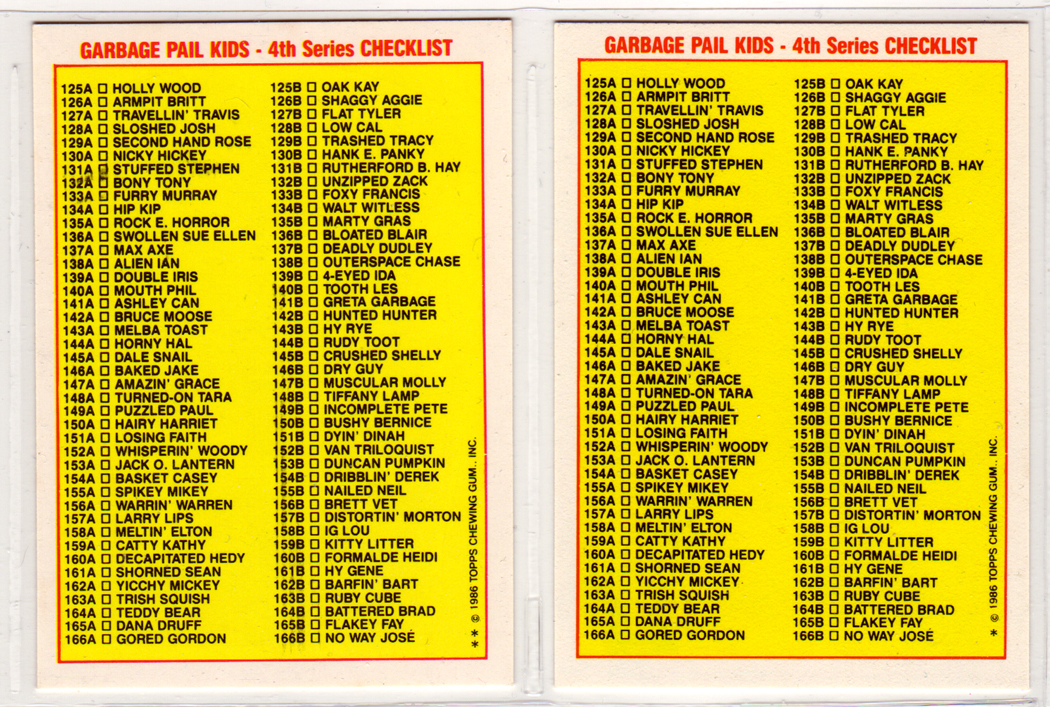
Anyway, the set came out in 1986 and featured 42 different pieces of artwork with a total of 86 different name variations. There was also one less puzzle poster on the card backs, but it consisted of 21 instead of 18 cards. Also, returning after the last set were more Wanted Posters, most of which were again reworked from the original 1975 Topps sticker set, yet with two new Wanted cards that hadn’t been produced before.

This time around John Pound still handled the majority of the front card art duties clocking it at 25 paintings. Tom Bunk again helped to share the front art duties (though he only contributed 9 pieces) as well as doing all of the art for the new Wanted Posters. This time a third artist came on board doing paintings for the card fronts named David Berg (with 8 paintings). I’m not sure but this might be the Berg that worked for MAD magazine. You can see on the checklist at the bottom of the series 4 entry on Barren Aaron’s GPK reference page which artists did which cards. All of the above cards were painted by John Pound, who (as I said in the last Peel Here) is probably my favorite GPK artist, if not flat out my favorite artist.


Though my favorite cards tend to be some of the ones with more horror themed artwork, I found that I’m also enjoying a lot of cards that I didn’t like all that much as a kid. For instance, in the above set (again, all done by Pound) I really didn’t like 134 a&b as a kid, probably because it’s a little more muted with a lot of earth tones, not to mention that the beatnik joke was completely lost on me. Now though I’m sort of astounded by the level of detail in the background, while not jam packed, it’s pretty rich compared to a lot of the other cards that are pretty space on BG. I also dig the Walt Witless pun-y name and still can’t believe that the character is smoking a hand rolled cigarette (or a joint, take your pick.) 

Again, as a comparison to my interest in the concepts of these cards as I’ve grow older are cards 135 a&b and 137 a&b. As a kid my favorite card in the set, bar none, was 137. Not only was it bloody and feature a skull, it was also very simple. Of course, it didn’t hurt that I also found this card in my elementary school library stuck in a copy of Bunicula that I check out of the library (yea, free sticker!), so it’s always had a fond place in my memory.
Growing up though I’m more drawn to card number 135 as I’ve become a huge fan of both Rocky Horror and the idea of grown men (I’m working on the idea that he’s older because of all the stubble) in drag, ala Monty Python, et al. Again, as a kid this card was completely lost on me. I think it’s truly awesome that the designers and artists were brave enough to do this, to plant ideas in these sets that they knew would go way over the heads of most of the kids buying them. To me this is a sign that they were hoping that kids would come back to these later on and develop a whole new appreciation for them. Heck, if nothing else, it has worked for me. It can also be kind of subtle too, as with card 138. Most kids are going to like this because it has a kick ass alien on it blasting a ray gun into to air. On the other hand it’s also a reference to Topps’ roots and their Mars Attacks! card set.


Something that I found a little interesting in this set was that Tom Bunk was losing some of the plastic rigidity in his art, softening up the faces and shapes a little (you can see this in his art on card number 141.) As for David Berg, he has a style that is very close to Pound’s, though there’s an aspect to them that makes them feel a little off to me. He did cards 142-147 here and below. I can’t tell exactly, but it feels like his pieces are a little flatter, as if he wasn’t quite getting the same softness because he isn’t blending the colors quite the same way as Pound. This isn’t to say that I don’t like his artwork; in fact it’s probably some of the better ‘on-model’ work in the series as a whole. In particular, I really like the art on number 147 at it gets to the softness I like in my GPKs.


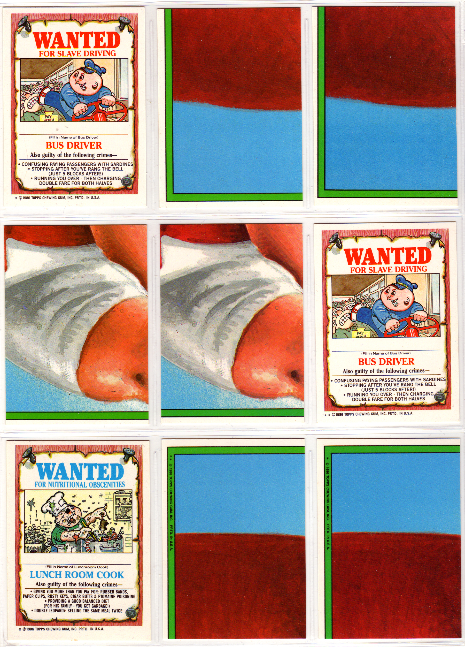


In the above scan you can see a spot for a missing card. This is where the variation on card number 158b would be. The triplet card is named Crystal Gale.


Again, above there should be a triplet for card number 164 (b), which is named Salvadore Dolly.


I’ll be back next week with the complete 5th series, which marks a turning point in the tone of the GPK stickers. From that point on the cards start getting a little nastier and a little more violent.


