Well, I didn’t get off my lazy butt for a Sunday post, but the world isn’t ending because of it (there are so many blogs doing Halloween countdowns this year I think we can all stand to take a break for a day here and there.) This week I thought it would be fun to have my normal subject matter and the Halloween countdown converge with an entire week of animation cels from the Real Ghostbusters cartoon. I recently picked up a bunch of nice cels and have been talking about them in my regular Cartoon Commentary! column. So break out the proton pack, warm ‘er up and get ready to bust some ghosts (or do something more creative like redecorating your house with the portable nuclear generator strapped to your back, or rescue some helpless kittens in trees by blasting them off the branches, it’s up to you.)
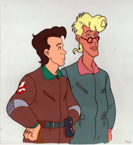
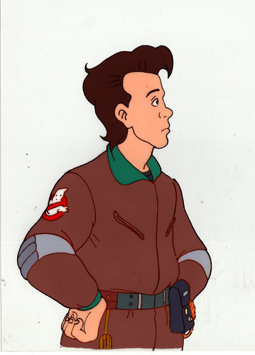
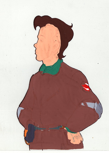
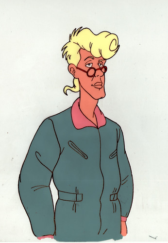
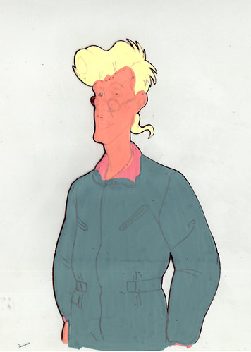
I picked up these first couple cels as a set. In this scene Peter Venkman and Egon Spengler are walking together. Now one of the things I love about going over these animation cels is trying to learn more about the process of making cartoons by studying the art and how it was put together. These cels raise the question of scene construction for me. Now I always assumed that a scene with multiple characters would be broken down into many layers of cels, each with one aspect of the scene painted on it. For this set of cels there’s one for Egon, one for Peter, and I assume there was at least a background (and possibly another layer of background objects that might be moving.) On the other hand, I figured that if two of these aspects come into contact (outside of the background which is typically not on a cel, but rather a painting that the cels are shot on top of, or which are transposed onto later in the process) that they’d end up being painted onto the same cel. I’ve seen examples of this in cels available on eBay where characters grabbing each other, or layered on top of each other are on the same cel (in fact the cel that I’m going to share tomorrow has Ray and Winston together on the same layer.)
Well since this set is in two layers, it makes me wonder why. My best guess is that one or both of the characters won’t stay static for very long, so it would be easier to just paint that character again on a new cel to show the movement, and there would be less of a chance of screwing up and less work in general than having to paint both characters over again.
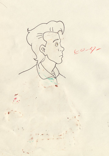
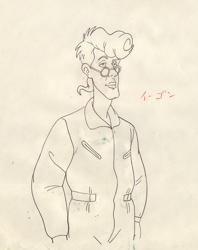
Another aspect to this set that I found interesting are the pencils for Peter that I picked up along with the cels. The whole form that appears on the final painted cel isn’t in the pencils. Again, this suggest to me that the animators used the body that was already drawn for the previous cel and just changed his head. This seems like a pretty standard way of saving on drawing time. What I’m curious about is how they merged the two sets of pencils (this head with the previous body) for photocopying onto the cel above. Since this drawing of Peter’s head is still on a full sheet of paper and not cut out and pasted over the previous body drawing’s head, how did they get the new final image? In the examples of this time saving practice that I’ve seen before, the new pencils are typically added to a photo copy of the previous drawing, which when copied onto the cel looks like one smooth set of line work. I guess the animators in Korea could have photocopied this drawing of Peter’s head and pasted it over the other drawing. Again, it then raises the question of how they store their finished work when it’s done and what sets of pencils to keep with what finished cels. Actually that’s more of a nitpicky question that seems a bit too pointless to wonder about (unless I’m planning on getting a job collating for an Asian animation house.)
These cels are a nice example of how not to over work one’s self as an animator. Notice that Egon’s right shoulder is missing the Ghostbuster’s logo patch. Obviously there’s no point in drawing it, and then wasting paint when the shoulder is just going to be covered up by Peter in the shot. Of course I wonder where it’s best to draw the line on this sort of practice. I mean why not leave off most of Egon’s right arm while you’re at it? Seems sensible enough, though maybe the logistics of not finishing the drawing might make it a little more difficult or tricky to animate (like if the cels where laid down in the wrong order, there would be one weird looking armless Egon instead of him just missing his BG patch.)
I do have to wonder why the producers and designers of this cartoon decided to make the characters so different, not only from the original movie, but between the various character designs. I suppose this was an extreme and early example of the Teenage Mutant Ninja Turtles phenomenon where it would be easier for kids to tell the characters apart if they had their own color schemes, in particular with the hair colors. I always thought it was a very odd decision to make Egon tow-headed instead of having dark hair. Not only does it seem really out of place when comparing him to his real life counter part played by Harold Ramis, but it changes the characters possible Jewish ancestry to something more Nordic (or Jewish new wave/punk.) What’s even weirder to me is that I never questioned it as a kid. Egon was Egon, and that was all there was to it.


