I sort of wanted to dig a little deeper into the Thundarr cartoon. While I was doing the write up for the 1st episode, Secret of the Black Pearl, I realized that the majority of the concept artwork that accompanied both vintage articles I posted last month was for this episode so I thought it would be cool to see the transition.
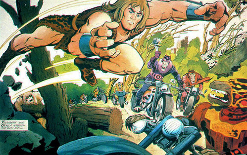
This first piece was done by Jack Kirby. There are a lot of his trademark flourishes in the art from his thick, square-fingered, grasping hands, to the iconic costuming with the zigzag patterns and bold, wavy shadows…
This piece is illustrating the 2nd attack of the rat-men, after Thundarr, Ookla and Ariel sent the creatures packing in the episode opener. Chided by their master, Gemini the evil wizard, the rat-men regroup and make a second assault, though this time outfitted with 20th century motorcycles (and in the cartoon, laser gun clubs.) Kirby’s (at the time) 40-odd years worth of comic book work really show in the layout of the piece. It’s just bursting with action and movement, not to mention a ton of personality and story detail. He manages to bend the perspective so dynamically that you almost feel like you’re leaping precariously at the lead rat creature right alongside Thundarr.
What I find interesting in the transition from page to screen is that the final sequence is both very diluted in terms of some of the fantastical elements of the original design (like the more alien costuming of the rat-men) and the static side-scrolling camera angle, yet also slightly more violent…
Granted, we don’t get before and after shots in the concept art, but instead of leaping at the rat-men with a flying tackle, in the cartoon Thundarr plants a swift kick to their heads as the speed by. Also, though I really dig Kirby’s futuristic costuming choices, I think the final design of the rat-men is more in keeping with the barbaric, post-apocalyptic tone and color palette of the cartoon.
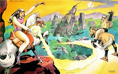
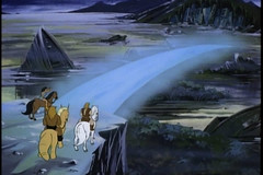
This second piece of artwork, again by Kirby, showcases some of the mystical powers of Ariel with her ability to build bridges out of energy and light. The first thing that jumps out at me is that Ariel’s design was a little different initially. First and foremost is her Valentine’s Day color scheme, which started out slightly more feminine with the reds, pinks, and purples and the purer white of her steed. Also, slightly more subtle, is the apparent source of her powers. In the concept art she is wielding an orb from which she appears to be drawing the power to build the energy bridge. I wonder if this was ditched because they didn’t want the character hampered by carrying an orb all the time, or if the act of summoning the energy from an outside source was a bit too close to the idea of incantations (which would point more towards the dreaded occult, than say harmless magic?)
In the final sequence, and in the show as a whole, we can see that Ariel’s color scheme was shifted to a more primary look with blues and yellows. I can see this as a way to tone down the garish red-pink-purple combo, while also keeping it more upbeat and separate from the murky dark colors and earth tones of the setting. You can also see that Ookla’s steed is softened in the final design. It’s still alien, but less severe and scary than it appears in the concept illustration. Also, unrelated, but I really love the idea of the shattered moon hanging in two pieces yet still in orbit. The decimated landscape of the show is cool, but it’s the moon that really sets the mood for me…
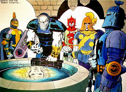
This third piece of concept artwork is pretty cool (and revealing.) Here Kirby illustrates the main villain for this first episode, the two-faced (literally) evil wizard Gemini and his robotic knights. First off, it’s kind of interesting to note that Kirby is really drawing on his previous character design of the DC comics character Darksied. It’s mainly in the concept design, with his choice of headgear, the craggy face and heavy brow, the electrified eyes, and his overall blue armor. What I find really interesting about this piece though, is the notation at the top left identifying the wizard as Gemini. This piece comes from the Buzz Dixon article that originally ran in Fangoria, but it was also accompanying the Fantastic article, and in that piece the notation is missing from the art. The character is named Sabian in the Fantastic article, which if you listen to the internet zeitgeist (or read either of the two articles) is the name of both Ariel’s evil father and Thundarr’s original captor.
I’m wondering if at one time Gemini and Sabian were interchangeable? Based on the episode, Gemini is certainly not Ariel’s father, so if they were the same that idea was dropped by the time the show was animated.
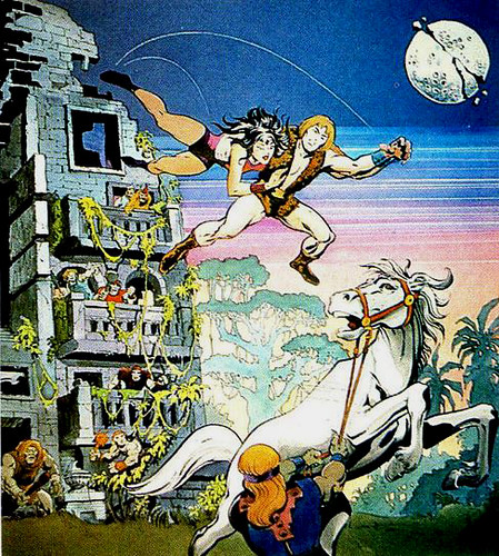
I’m not sure who illustrated the next piece of concept art. One of the articles, the one from Fantastic, attributes it to “John Doorman”, though I think they meant John Dorman who’s listed as the supervisor of story direction in the show credits. The Fangoria article attributes it to Jack Kirby, though it doesn’t seem to be quite as loud as his style typically comes off. Also, Kirby’s Thundarr is a bit more barbaric and not as clean cut, but I could be totally reading into it. Anyway, the reason I wanted to talk about this piece is that regardless of who drew it, it illustrates a crazy theme of jumping on a horse from a great height. There’s a scene in the cartoon towards the end of the episode where Thundarr grabs Ariel after saving her from Gemini, and the two plummet from the top floor of the evil wizards tower onto his waiting steed below (at least 40 or 50 feet below…)
I’m not positive but I think this would kill the horse instantly, and very likely cripple both Thundarr and Ariel (I don’t care that he’s a barbarian, gravity is a harsh mistress.) This actually happens a couple of times in the episode as there’s a scene earlier that has Thundarr jumping off a cliff, catching a vine and then swinging onto his horse from a great height. You tend to see this type of crazy equestrianism in older adventure films and it’s always bugged me. According to the concept art though, it looks like it was planned from the beginning…
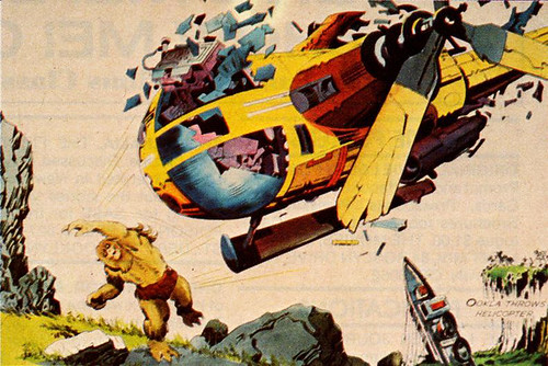
The last bit of art I wanted to highlight is without a doubt more of Kirby’s work, and it’s also a scene mentioned by Steve Gerber in the Buzz Dixon Fangoria article. When describing Ookla the Mok, Gerber relates how he’s sort of the comic relief of the series (I’ve read that he wasn’t happy with the character and that he was urged to include a “wookie” in the series), and that when confronted with technology he’ll inevitably break it and use it as a blunt object. Actually, Gerber refers to the Mok getting frustrated with trying to fly a helicopter, so much so that he rips out the joystick, tries to spin the blades by hand, and eventually just throws the whole thing at an enemy. You can certainly see this frustration in the concept art…
The final sequence in the episode is sort of an amalgam of Gerber’s description and Kirby’s art. Ookla is left in the hovering vehicle as Thundarr goes to rescue Ariel. When Thundarr calls for Ookla to maneuver the chopper closer to them he gets frustrated trying to work the controls (which he indeed rips right out of the console.) He’s so pissed that he wedges his feet between himself and the entire cockpit console and kicks it right out of the helicopter causing it to crash. Personally I would have liked Kirby’s outcome a bit better, as pitching something out of frustration is less broad and cartoon-y, but what are you going to do?

