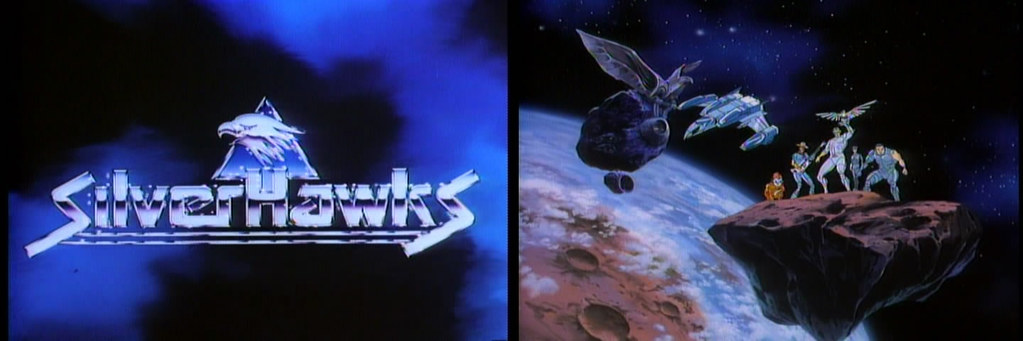
As I mentioned in the first part of the discussion on the Silverhawks cartoon, there isn’t a whole heck of a lot going on in the first two-part origin story. Peter Lawrence delivered a pretty bare-bones story that sets up all the main characters of the series, and some general plot points, but overall there’s noting all that interesting about this maiden voyage of the Silverhawks as they battle MonStar and his mob of intergalactic mercenaries. I spent a good bit of part one talking about what is great about these first two episodes, which is showcasing the dynamic character designs and concepts of the villains. Today I’m going to take a look at the heroes of the show, Commander Stargazer and the five core Silverhawks characters.
Before I get into the specific characters, I thought I’d mention some of the other design aesthetics in this series that really struck me. First, from the get-go the artists and writers chose to work in an odd style that blends futuristic and antiquated elements in the design of the world. With the villains for instance, you have a handful of characters, Pokerface, Buzz-Saw, and Mo-Lec-U-Lar, that seem right at home in an alien sci-fi environment, while some of the others (Windhammer and Mumbo Jumbo) seem more at home in classic Greek fables with their odd style of clothing, and their more mythical designs. Then there’s a character like Melodia, which seems grounded in the 1980s, the time in which the cartoon was produced, yet not set in. Also, we can look to the style with which MonStar’s mob is handled, flying through the galaxy in convertible speedsters that would seem more at home in a 40s era gangster flick that a sci-fi action adventure cartoon.


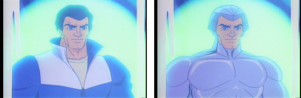
This odd mix of style is a bit more recognizable in the heroes of the series, in particular with Commander Stargazer. Aside from some gold plated cybernetic enhancements to his face, chest and left arm, he’s basically a character that’s been ripped right out of a Raymond Chandler pulp novel. The character is decked out in a private dick’s suit minus the trench coat and fedora, which are actually there, just hung up in his office. Speaking of his office, it’s been retro-fitted to look and feel like something from the 40s or 50s complete with frosted windows, and wood paneling. Though it’s completely out of place for the environment, it speaks volumes about the disposition and personality of the character. One look at his design and there’s no question as to who runs Hawk Haven.

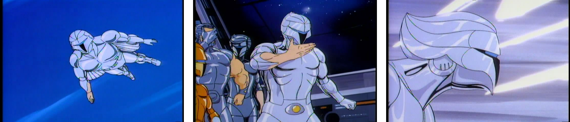
As for the actual team, we have Quicksilver (the mission leader), Bluegrass (the pilot and resident cowpoke), the Copper Kid (the only alien of the group), and Steelheart & Steelwill (the brother/sister duo.) Their overall design is surprisingly un-avian, and more in the realm of clean-lined, organic cyborgs. They share more in common with the character designs of Robocop or Boba Fett, than they do birds. In fact, aside from the idea that they have (presumably) metal skin, the basic design of the characters could be considered quite simple and almost boring. What saves the design, I think, is all the little details, in particular in the rendering where the artists have broken their outer armor into form fitting plates. All these plates are outlined and have small embellishments, giving them a much more detailed and dynamic look to they’re less T-1000 (from Terminator 2), and more Robocop. There are a couple of other design flourishes that I really dig which helps the characters keep a bit of their humanity while also making them a bit more dynamic at the same time. The first is the single bare arm each character sports, an unrealistic but striking affectation in the armor that breaks up the symmetry of the design. More important is the removable faceplates that each character has for combat/spaceflight.
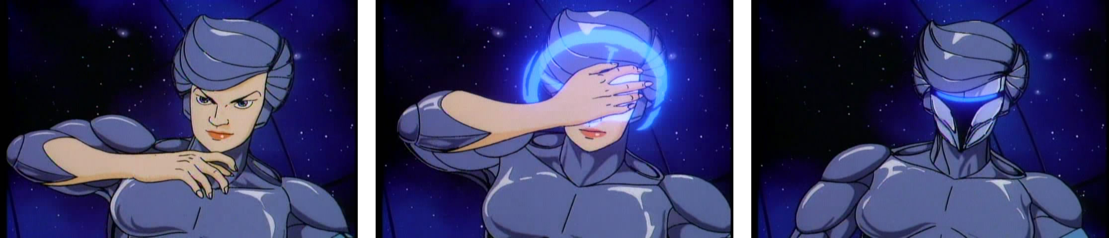
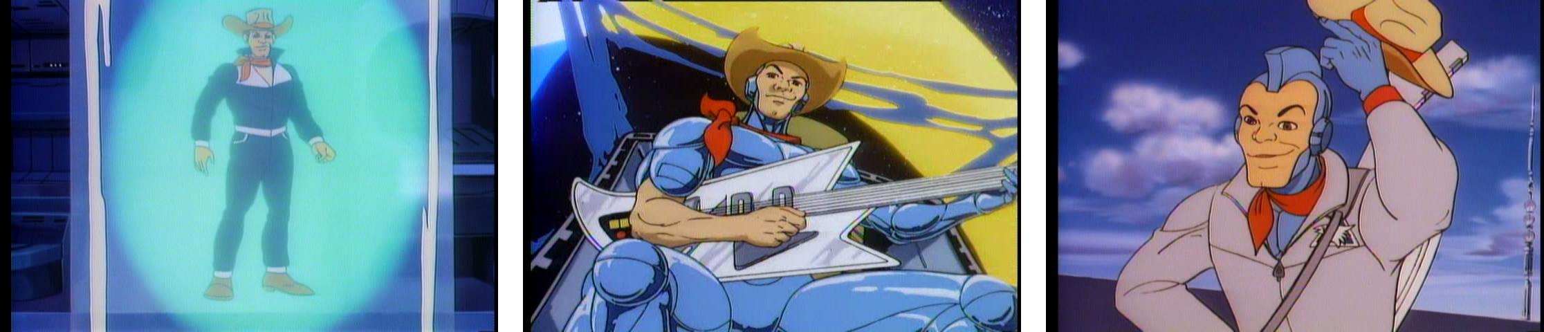
If there was one gimmick to the designs that really suckered me visually as a kid, it was the faceplates. First off, the design of the masks echos that of Boba Fett’s helmet, which are both futuristic with their thin visors that melt into very inorganic, alien mouth-pieces, yet they’re also antiquated, mimicking the design of medieval battle helmets. Remove the lens in the visor/mouth-piece and you’re left with a helmet that wouldn’t look all that out-of-place on a knight. But the appeal isn’t just in the visual design, as it’s in the functionality. To put the mask in place, the Silverhawks just have to wave their hand in front of their face (again, mimicking the action of a knight bringing a hinged faceplate down into place before a battle/jousting) and it appears. With a slight laser light flourish, it’s almost liquid or digital.

Also, there’s some other fun aspects about the simplicity of the characters, from the character names that work into the visual design, the lack of handheld weaponry (instead each character has lasers concealed in their shoulders, biceps and feet), and an interesting way of displaying faction iconography. With the names, for example we have MonStar, which is really just a play on monster. Thinking about it, his character design, especially the plotting and scheming organic form, hits on a lot of the basic monstrous iconography (wild hair, sharp teeth and claws, dark, etc.) You get this with the heroes as well in that their names reflect both there color and aspects of their characters. As far as the faction iconography goes, I didn’t remember that there was any when I first revisited the show. There is a definite symbol for the heroes, an eagle head against a triangular background, but it’s mostly worked into the aesthetic of their home base, Hawk Haven. Every one in a while though we see this symbol flash on the chest plates of the characters, so I’m not sure if it’s a weird hidden cybernetic detail or if it’s just the animators taking liberty with their artistic license…

Anyway, as far as the core team goes, first we have Quicksilver, who’s both covered in silver cybernetics and is arguably the first to head into danger. As the leader of the group there aren’’ that many really personalized traits to the character, probably to give kids a basic hero archetype to latch onto. As a kid, Quicksilver was the only Silverhawks figure I had, and even though it was kind of cool that you could squeeze his legs together to get his arms to pop to the sides revealing his cybernetic wings, I was always bummed that he didn’t have his iconic faceplate. I’d turn his head all the way around to mimic the mask with the chromed plastic silver of his “hair”…
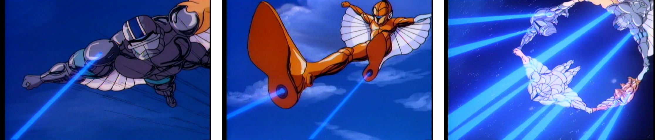
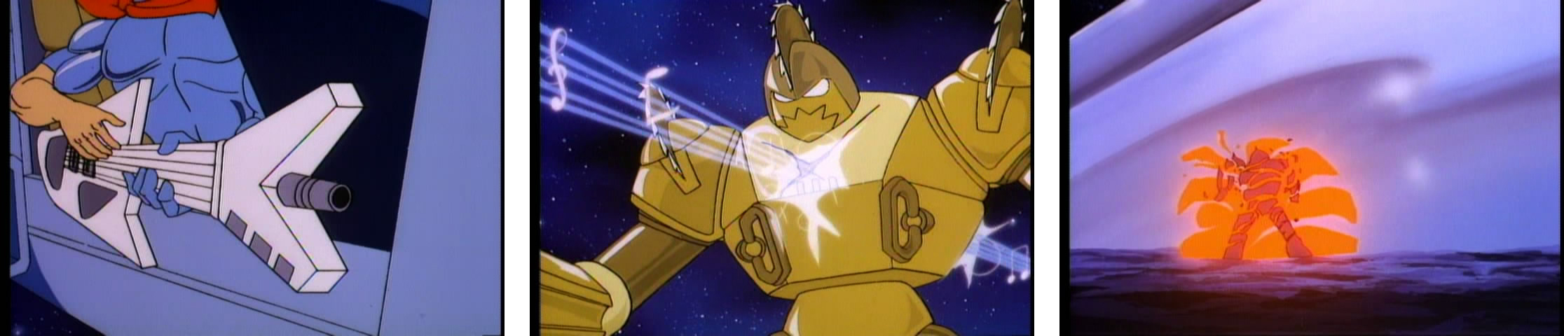
Next up we have Bluegrass, the pilot of the Miraj, and all around jovial cutup of the team. The character has both blue armor and is also a spirited country and western playing, guitar toting cowboy with a Stetson and a neckerchief. For some reason the idea of space cowboys was common in 80s era syndicated animation. Between Bravestarr, Silverhawks, the Galaxy Rangers, and Saber Rider and the Star Sherrifs, there was no shortage of intergalactic cowpokes. Heck there was even a cowboy on C.O.P.S. (though not intergalactic, it is set in a cybernetic enhanced future.) Anyway, I always thought it was weird that Bluegrass sported a steel mohawk under that Stetson.
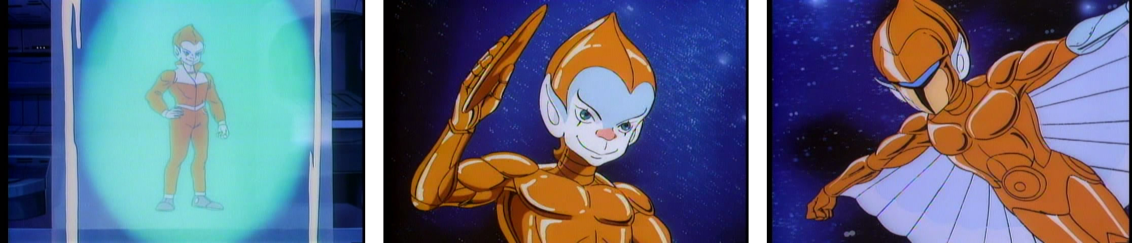
The only alien of the team is the Copper Kid, who’s filling in the silent yet fun slot (think Harpo Marx or Teller from Penn and Teller.) CK is sort of a weird character that’s all over the play in terms of design. On the one hand he’s a kid from the planet of the mimes, so he comes off sort of as a novelty, or a mascot for the group. Tiny, with his clashing blue skin against his copper/orange armor he really sticks out in the Silverhawks line-up. Yet he also sort of painted as the Snake-Eyes/Panthro of the team with his ninja-like reflexes, and his built in boomerang disc weapons (the spherical discs on each hip); there’s never a shortage of action when the Copper Kid hits the screen. If nothing else, he’s certainly the character that kids are supposed to map themselves onto as he’s typically the one being taught lessons in the stories, and literally at the end of each episode where he’s being trained to be the backup Miraj pilot in a series of PSA like quizzes about the universe.

You can hear one of the lessons here.

Rounding out the team members are the brother/sister combo of Steelheart and Steelwill. These are the two that I remember the least from watching the show as a kid. Like Quicksilver they don’t have a lot of obvious or physical character traits aside from the fact that Steelwill is athletic based on his silly looking football inspired faceplate. The most notable aspect about the duo revealed during the two-part series opener is that their hearts didn’t take to the cybernetic implementation process and they needed to have artificial hearts surgically implanted. Though this is played off as sort of a heart-warming joke (pun most certainly intended), I think it was more of a missed opportunity for some character development. Considering the amount of cybernetic implants these characters have, it would be interesting to have a character with more than the rest who has a challenge in keeping their humanity. Sort of like the trials and tribulations of the Data character from Star Trek the Next Generation, this idea of grasping onto a humanity that’s slipping through one’s fingers is a common theme in cyberpunk fiction and I’m surprised that they didn’t allude to this. Maybe it’s in some of the later episodes, though I haven’t come across it yet.

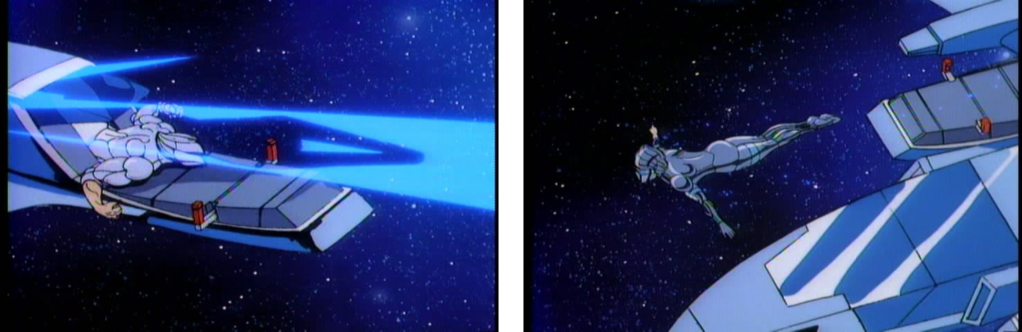
Last, but not least, is the single coolest looking spacecraft known to mankind (in my opinion at least), the Miraj. This star-fighter, consisting of four compartments and launch-able cockpit, has a super sleek design that I was always trying to replicate out of Lego blocks as a kid. The Miraj is more of a launching pad than a true star-fighter though, carrying the team to a destination where they open their individual canopies and then shoot out into space. Not only does it look cool, but it also has a cloaking device (which is where it get’s its name), and the exhaust is a multicolored rainbow of energy. Sure, maybe that sounds a little too “gay”, but as a kid I thought it was the coolest thing ever.
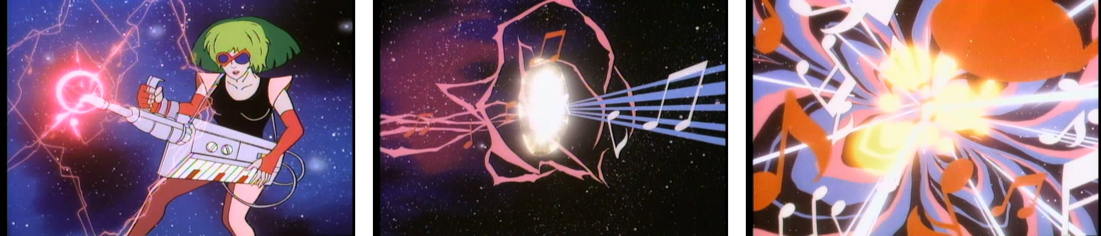
The plot of the second half to this opening mini-movie is again, pretty basic. After flying up to Hawk Haven and meeting Stargazer, the headquarters is immediately attacked by MonStar and his cronies. The Silverhawks fly out and basically whip the pants off the villains, showing off most of their capabilities. There a couple bits that I found pretty interesting including a musical laser battle between Melodia and Bluegrass that ends in a true cacophony of energy, and a showdown between Buzz-Saw and Bluegrass where he uses his guitar gun to blow up the saw-toothed android. But it’s all pretty anticlimactic. For all his bluster, MonStar packs it in pretty easily and we’re back to the status quo pretty quickly.
Again, these episodes are serviceable to showcase the characters, but they really are kind of boring at the end of the day. I much prefer the intense backstroy of the Thundercats as a great example of a Rankin/Bass series kick-off…
![]()