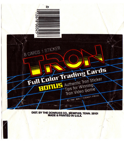
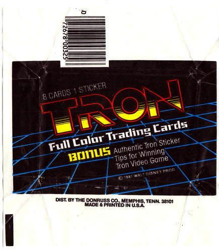
As a slightly anticlimactic close to this mini Tron nostalgia week, I decided to close out with the wrapper to the 1982 Donruss Tron card set (as a bookend to the stickers I posted on Wednesday.) It’s not the most engaging wax wrapper design. In fact I believe other than the neatness of the logo, this is probably one of the more boring card pack wrappers out there.
I think this is a bit indicative of the marketing issues I’ve noticed with the original film. Most of the merchandise I’ve seen used the same hands-on-hips static pose of the Tron character blankly starring, or it uses that image as the center piece surrounded by a barrage of small screencaps that don’t really capture the excitement of the lightcycle race, or the emotional resonance of watching a program get de-rezzed.
I know Disney wanted a big push with the merchandising of the flick, but I’m wondering if people just didn’t know how to market a movie like Tron?
Well, the new flick opens tonight and the wife and I are going to try and catch the 1st screening in the morning. Here’s to hoping it does the original some justice…

