It’s not very often that I get a chance to revisit a set of stickers I’ve shared before with some interesting behind the scenes updates on the production and input from those involved in creating the set. I was really happy to have a chance to do just that this past week when Gary Cangemi the co-creator, artist and writer behind Fleer’s 1986 sticker set called Grossville High paid a visit to Branded. Not only did he share some of his experiences working on this set, but he also graciously provided a scan of the original artwork for one of the cards to share here as well as to clean up a bit of a buggy mystery.
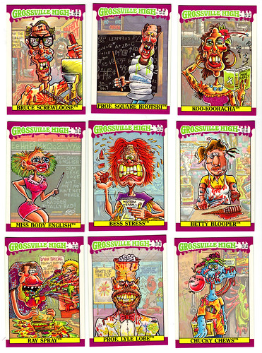
About a year ago, a reader of the site named Joe pointed out one of the obscure facts about this set that I neglected to talk about when I first posted about the Grossville High cards. Basically, the Grossville mascot (named Ronnie the Roach) is hidden in the artwork for each card in the set, so there was a additional bit of fun to be had in searching for the little bugger. Joe had also pointed out that there was one card that didn’t feature a hidden Ronnie, sticker card #58, Miss Body English (pictured below at the center-left.)
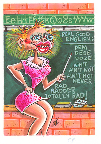
As you can see in the original artwork below, Ronnie is indeed there, he was just cropped out of the final card art by Fleer…
What I really love about getting a chance to see this original artwork is the little details and differences between it and the final printed card. First of all, one of the things that I’d appreciated about the artwork when I first took a look at this set was the care that was put into the aesthetics of the color when it came to the backgrounds. This set is very loud with a lot of neon yellows, neon greens, reds, oranges and purples, and it can be an assault on the eyes at times. One of the ways that I assumed Fleer tried to tone this down was by dimming the backgrounds, which both highlights the main characters and reduces the color “volume” so to speak. Well, with the original piece, we get a chance to see the artwork as it was intended without the background obscured, and honestly it’s not nearly as eye-strain-inducing as I’d imagined. Actually, the overall art seems less garish and less intense. I think this has a lot to do with the fact that Fleer went with a very vivid and saturated look to the set instead of using the more subdued palette Cangemi originally chose.
Closer inspection of the piece also reveals some changes in the art that Cangemi noted Fleer had asked him to make. In particular you can see a reduction in Miss Body’s bustiness…
Anyway, here’s what Gary had to say about working on Grossville High…
“My business partner Larry Newman came up with the concept of a gross high school and most of the names. I did all the writing and artwork for the series. There are some creative and design problems with the series caused mostly by the lack of time given me to complete 66 designs PLUS the humor on the backs. I remember doing the whole thing in 5-6 weeks. Some of the stuff got repetitive because there wasn’t enough time for creative development and feedback. You will notice there are no African-American characters in the series. Joe Stereo WAS black originally but fleer was so afraid of being accused of racism they made me turn him into a white guy. I told them they were wrong, that to exclude African Americans was more racist. Of course they had no objections to my stereotypes of Chinese, Italian, or Latino characters…go figure. Some of these cards wouldn’t survive today’s hypersensitive market and others make me cringe a little, but the 70s-80s were a different time when people could kid around about race without all the political correctness. Sitcoms were loaded with these stereotypes.
The only resemblance I see to GPK (in response to my assertion that Fleer was riffing on Topps’ GPK stickers – Shawn) is the naming scheme and the grossness, but I tried to be as original as possible and more MAD-like. The faded backgrounds were fleer’s decision. The original art, which I still possess, is rich in color depth and detail, too much so. Fleer said the characters didn’t stand out enough like the GPKs did so they cut masks around the characters and lightened the backgrounds. There IS a roach on the Miss Body English card, you just need to look harder. I had a great time designing these cards but wish they had given me more. They would have been much better. By the way, the GH originals were not painted, they were done in Prismacolor markers, ink and colored pencil on Arches watercolor paper.”
As for the future of Grossville High, Gary had this to say…
“I now own the exclusive rights to Grossville High and plan on resurrecting them in some form or another, either a class reunion or a next generation concept. I also wrote a script for a GH graphic novel which I would like to produce someday. I think Grossville High, with some updating, would make a great CGI film.”
Also, another bit of fun trivia for this set is that it was originally intended to be called Grossburger High, but Fleer nixed that idea for being too close to yet another of their rival Topps’ products, Gross Bears (their Garbage Pail Kid-like parody of the Care Bears released in 1985.)
I really want to give a huge thanks to Gary Cangemi for sharing his thoughts on the set and for giving the Branded readers a chance to look at some of his original untouched artwork! I also hope he gets a chance to bring these characters back to life in a new project, and I’m really excited to see what might come in the future…

