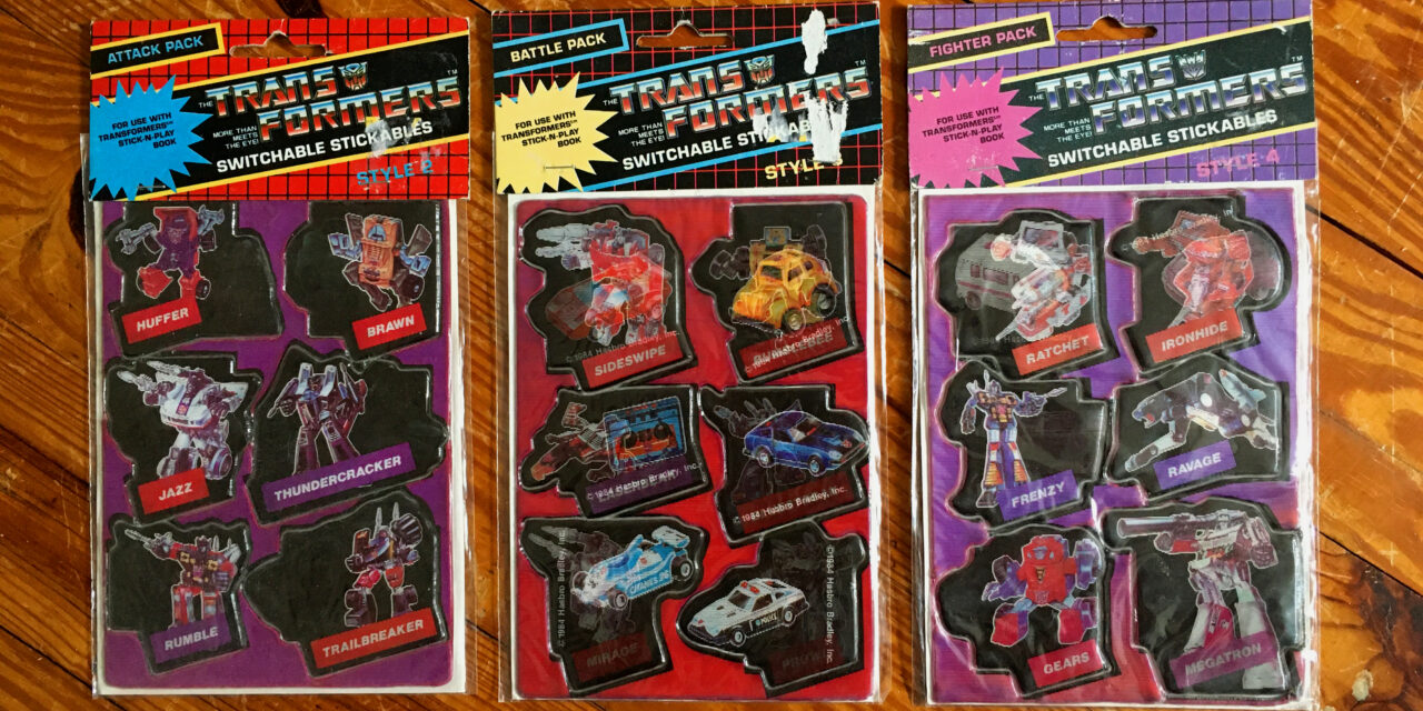
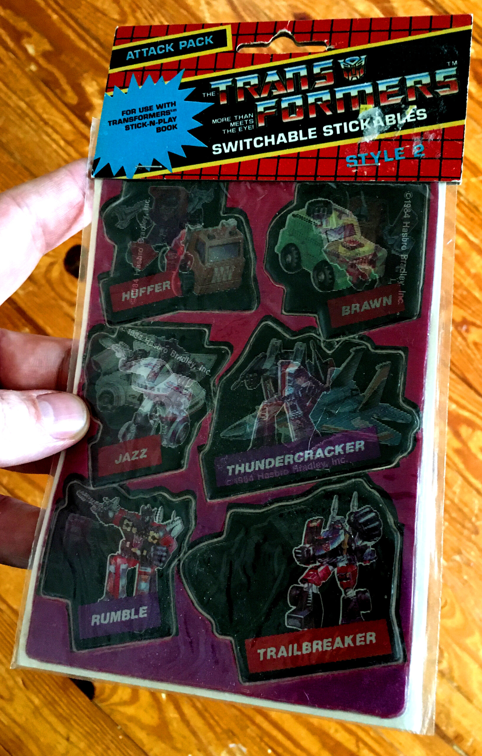
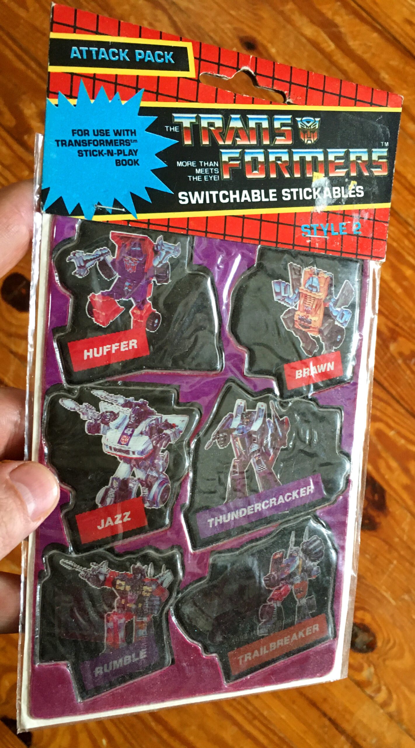
About a million year ago, when I first started writing about stickers here at Branded, there was one style of sticker that I wanted to cover more than any other because it was one that, more than anything, reminded me of my childhood. Lenticular stickers, as a subset of puffy stickers, is certainly an older technology than the 80s, but it was one that fit in so well with the decade (considering all of the transformable toy lines) that it’s kind of insane that we didn’t see more. I mean, Transformers, Smooshies, Go Bots, Popples, M.A.S.K., or even McDonald’s Changables, there were tons of franchises that were ripe for the lenticular sticker treatment. Overall, the Transformers is probably the most prominent toy line to take advantage of the format with tennis shoes, backpacks, wallets, cereal premiums, and of course, stickers. Way back in Peel Here #2 I brought up the Transformers Switchable Stickables with the one package I’d managed to snag at the time. Then, about a year or so after that a bud of mine, Esteban of the Roboplastic Podcastalypse, donated some scans of Transformers stickers he had and included in the bunch were the two remaining packages of lenticular stickers I hadn’t been able to source.
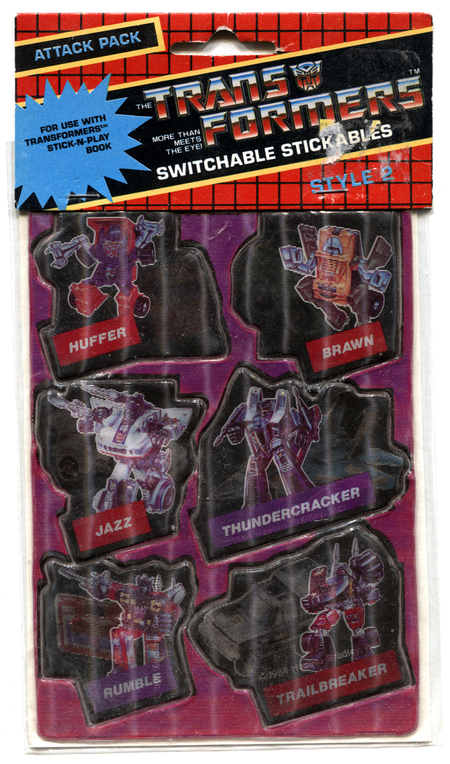
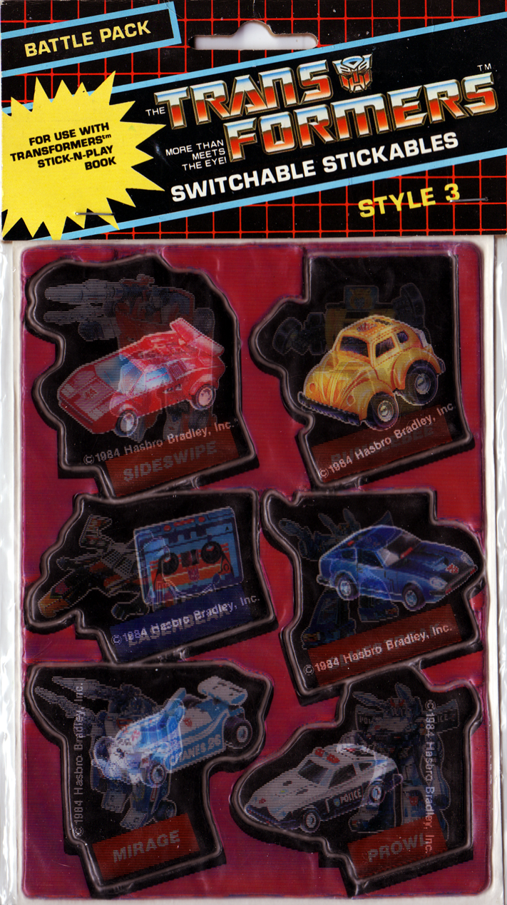
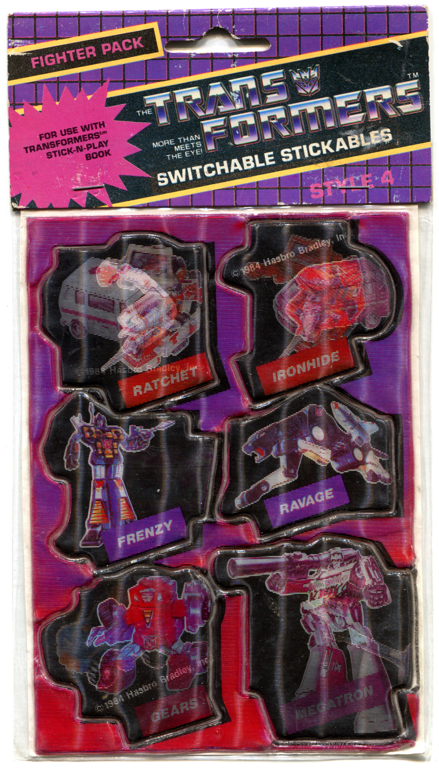
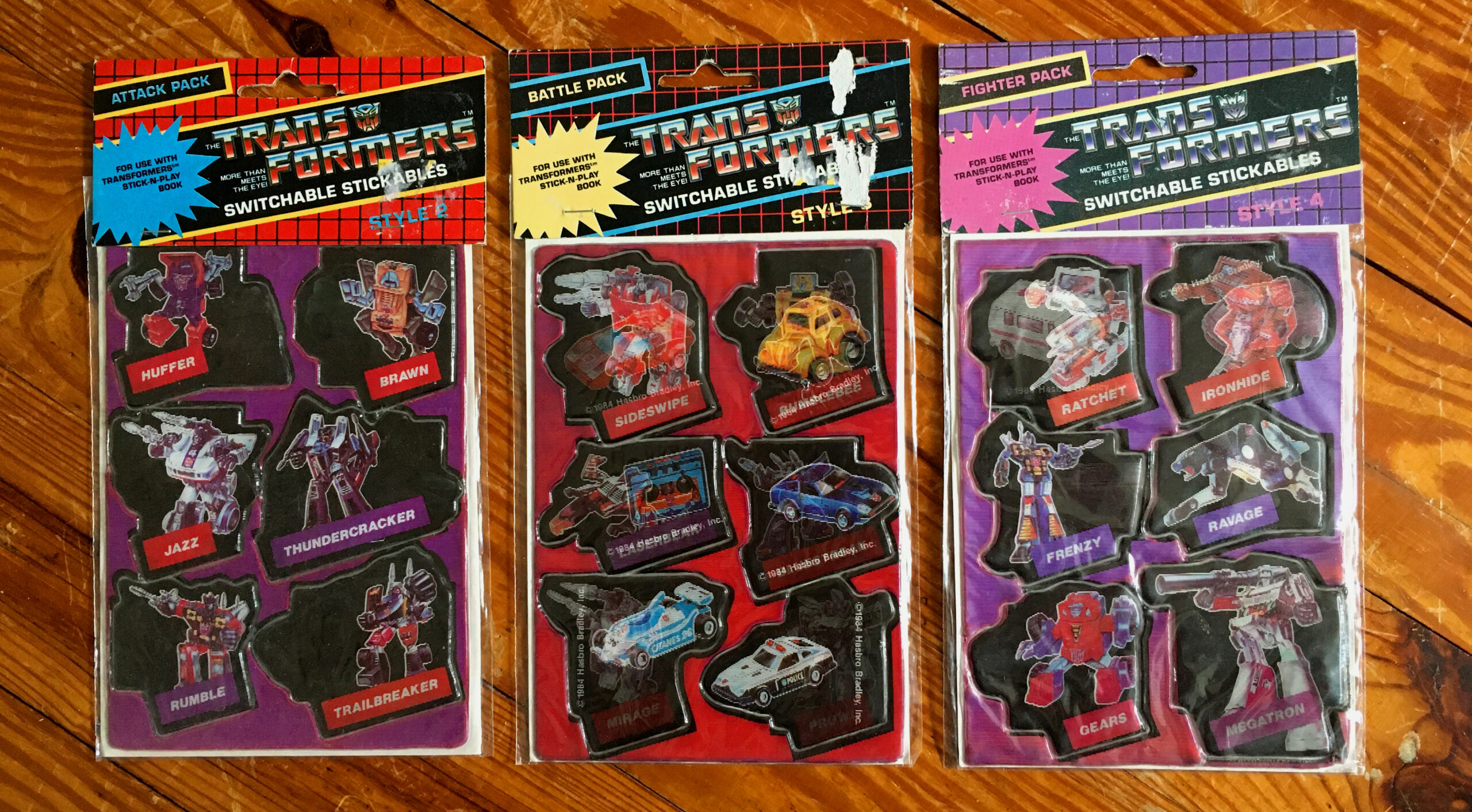
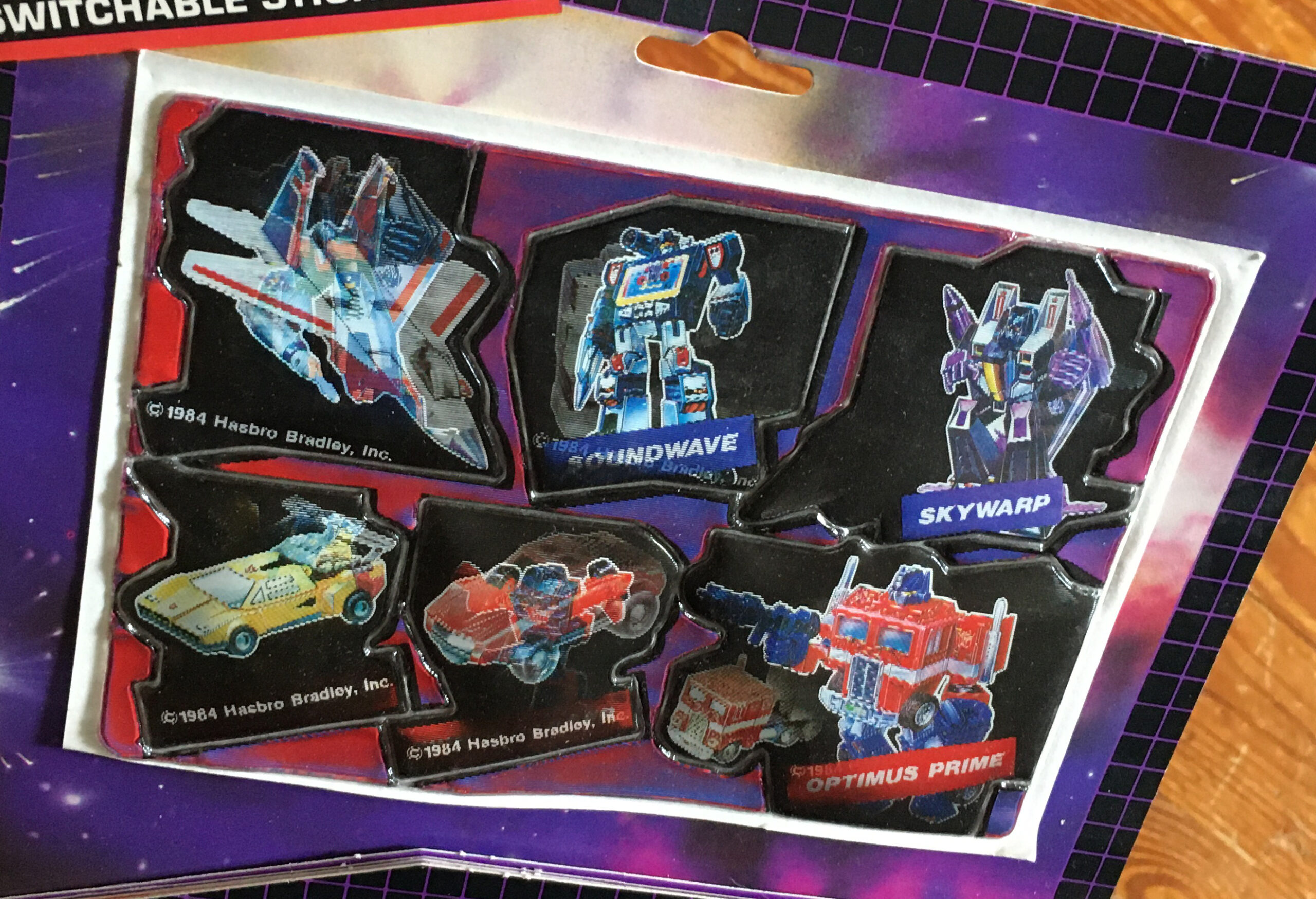
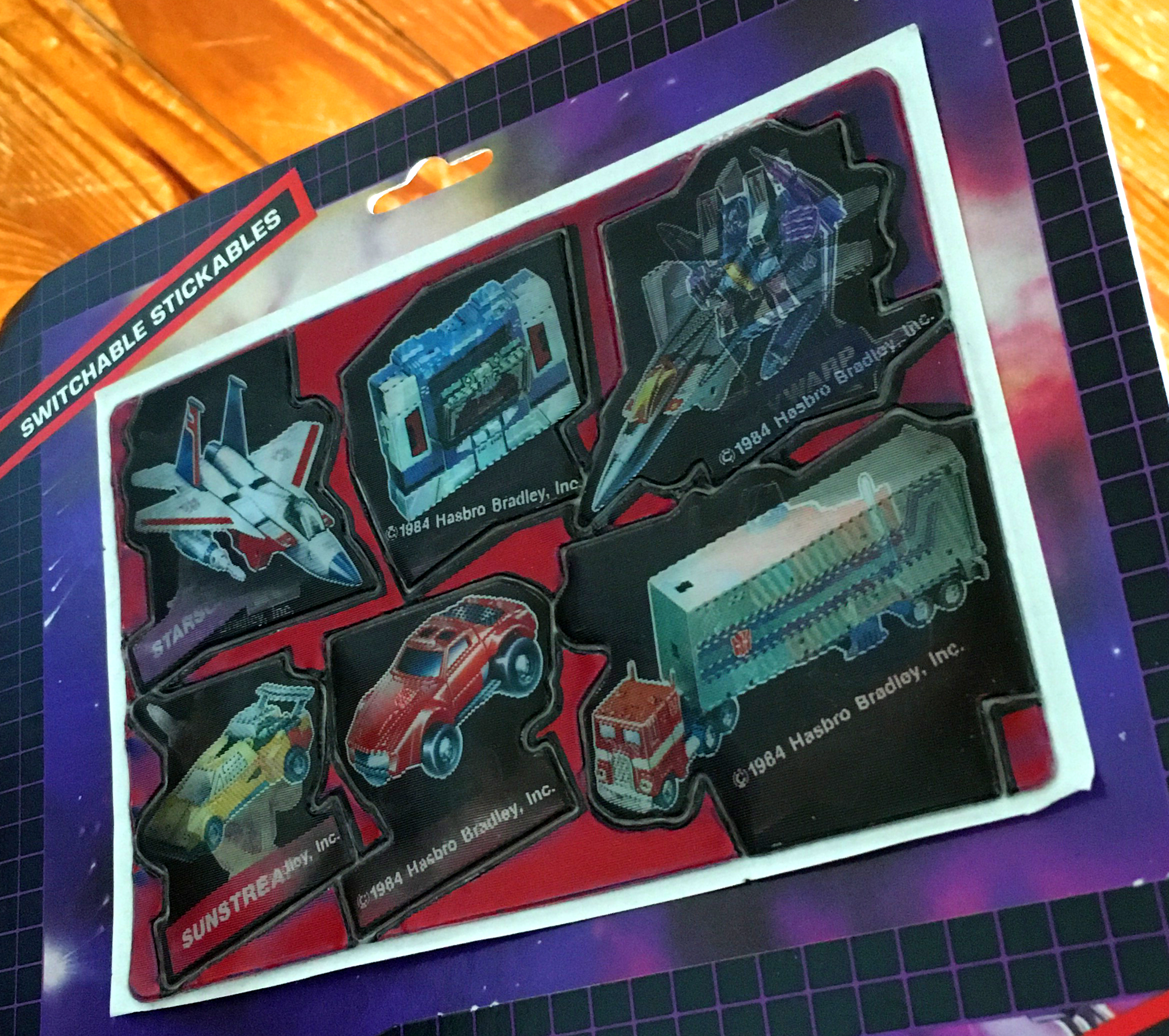
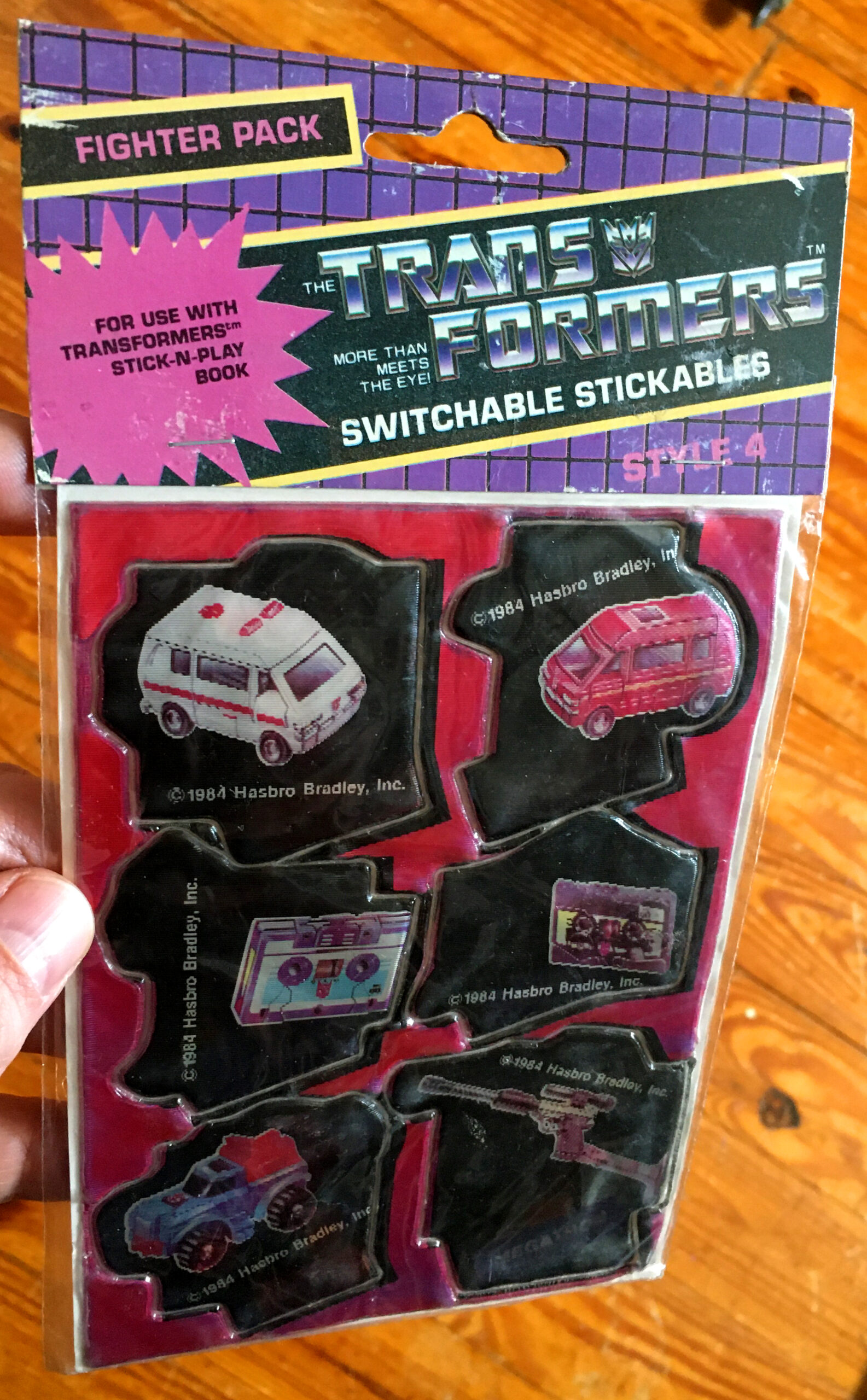
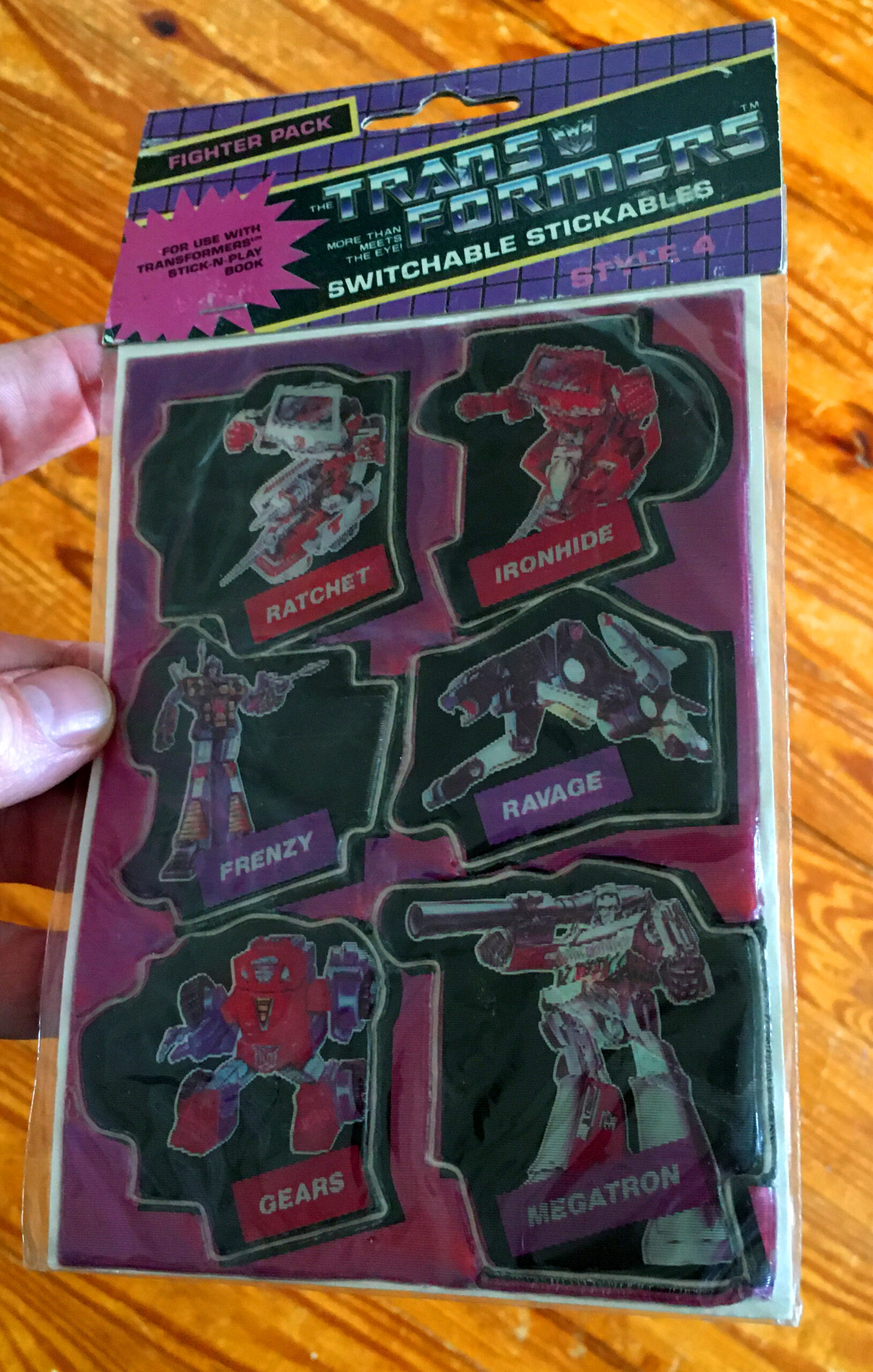
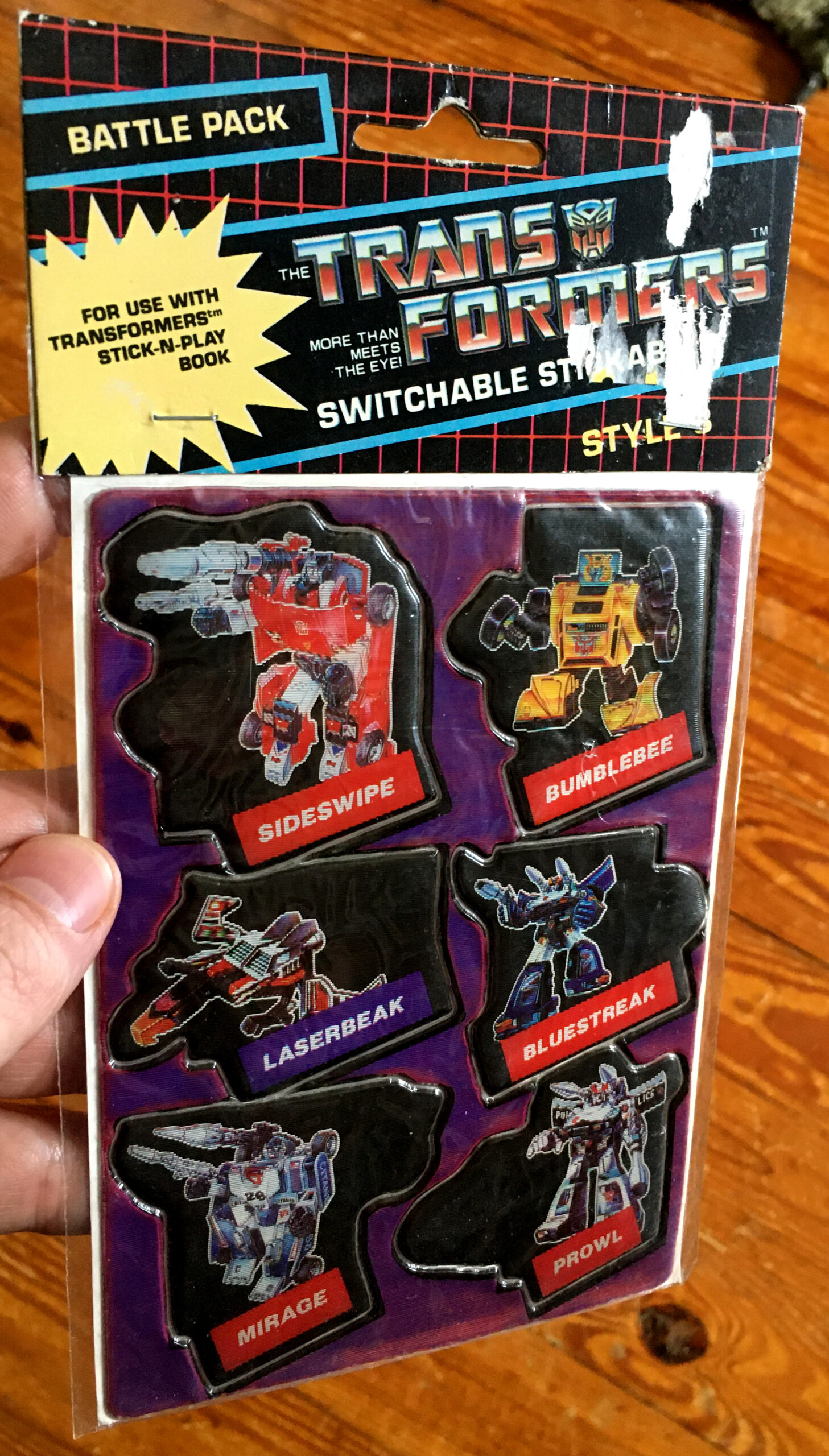
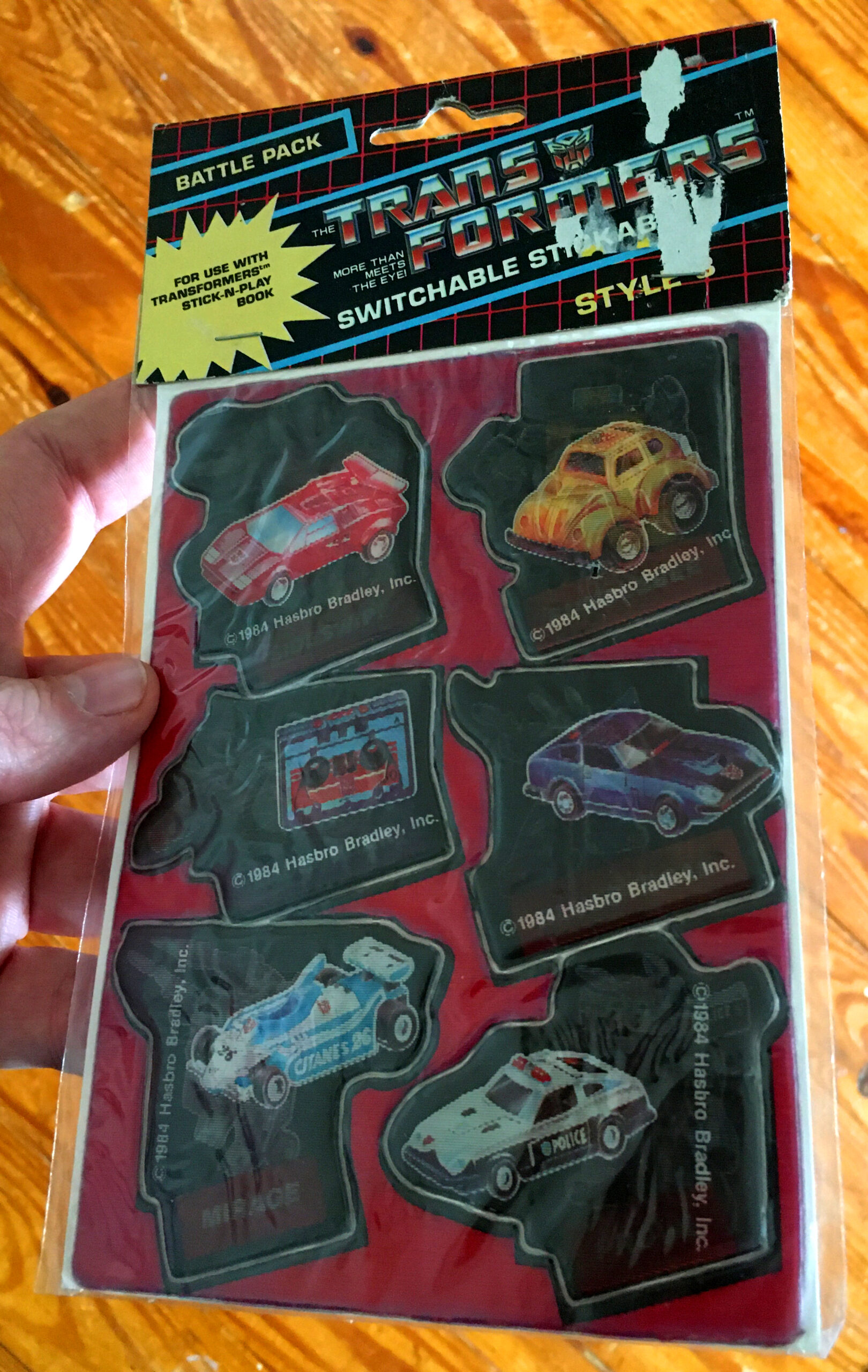
At the time it was a little confusing to me because of the numbering on the sticker packages, Styles 2, 3 and 4, had skipped style 1. Esteban let me know that the actual Stick-N-Play book came with the first style attached directly to the book. For years I could never find the book and just accepted that I’d never get a chance to scope the final six stickers in the set. But as any patient collector knows, sooner or later your ship will come in if you’re dedicated to the search. I finally found a book, and for a very reasonable price, along with the two packages of stickers that I was initially missing. So I finally had a complete set of the Transformers Switchable Stickables. Of course, with the nature of the lenticular format, it’s next to impossible to get good images of the dual images with scans of the stickers. Just check out the scans above. Sometimes you can get one clear image of the two, but you usually get a mix of both as the light from the scanner passes along the image. You can also see that different scanners yield different results as well. The image in the middle, my original Style 3 set, was done with my beloved and sadly dead scanner that I used for the first 10 years of running Branded. It usually needed some post scan image adjustment, but it was still an amazing workhorse. A few years ago I had to get a new one, and honestly, they’re just not making scanners like they used to. The lenticular ridges really threw off my new scanner when trying to get decent images. So for the rest of this piece the best I can do is take regular photos, so the results of trying to capture both images on these stickers is, tenuous at best…
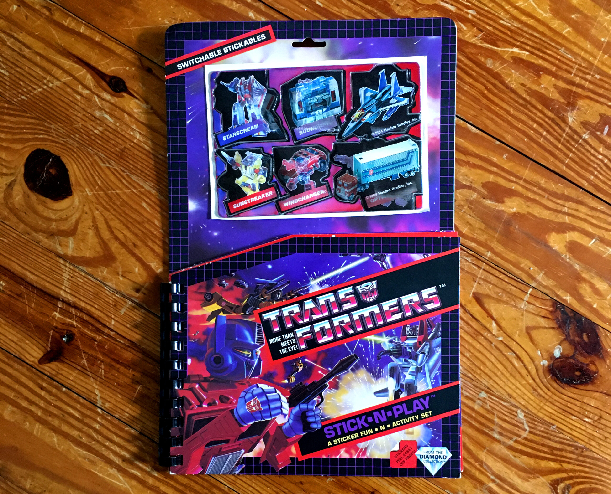
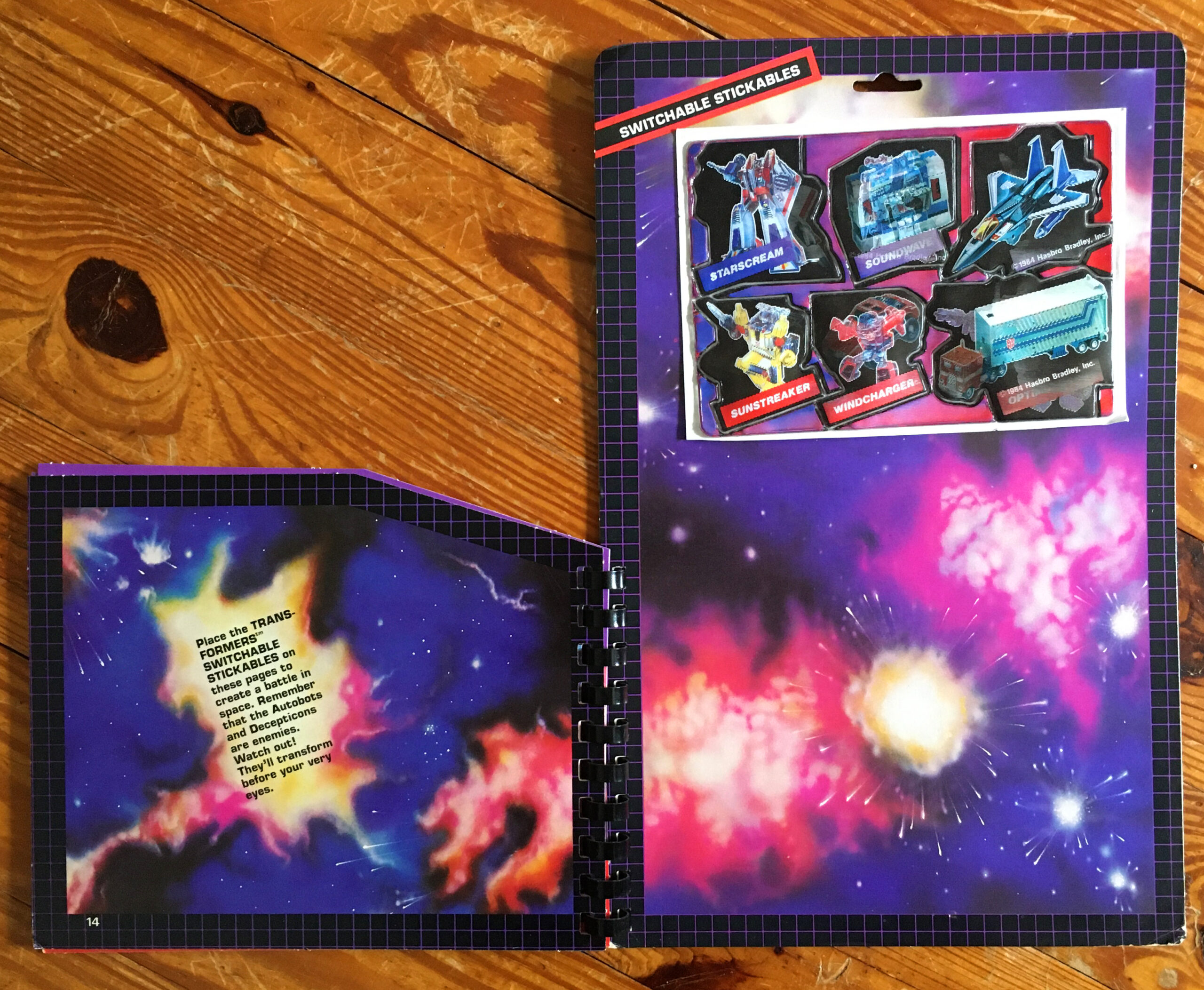
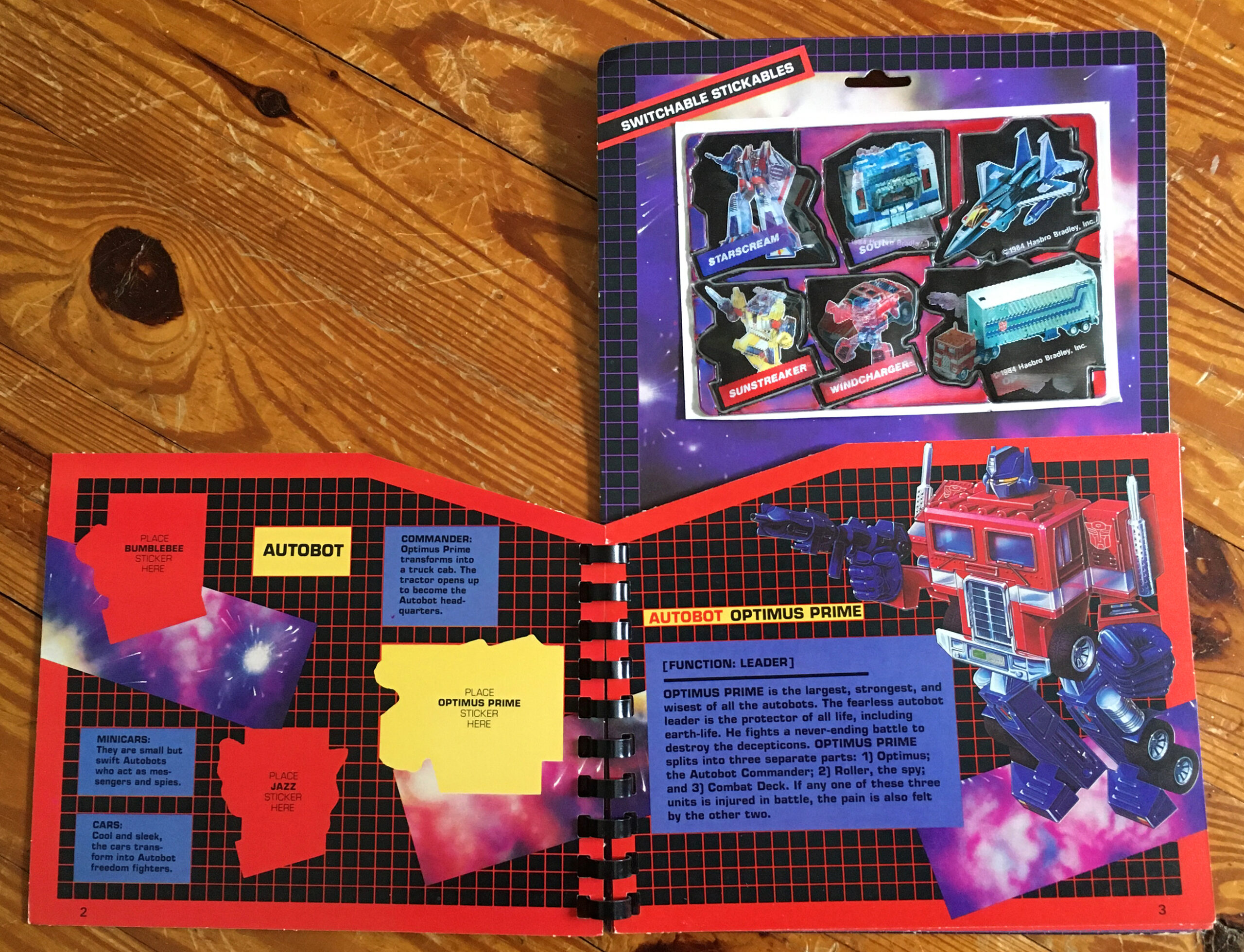
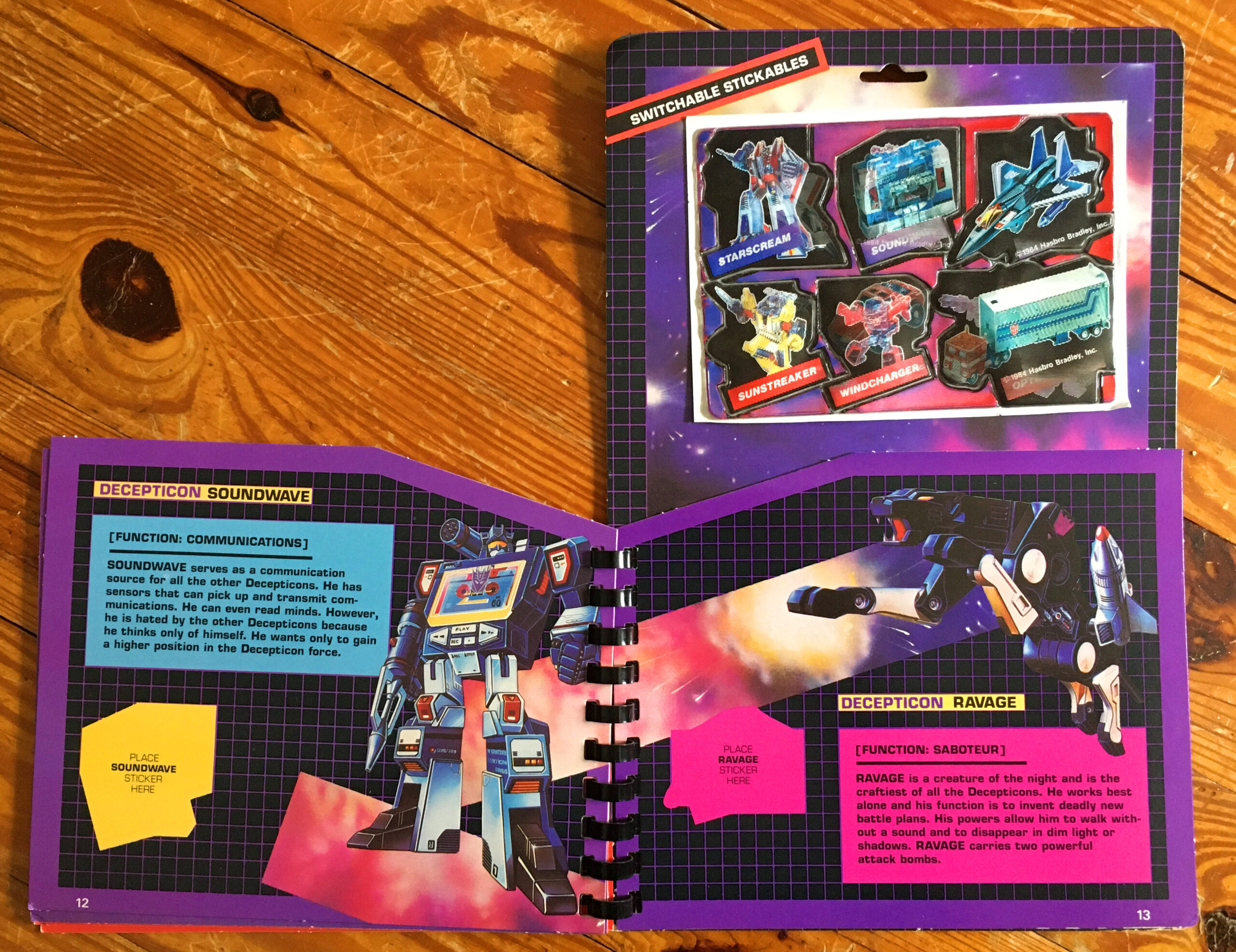
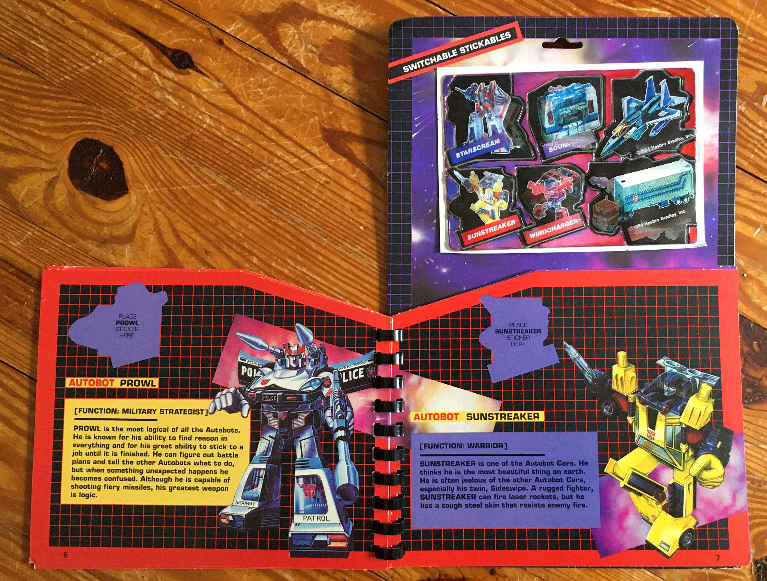
This set of stickers was released by Diamond Toymakers in 1984 and features 24 different characters from the initial wave of Transformers toys. The book itself has 14 pages, each set up with places to stick your collection and descriptions of all the characters to boot. The last two pages feature cosmic background where you can put some of the stickers to create your own battles. Actually, the “switchable” in the name has a dual meaning in that the stickers themselves have two images and you are also susposed to be able to stick and then remove and re-stick these at your leisure. The truth of the product though is that you probably only ever had one good chance to stick these on the pages before they lost most of their stickiness. So the product was overambitious for sure.
I should probably have taken video of these and tried to make gifs for this piece, but that just sounds like A LOT of work, so you’ll just have to use your imagination…
And here are the corresponding pages in the Stick-N-Play book…
There were both dedicated Autobot…
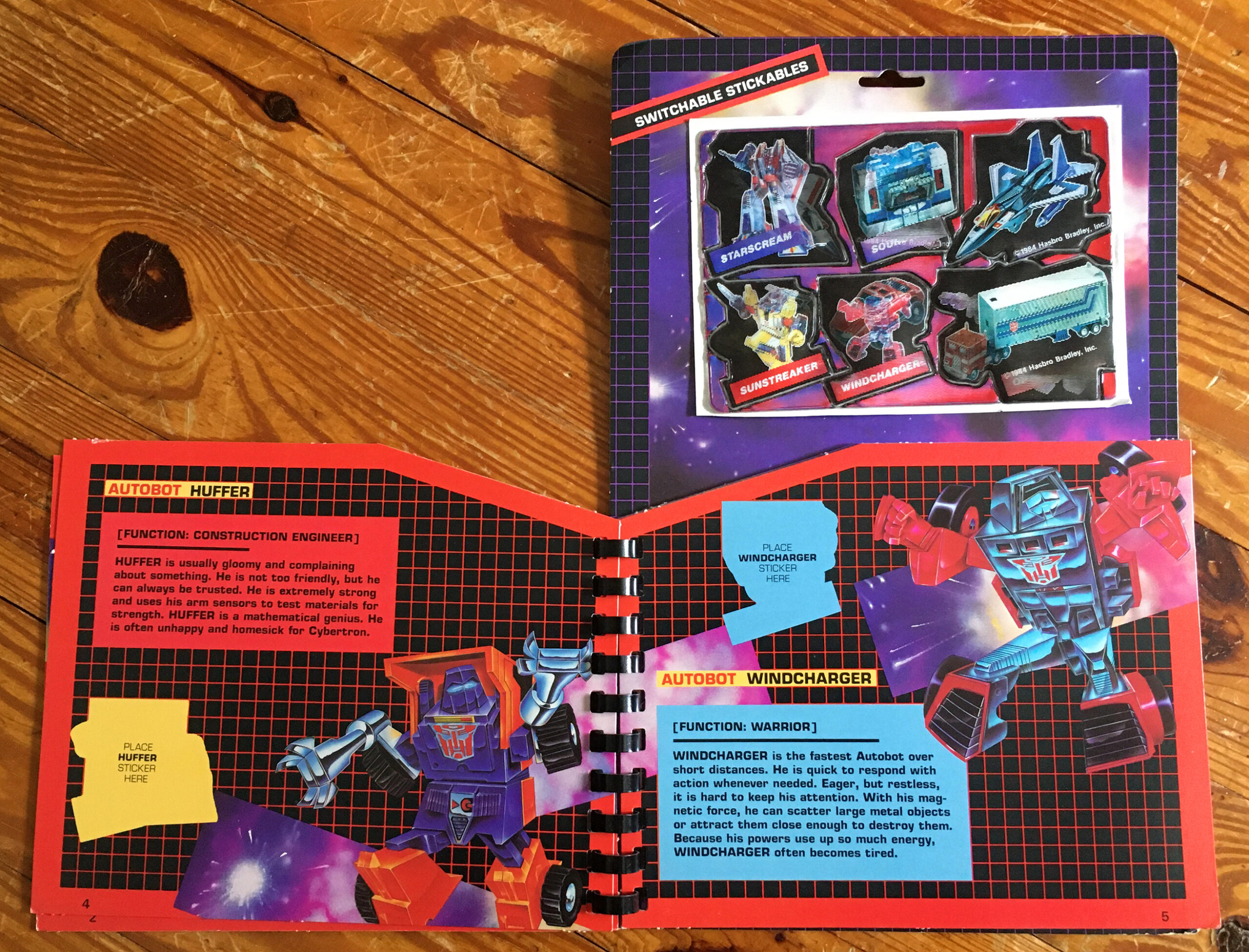
…and Decepticon pages.
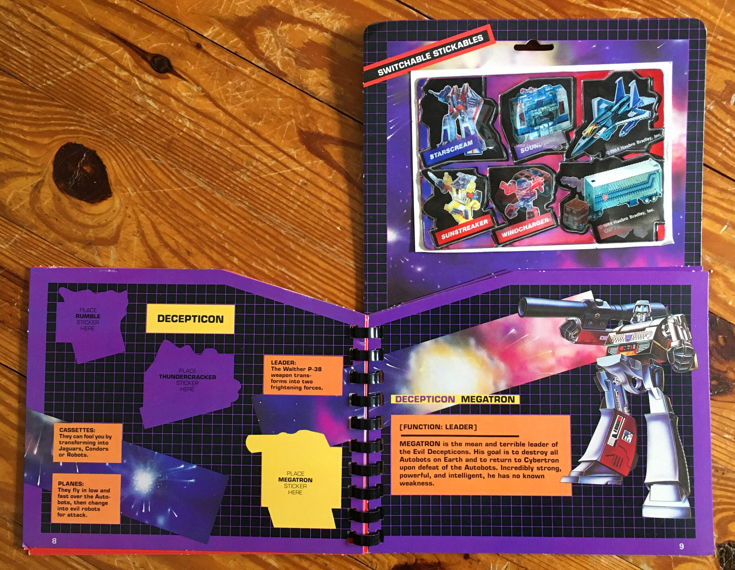
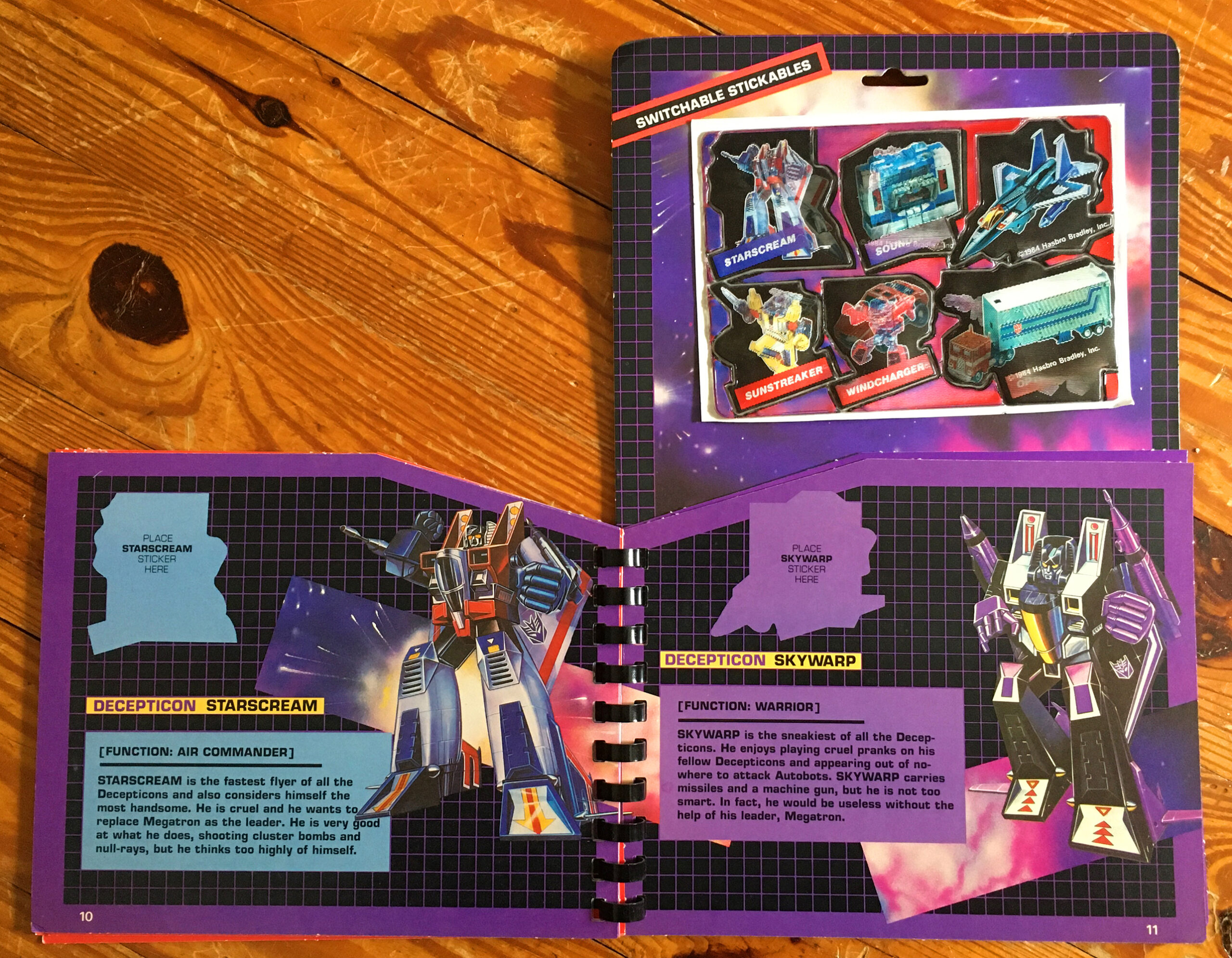
But weirdly, there aren’t places for all of the included stickers. So you’d have to put the rest on the battle pages above. As much as I love the use of the original box art images on these pages, I think there is a lot of wasted space where they could have made room for more stickers and character descriptions. I feel like this could also have been fixed by adding a couple more pages to account for all the stickers.
That being said, I love this set and all of these stickers.
Now I’m imagining what a set like this would look like for the M.A.S.K. brand…


