Somehow, unintentionally, I’ve amassed a rather large collection of vintage coloring books over the years even though I honestly have very little interest in them (even the rad branded ones.) I guess there have been a number of times when I was bidding on eBay auction lots that contained them, or they were just so cheap that I couldn’t pass them up. Recently I found myself with a stack of Marvel Transformers coloring books from 1984 after winning an auction for a bunch of vintage stickers and instead of just tossing them in a box or directly shipping them off to a friend that might appreciate them more than me, I thought it might be fun to take a closer look at them here on the site. The stack I have were very, VERY well-loved and a number of the pages were colored by some budding artist 36 years ago. So let’s take a look at these book, some of their key artwork and the skills of the kid who used to own them.
There were three books in the lot I won, The Deadly Fuel Shortage, Decepticon Patrol and Bumblebee to the Rescue. All were published by Marvel in 1984 to coincide with the launch of the cartoon and toy line, and like most of the merchandise at this point in the franchise the designs were based heavily on the look of the actual toys.
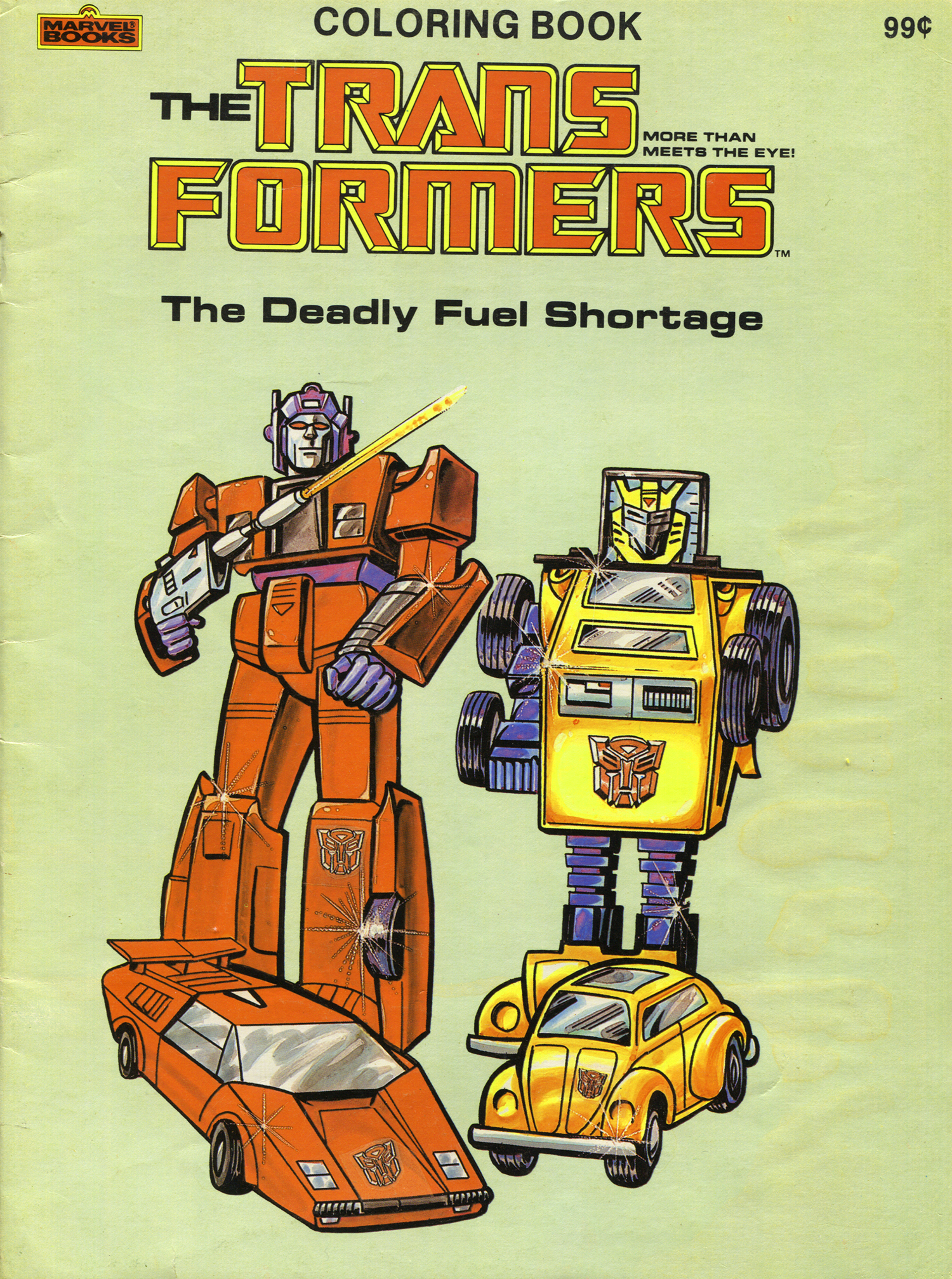
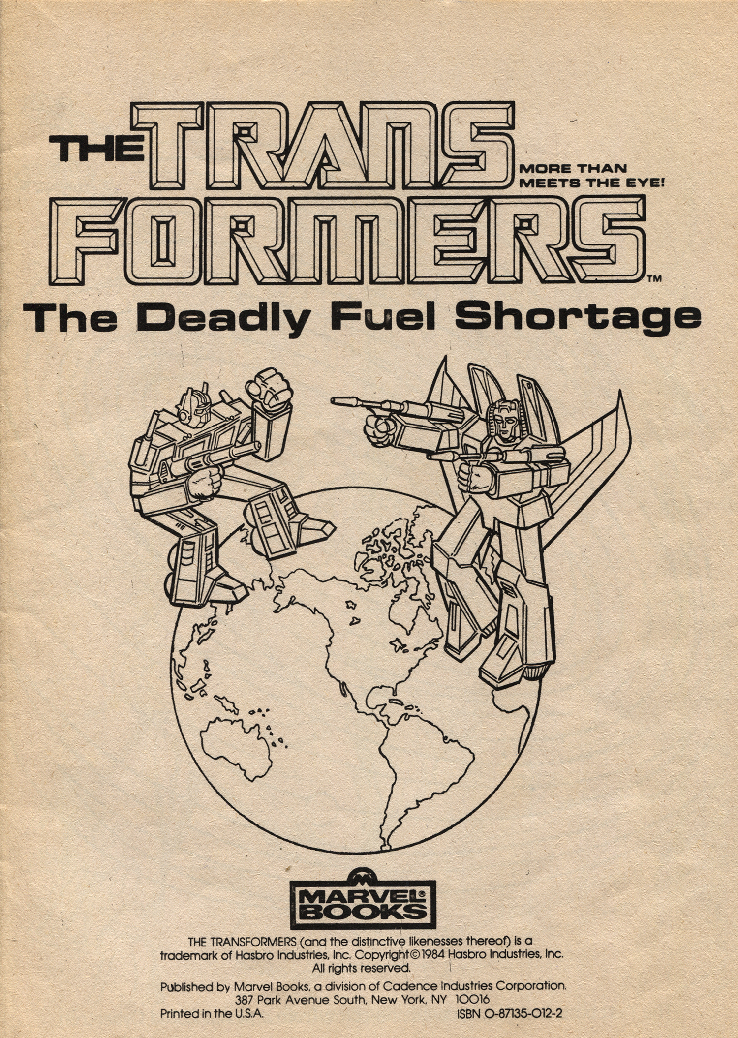
Above are the front and back cover to the Deadly Fuel Shortage. The back covers of all the books were the same, just featuring the two Transformers faction symbols for the Autobots and Decepticons. Right away you can get a feel for how quickly these books were put together just by scoping the art on the cover. For one, Sideswipe is very far off-model, even for the toy design. For one, somehow his Autobot logo fell off his hood and onto his shin while transforming, the colors are all off with a lot of blues instead of black and there is no white in his waist at all. The artist who rendered these even put an intense shine on his tire of all places. Bumblebee on the other hand is fairly on-model for the toy, though his torso is oddly angular considering it’s supposed to be the top of a VW Bug. I love that the artist decided to keep the square backing on his head though.
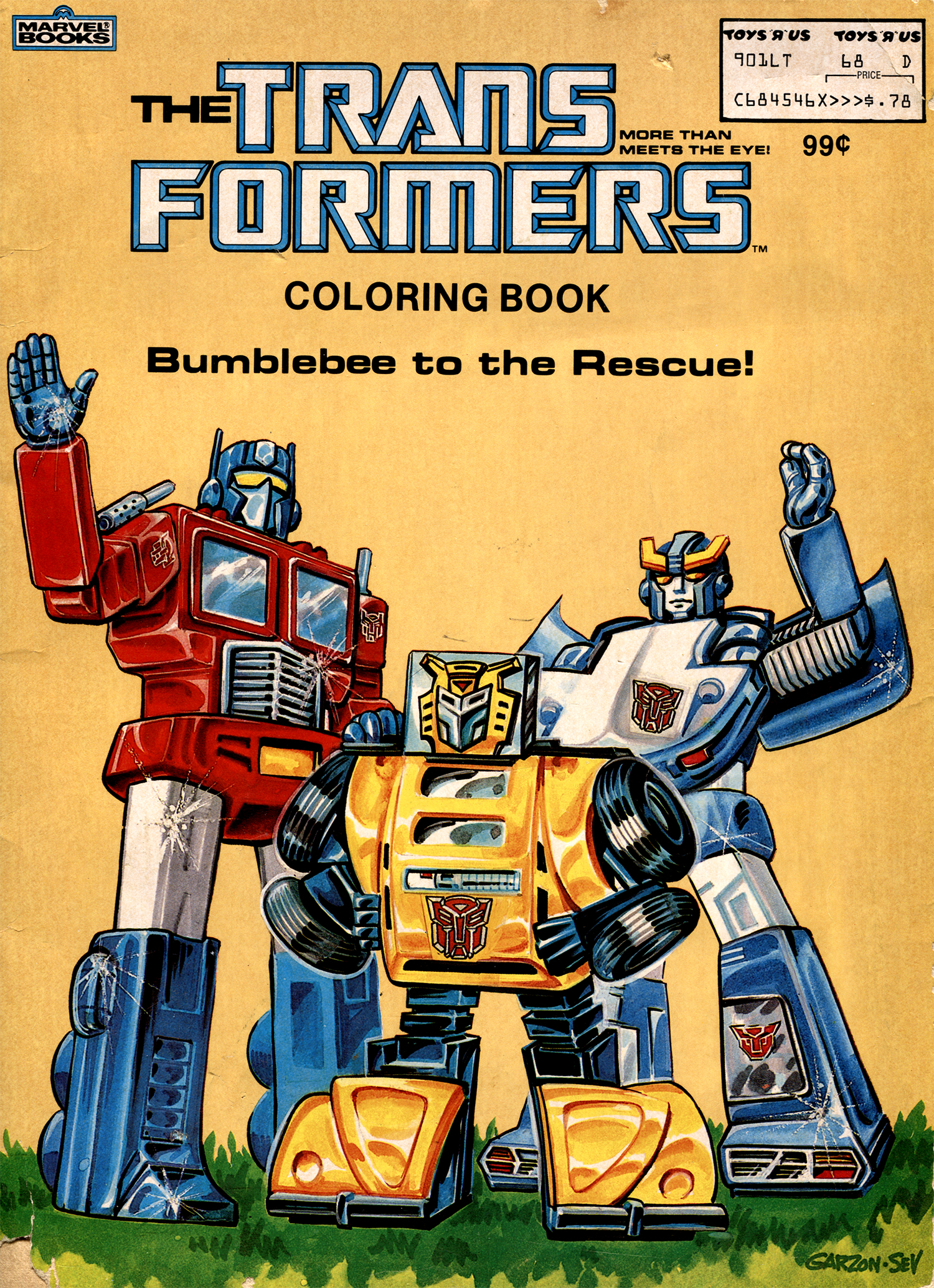
The cover for Bumblebee to the Rescue on the other hand is a hell of a lot better featuring a pretty damn good painting of Optimus, Bumblebee and Bluestreak. This one was done in what appears to be colored markers by an artist named Carlos Garzon (who I believe illustrated the interiors of these books as well.) Also, note that this coloring book was sold either directly by (and possibly exclusively by) Toy’s R Us back int he 80s as the price tag at the top of the book is actually not a sticker, but printed on the actual book.
Garzon also illustrated the cover of Decepticon Patrol below…
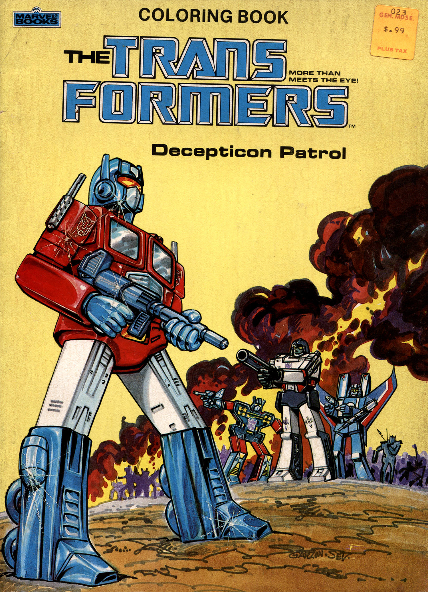
I really love Garzon’s marker work on these. The color is great and he manages to blend them very well, not easy for markers. As far as the interior art goes, well, these are coloring books so rich detail and super dynamic illustrations aren’t to be expected. I mean you have to provide kids with some room to color, and let’s be honest, crayons are not the best medium for accurate or nice coloring. That said, Garzon does deliver some great pieces in these books. Here’s some of my favorite pages.
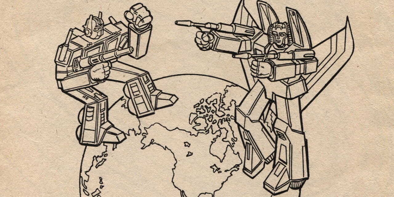
I love this title page to the Deadly Fuel Shortage with Optimus Prime and Starscream sparring on to of planet Earth. Though it probably should have featured Megatron and Optimus, it’s still a rad illustration and the kind of thing that would make for a great whole-back-tattoo. Similarly is this image of Megatron grasping the Earth below…
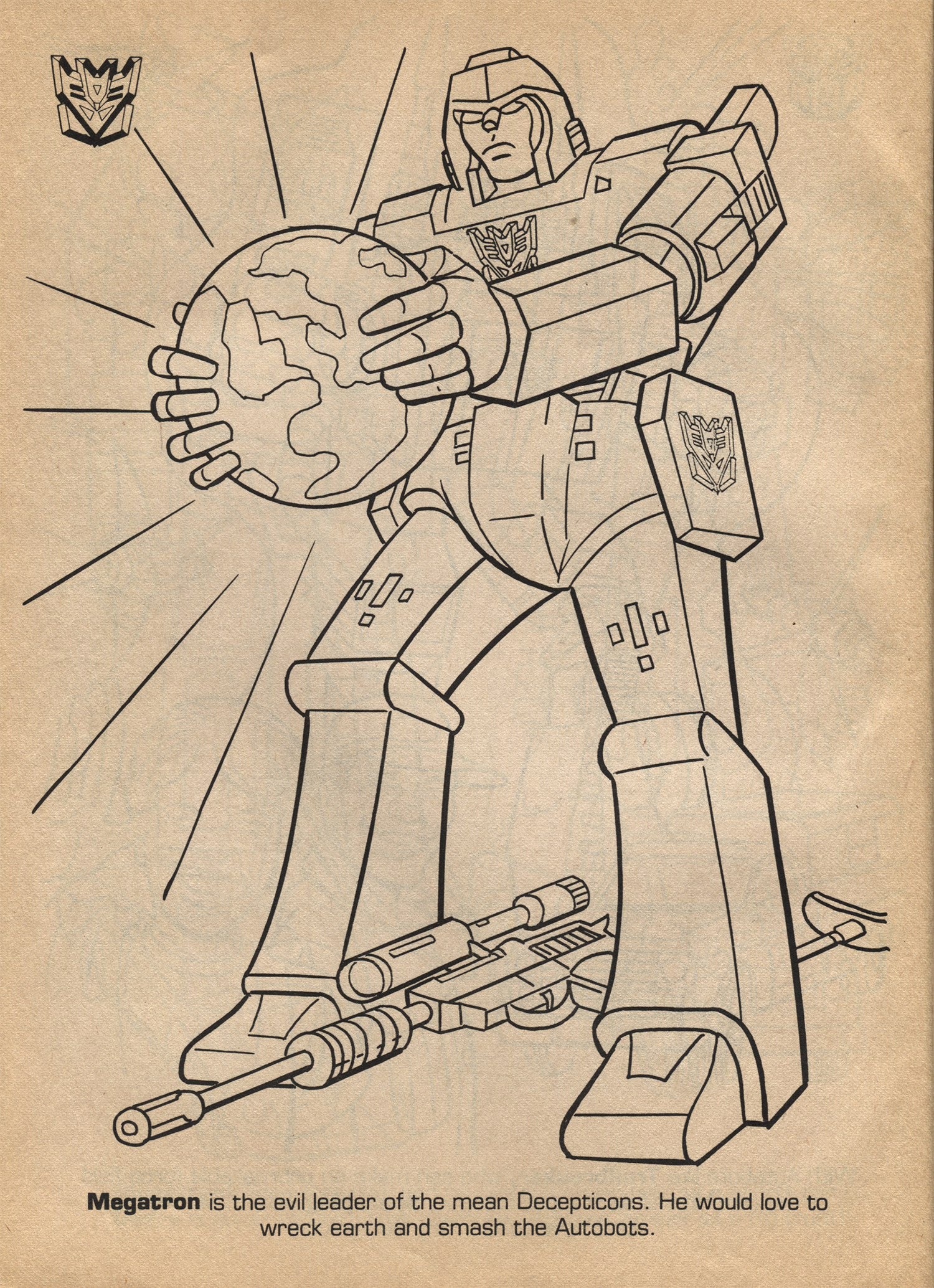
Is there any image more perfect for the text that accompanies it?! Also, though it’s weird, I kind of like that his weapon alt form is laying at his feet. It should bother me, but it really doesn’t as this is a more metaphorical image to begin with.
This next page above is one of my all-time favorites from these three books. You can really see that Garzon was capable of so much more when you look at his illustration of Sparkplug. That’s some classic 70s era comic book illustration right there.
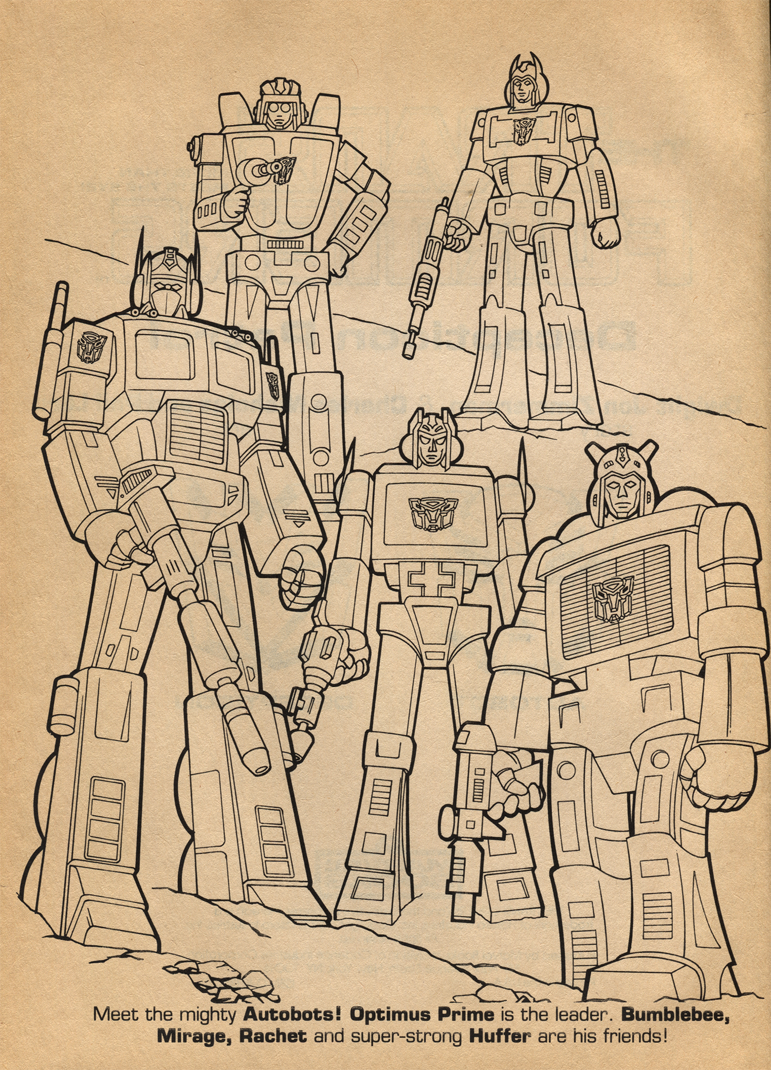
The image above on the other hand is a mess, design-wise. As a straight up coloring book illustration it’s great, but considering the characters that it’s seeking to display, not so great. I don’t think this one was drawn by Garzon as the style is vastly different, way more tight and methodical. Other than Optimus, the rest of these Autobots are so off-model it’s hard to tell who they are. They look neither like the toy or the cartoon iterations. I’m assuming because there’s a cross in the midsection, the middle robot is Ratchet (off, misspelled in the book), and maybe the one on the bottom right is Huffer with that big rig grill on his chest. But do any of you see Bumblebee or Mirage in there? The top left looks like a poor attempt at Wheeljack, though his character isn’t even mentioned, and the other one looks way more like Cyclonus years before his character would even debut!
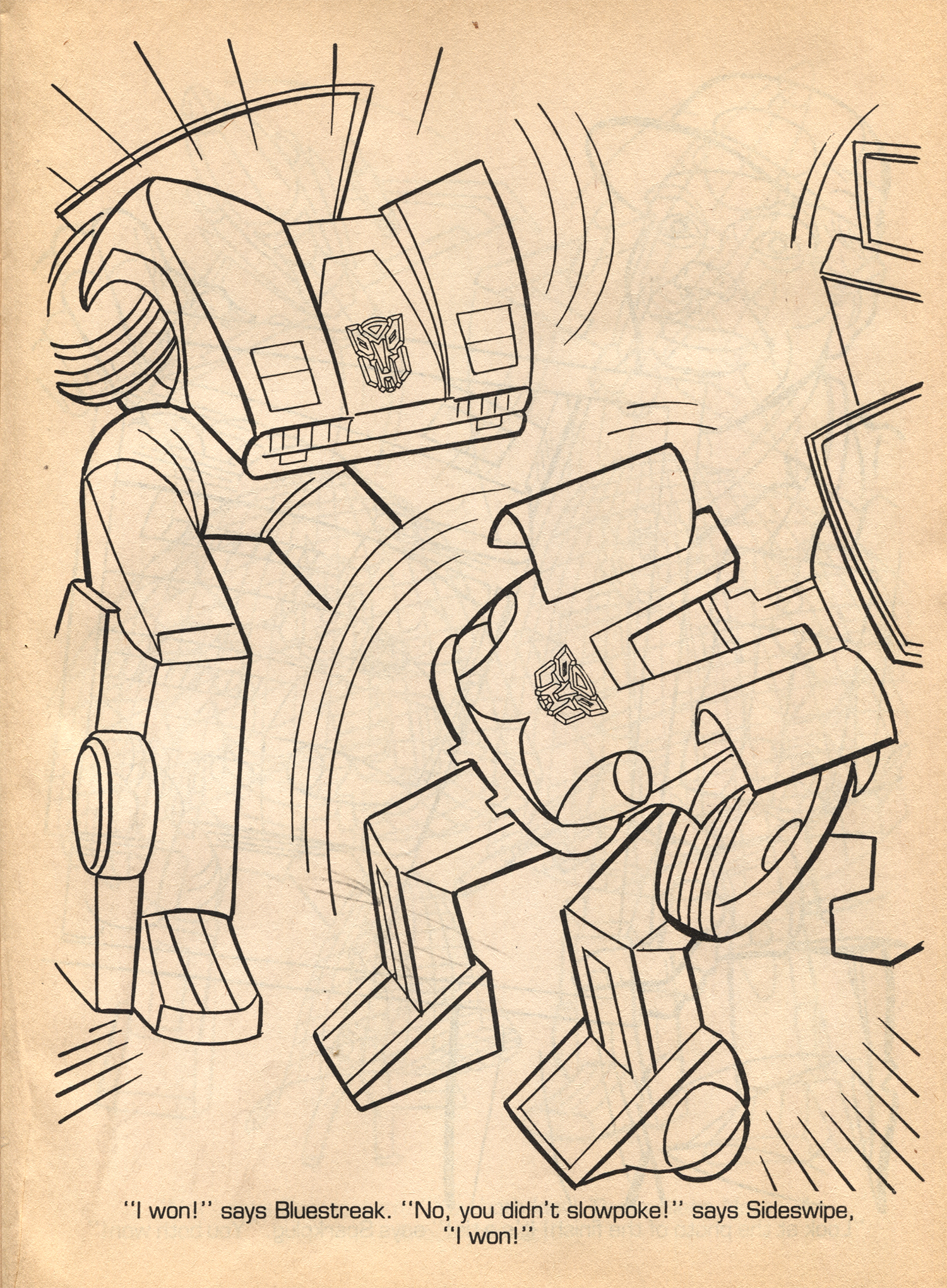
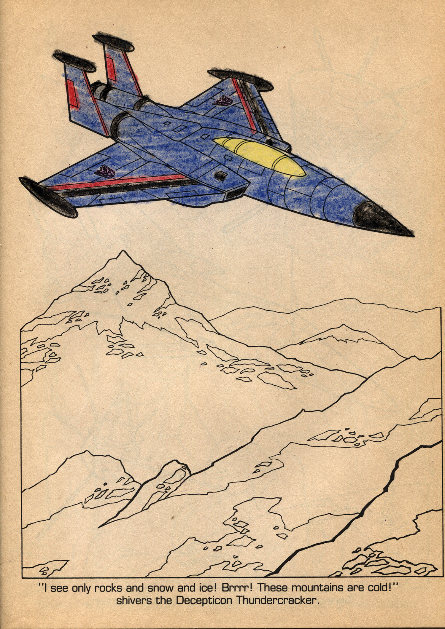
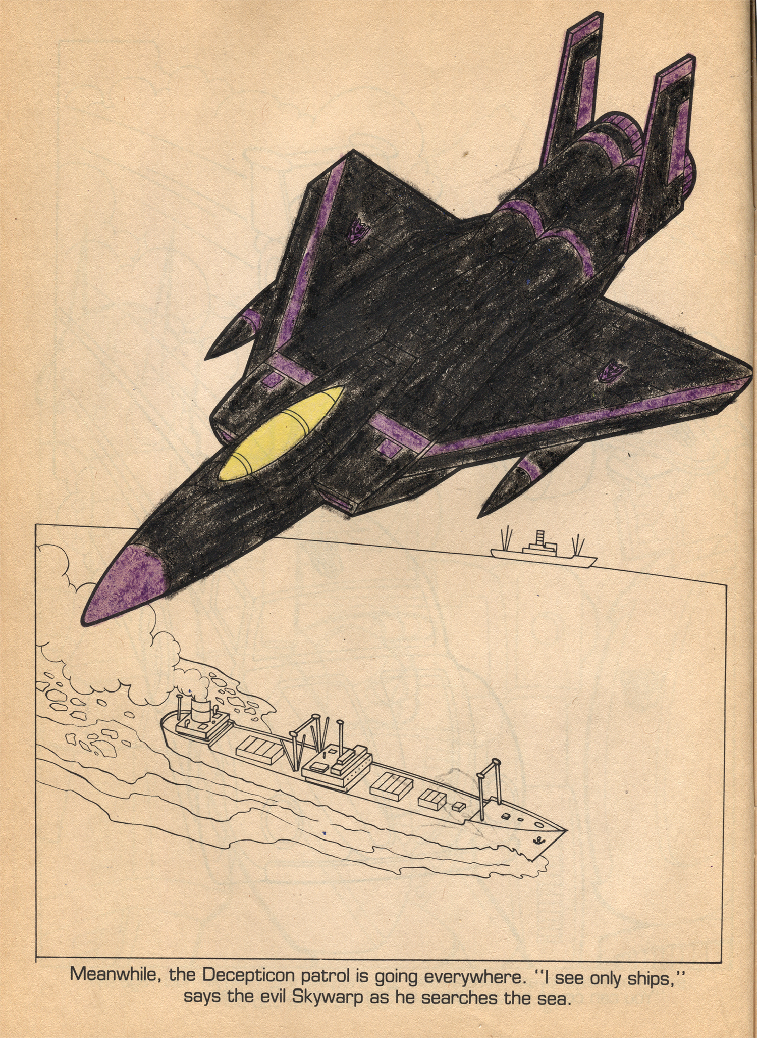
This next page above is so bad it’s hilarious. It’s an attempt to illustrate Bluestreak and Sideswipe in mid-transformation, but it’s so awkward. What kid wants to color that page?! So let’s move on from critiquing the books interior art and instead look at the coloring skills of the kid who originally owned these books. What I love about the pages that were colored is that there is a distinct scale showcasing just how hard the kid was trying on any particular page. You can tell that there were some days when the kid was in the zone and doing some fun work. But then there are days when they were inventing Generation 2 era color schemes before that was even a thing. Probably the two best pages were these two featuring Thundercracker and Skywarp. The art models are certainly off which didn’t help the kid, but they did a pretty great job of coloring them appropriately. With so much black on him, I would have colored Skywarp’s nosecone purple too!
I also really loved this piece below because even though the character featured on the page is tried and true yellow Bumblebee, the kid snarkily decided to make him Cliffjumper instead. Little details like this are gold to me because I remember how weird it felt at the time to have both toys and to realize that they were essentially just the same figure in two color variants. Sure, there were some minor details that were different in the toys, but c’mon. You can’t fool a kid.
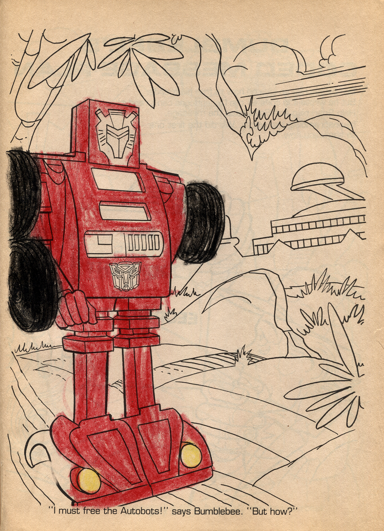
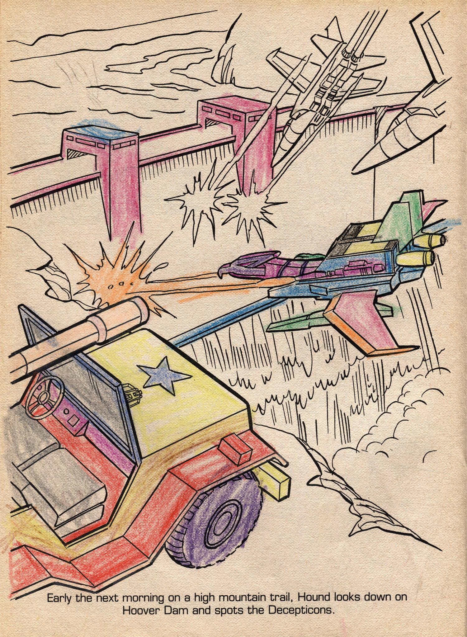
By far, my favorite page, and the one where the kid was trying so damn hard to “keep in the lines” is this one below. Are the color schemes wrong? Hell yes. But look at that technique! They were even mixing brown and yellow for some apparent shading on Hound. It doesn’t even matter that these look like those ridiculous Super7 Test Shot Masters of the Universe figures from a few years ago.
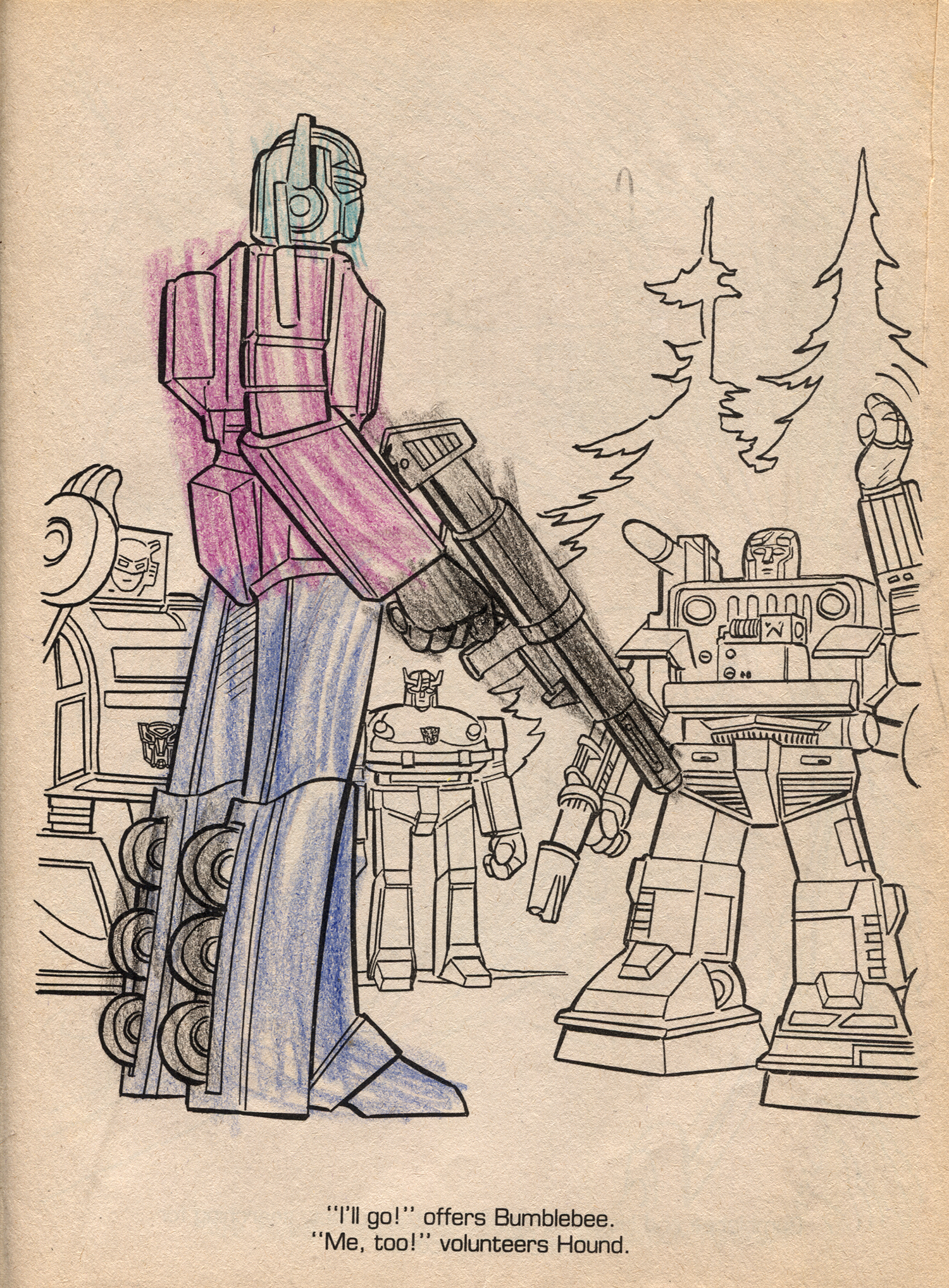
But this kid was not always on point. Even when they picked the generally correct colors for the box of Crayolas, sometimes you could tell that they just wanted to play Atari or do anything other than coloring in their dumb Transformers coloring book. Those are some sloppy strokes on that Prime kid…
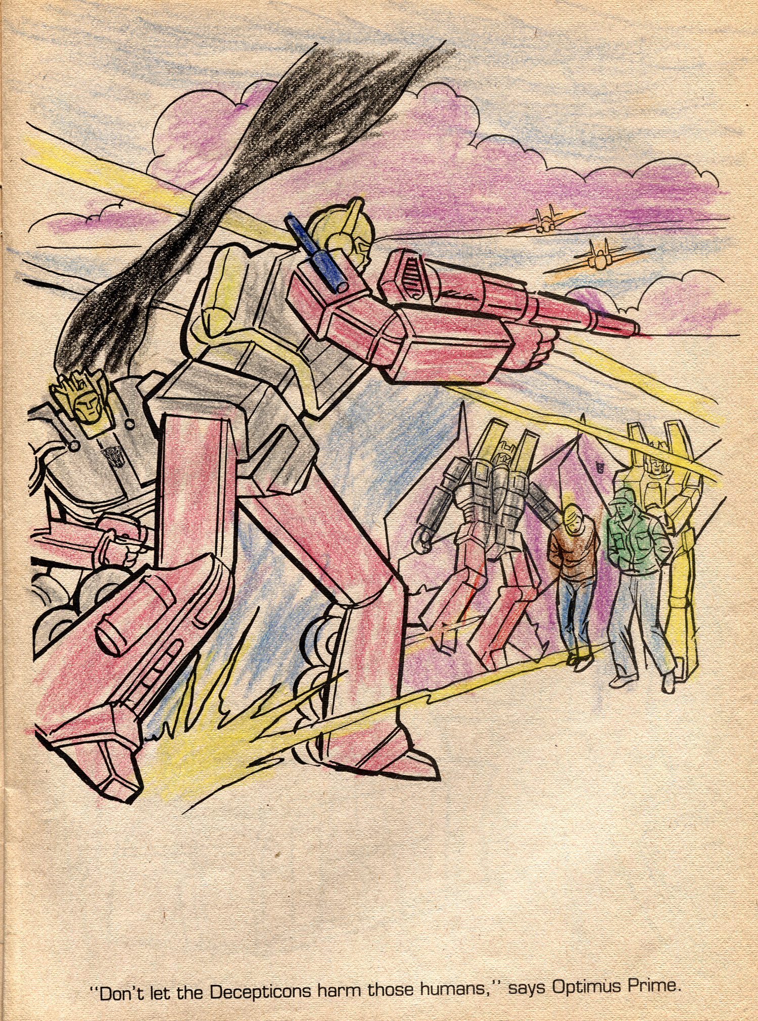
Last but not least is this action shot that is just a mess. The colors are wrong, the technique was thrown to the wind, and they even colored the dessert and sky both blue. Sigh, where was your head at on this day kid?!
So there you have it. I spend so much time scanning in and fixing these images and looking over the art and coloring that I thought it would be fun to take a shot at coloring one of these myself. Since there are no crayons in the house, I’m left with no other option than coloring a page in photoshop. What do you think?


