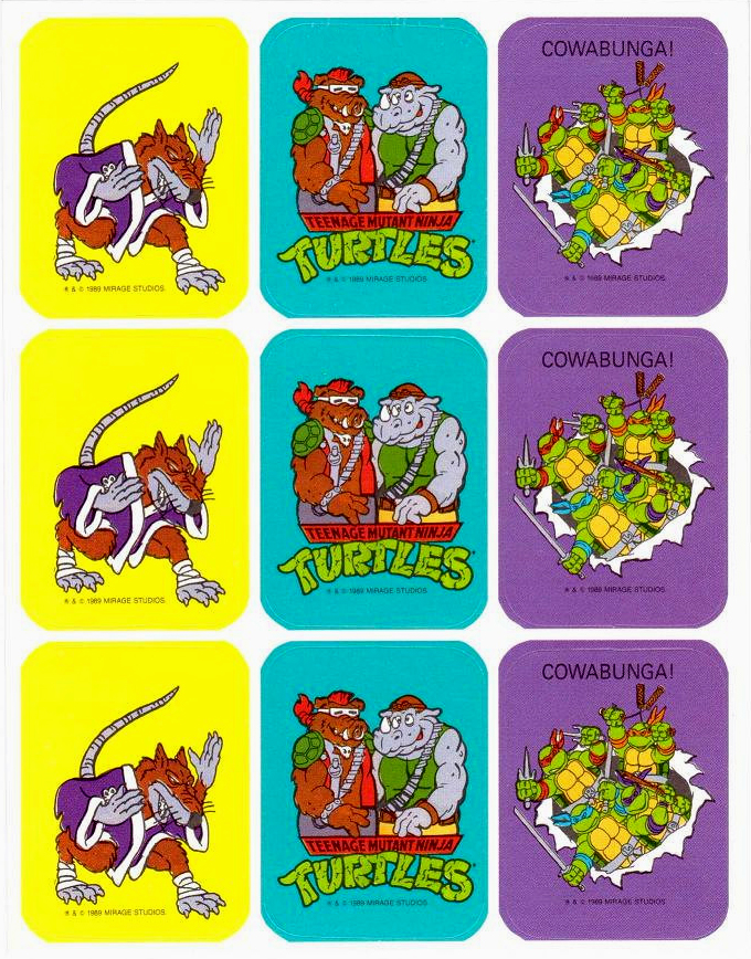
Diving back into some sticker fun here at Branded, I thought it would be fun to break out this set of Teenage Mutant Ninja Turtles sticker sheets released by Artis Paper Magic Company in 1989. There was a whole series of licensed stickers released in this format by Artis back in the late 80s including brands like Super Mario Brothers and Troll dolls. As far as sticker sheet designs go, these could possibly be considered on the boring and very uniform, but there’s something weirdly enticing about the simplicity mixed with the variation of the colored backgrounds. I really love these…
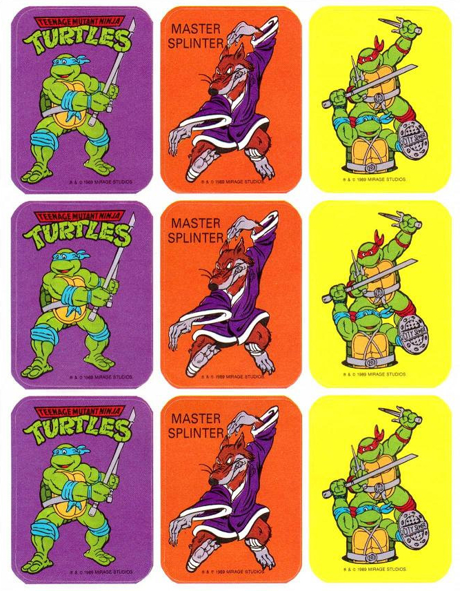
There was also a deceptive yet admirable decision when designing these sticker sheets to break up the characters in a way that you’d have to buy at least three of the four sets in order to have stickers for the individual turtles. I’ve actually noticed this in a lot of the TMNT merchandising as a way of enticing consumers to pick up multiple products. When the recent TMNT Lego sets hit store shelves it was impossible to snag a set of the four turtle minifigs without spending about $100 for three sets. Again, deceptive, but you got to hand it to these design departments in being good at their jobs.
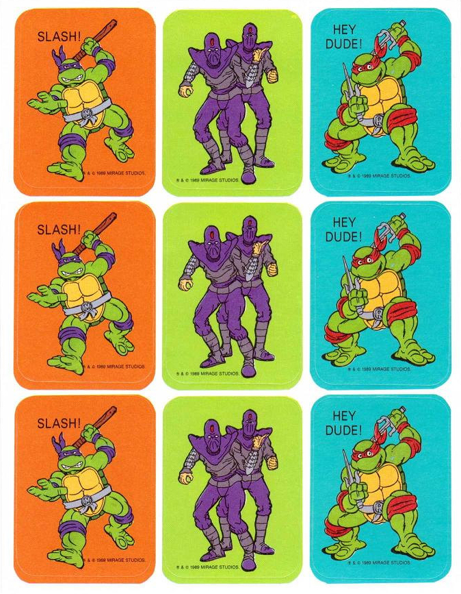
I also love that the artwork on these stickers is some of the common promotional art that managed to find a unique balance between the style of the cartoon series and the design of the toys. Take for instance the Shredder sticker below. He has the hunchbacked stance of the action figure, while also being fully clothed (more in line with the cartoon series.) The turtles have the stubby toes that suggest large toenails like the figures, yet have the more cartoon accurate heads.
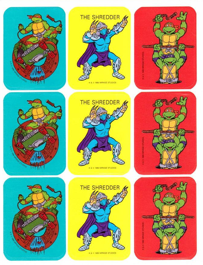
Weirdly, there are some errors in these stickers (again, very common with TMNT merch.) In the first sticker sheet above there’s a sticker with both Leonardo and Raph, except Leo’s belt has Donatello’s “D” on it. Similarly, in the second sticker sheet, the solo Donatello sticker has the character wearing Michelangelo’s belt.
Lastly, I think it’s a little odd that only two stickers feature the TMNT logo. You’d think they’d want to have it present at least once on each sheet, if not on every sticker.
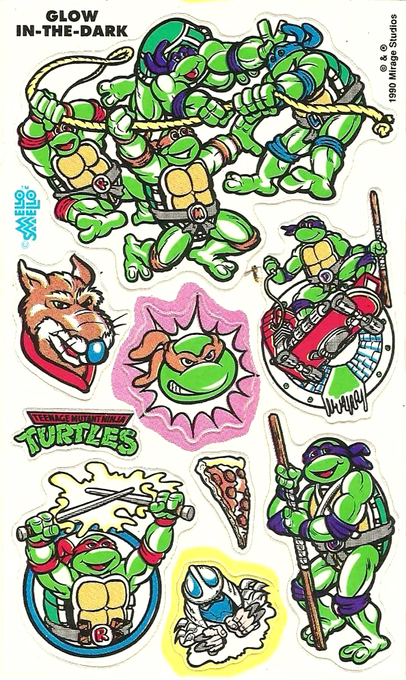
Since I only have one of these, I thought it would be fun to also throw in this sheet of glow in the dark stickers released by Mello Smello back in 1990. I love that the Mikey-on-a-skateboard artwork from above was repurposed for the Donatello sticker below. This is yet another trend that you see a lot in TMNT merchandising, the subtle art changes to switch up characters using the same basic illustration. I wonder how many times that image was repurposed?
