I can’t believe it’s almost been five years since I started creating sets of digital trading cards here at Branded in the 80s. I’ve really enjoyed working on all of the “These Should Exist” card sets, and since it’s been awhile since I’ve been able to flex that particular creative muscle, I started working on a new set this past week. That new set is almost ready, but in the interim I’ve been looking back at all of my previous efforts to see the progress I’ve been able to make with the designs. I also realized that I never made a nice dedicated article for my first effort, The Monster Squad set, so I thought I’d go ahead and do that.
Though there is A LOT I would change about this set looking back at it, it’s probably still one of my favorite efforts because it was my first and the subject matter is still one of my favorite pieces of 80s era pop culture. Also, when I first worked on these back during the Halloween season of 2014, it prompted me to really intricately examine that film. I ended up writing about 20 articles and lists during that month and it enabled me to catch the attention of some of the super cool folks that worked on the film. For instance, I was able to track down and interview poster artist Craig Nelson about his work on the iconic one-sheet which was a really fun discussion. I also caught the attention of writer/director Fred Dekker which was very humbling. I even got on the radar of the supremely cool Andre Gower who kept me in mind when started filming his recent documentary called Wolfman’s Got Nards which examines both the legacy of The Monster Squad and the fandom that keeps it alive. I was given the unique and amazing opportunity to appear in that film and to share my extensive collection of Monster Squad ephemera including my set of international dead media releases of the film as well as this very set of cards (a set of which I have thanks to a very kind reader of the site who goes by the handle Dust that painstakingly printed them out for me.) These were also featured in an issue of Non-Sport Update, a magazine dedicated to non-sport trading cards. That was pretty damn cool as well.
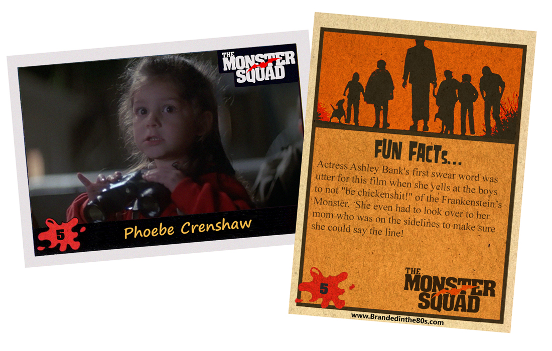
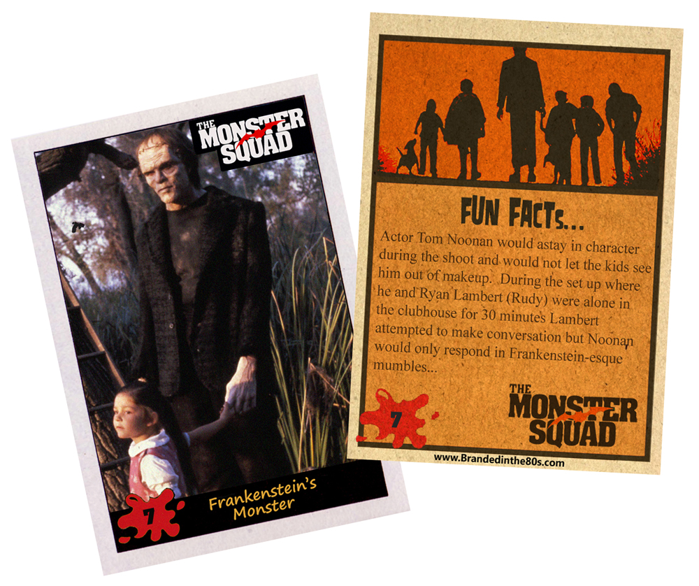
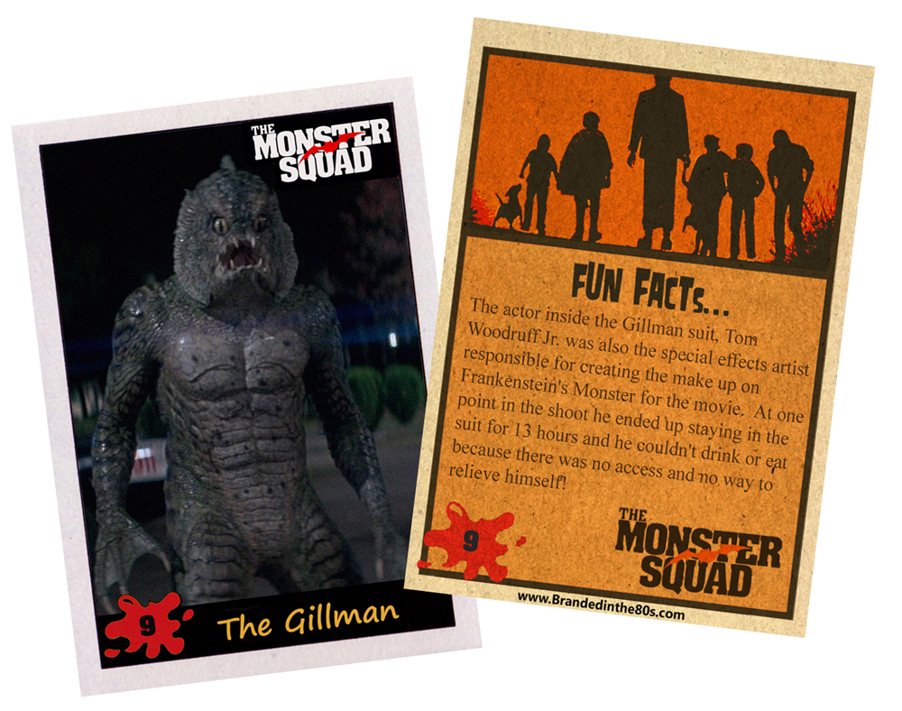
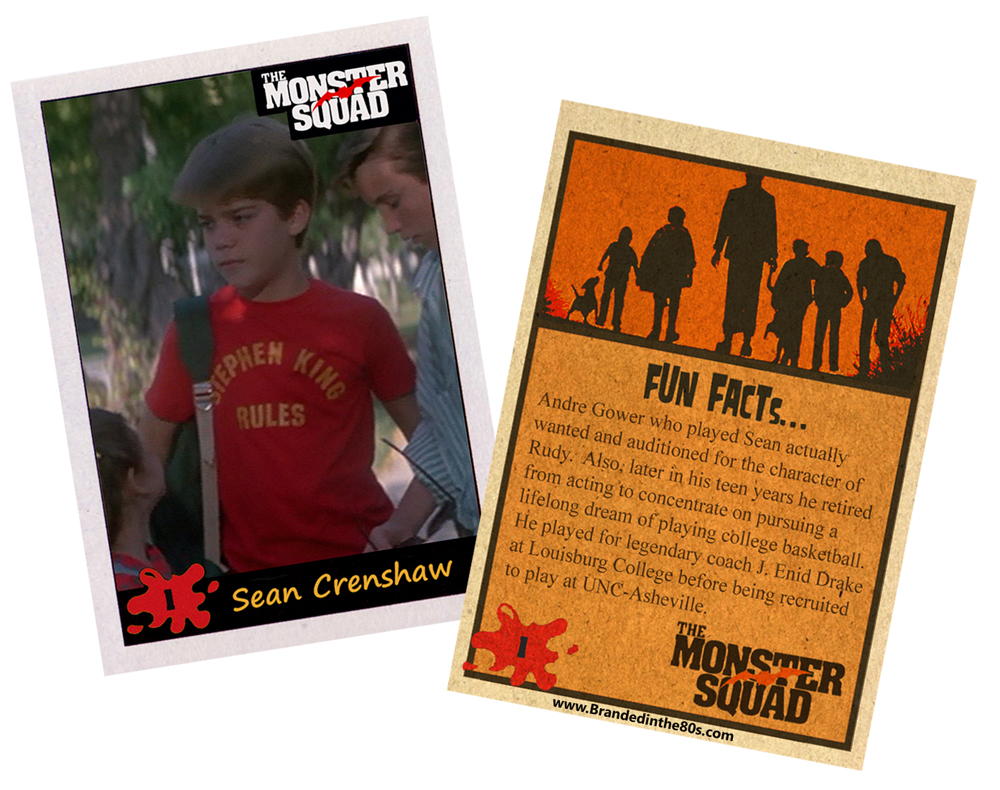
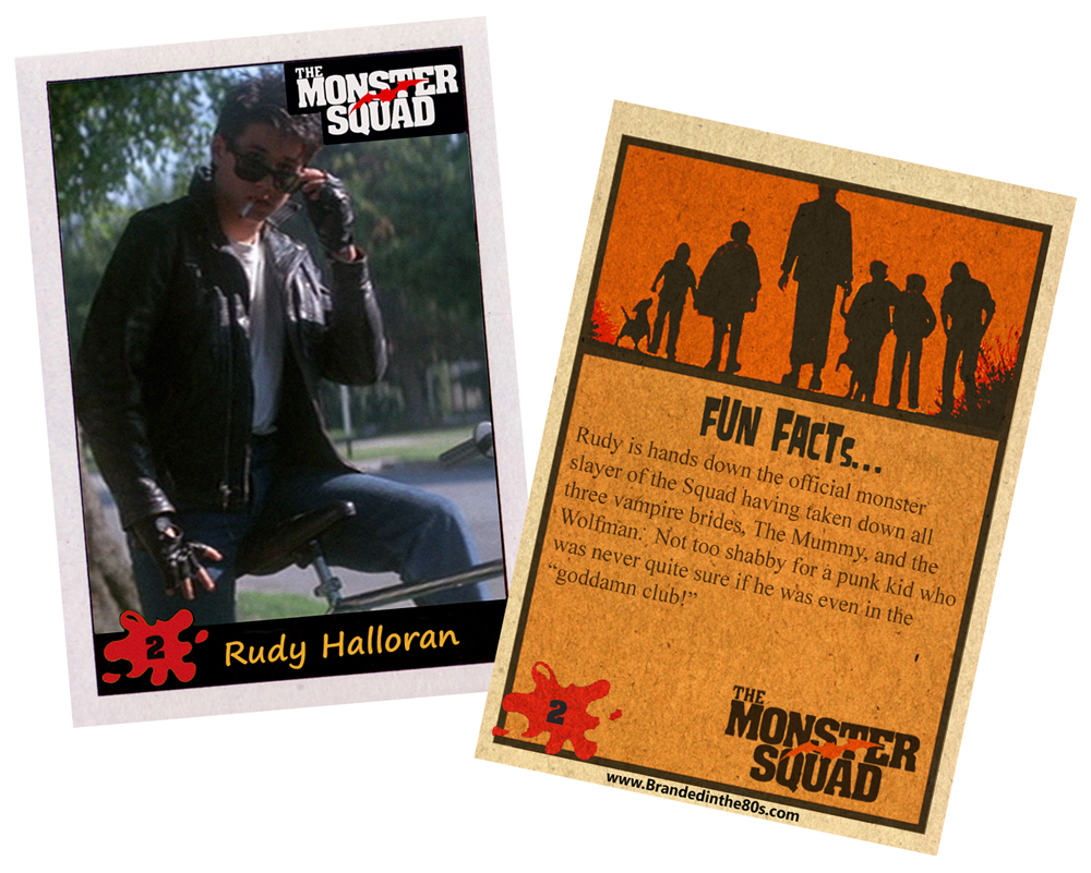
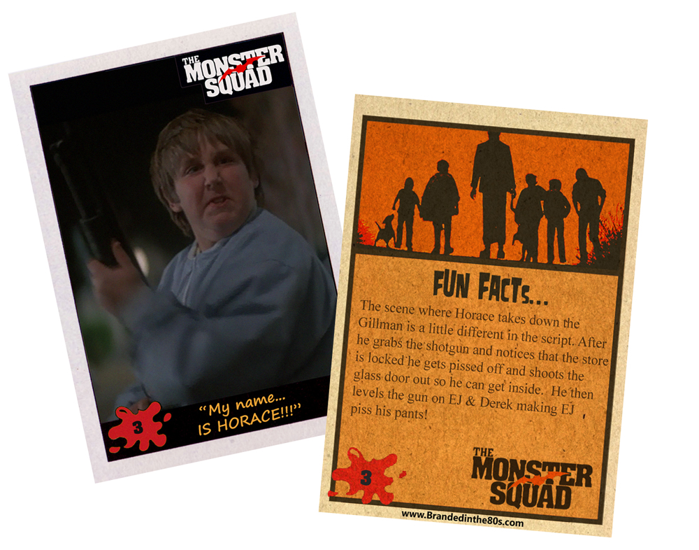
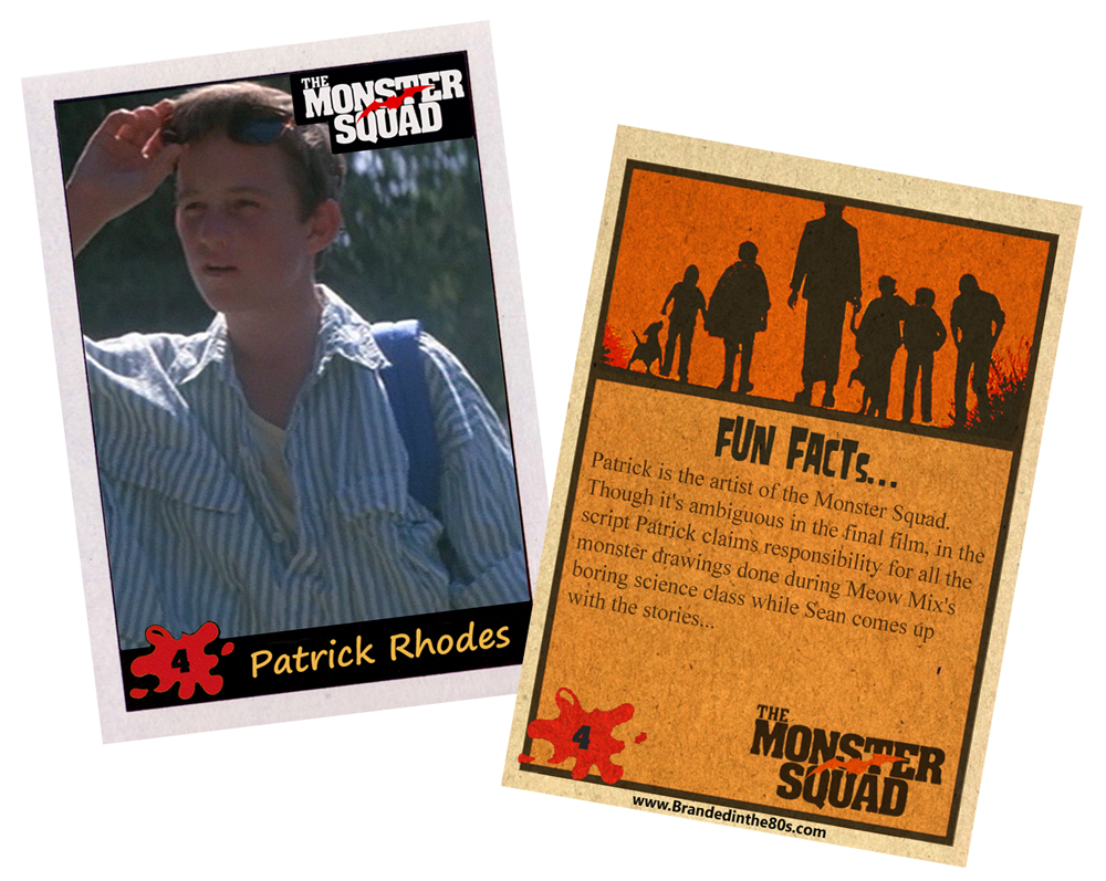
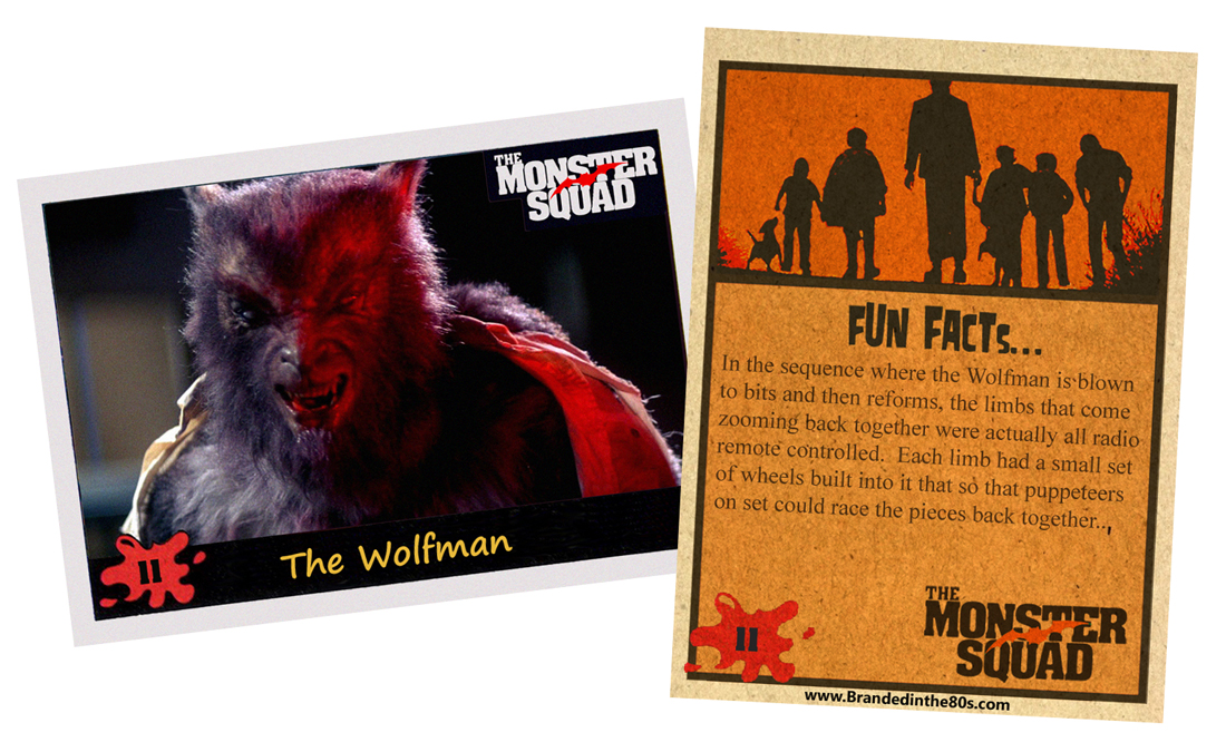
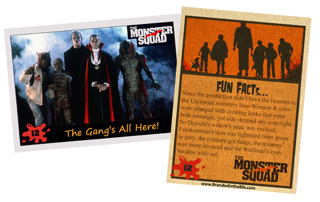
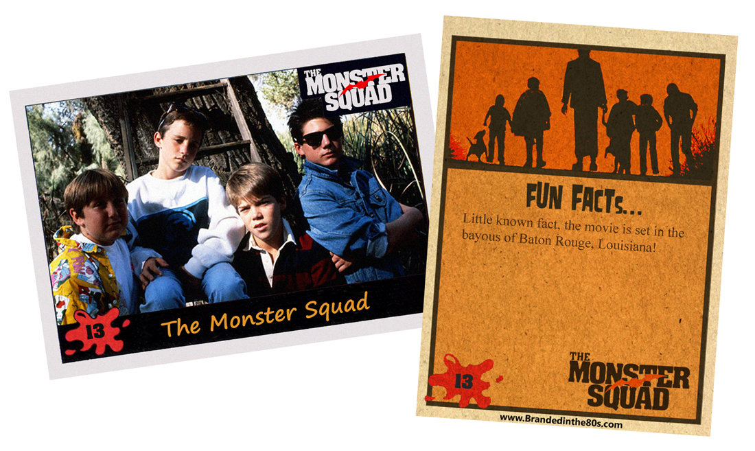
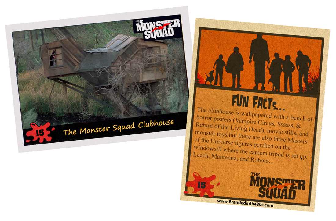
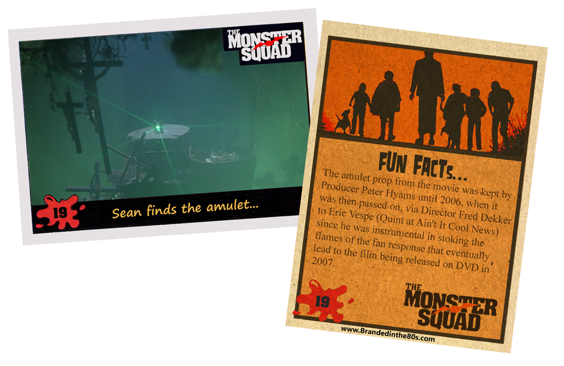
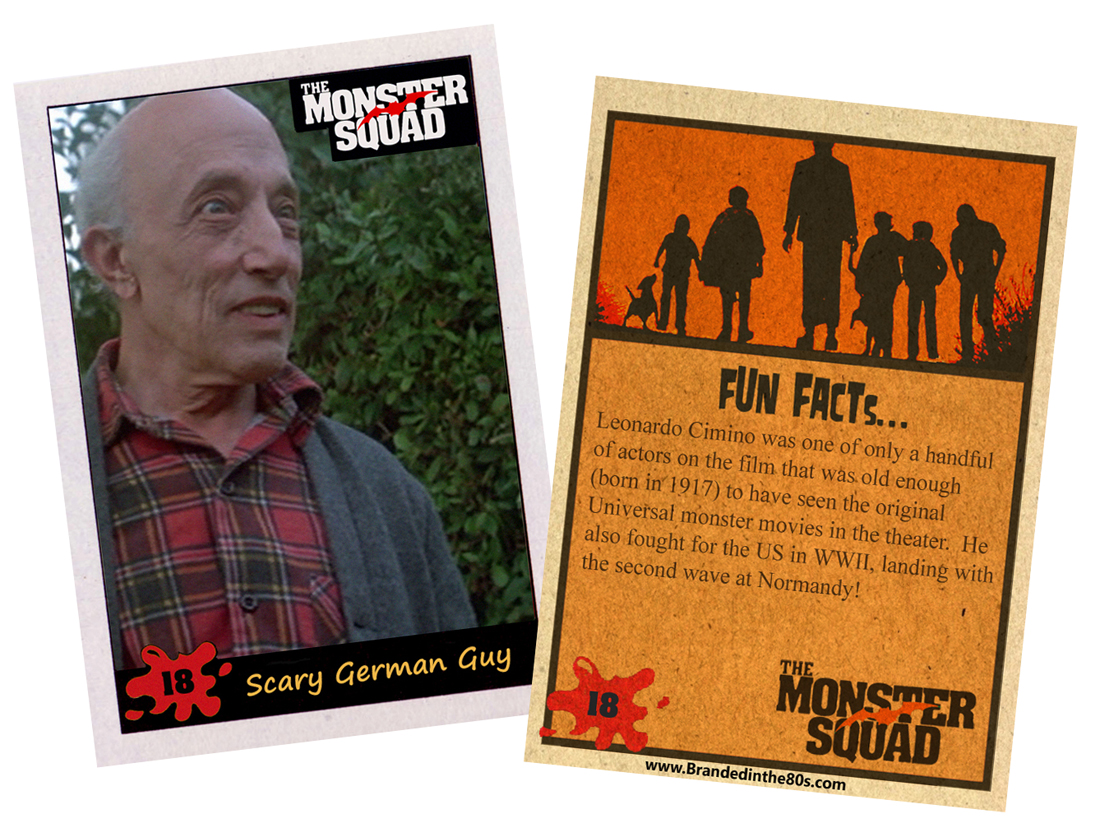
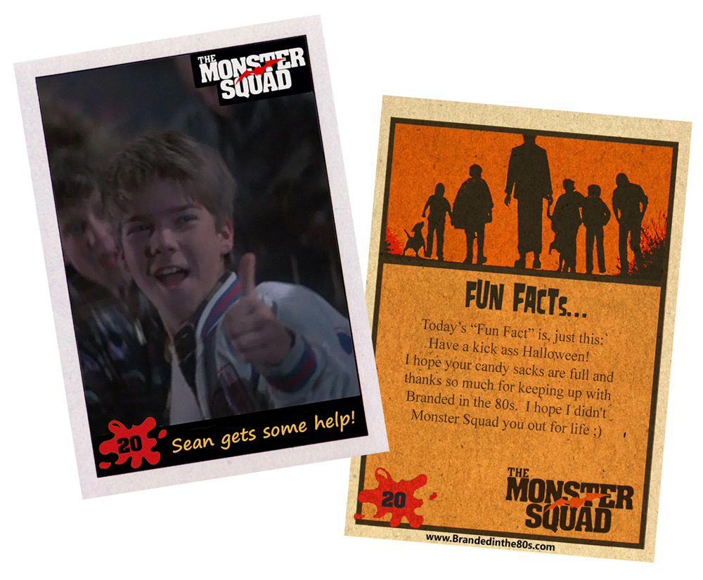
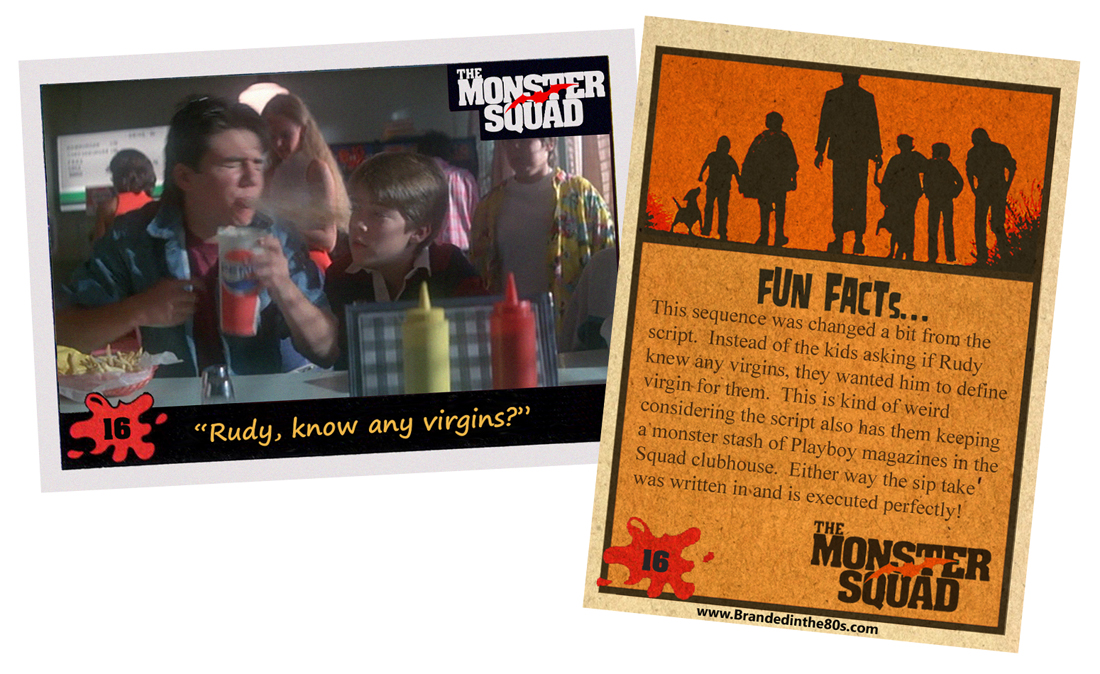
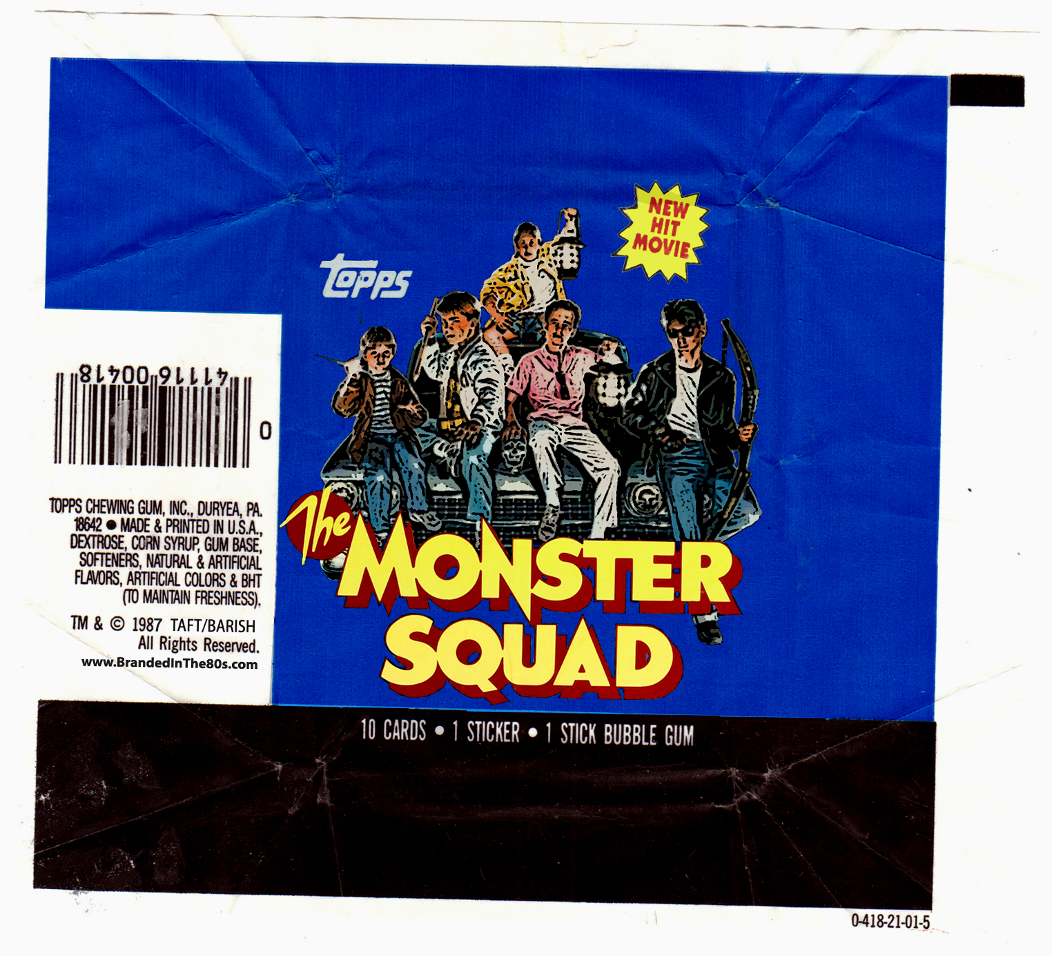
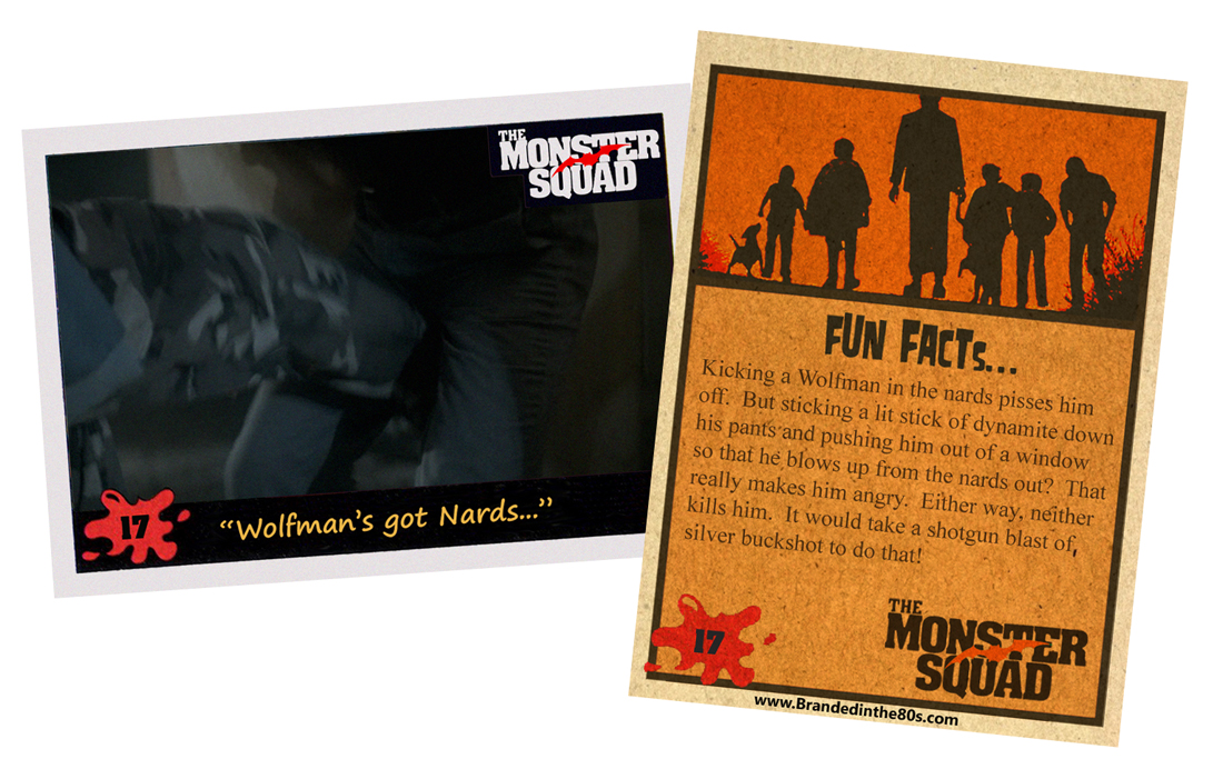
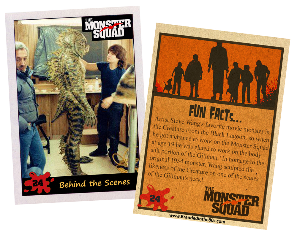
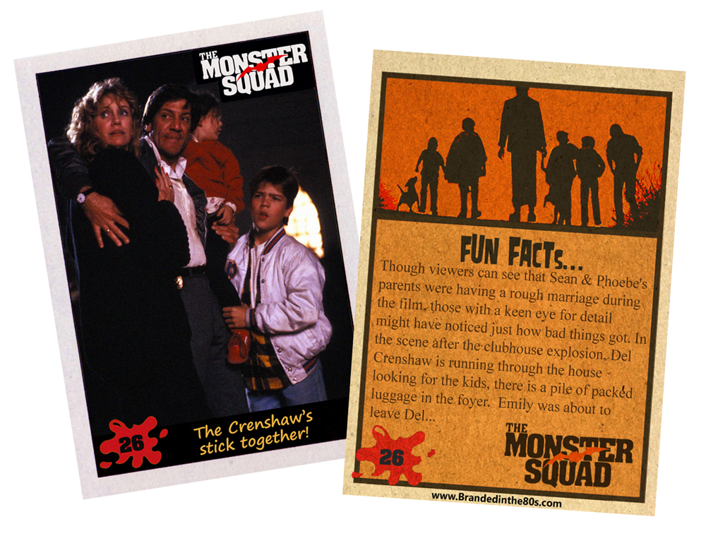
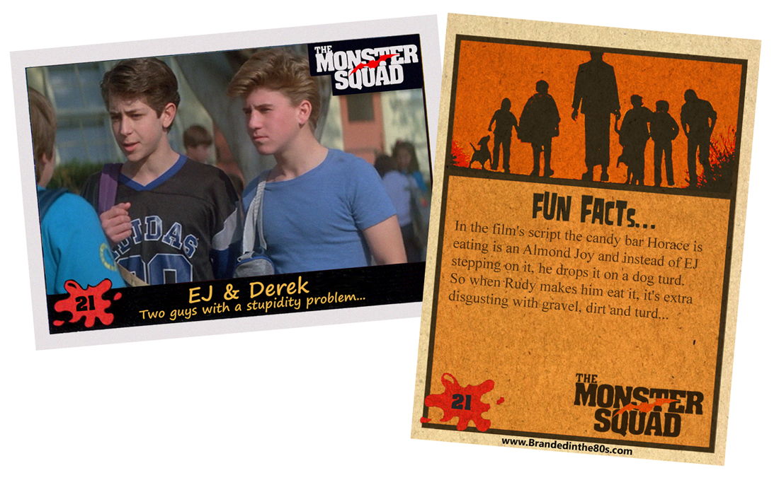
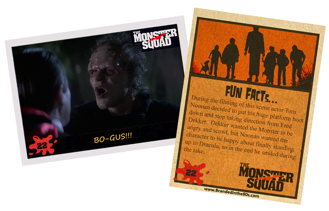
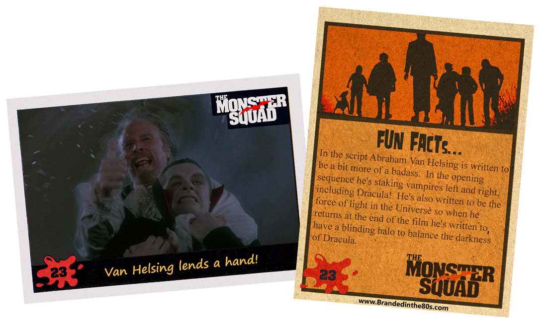
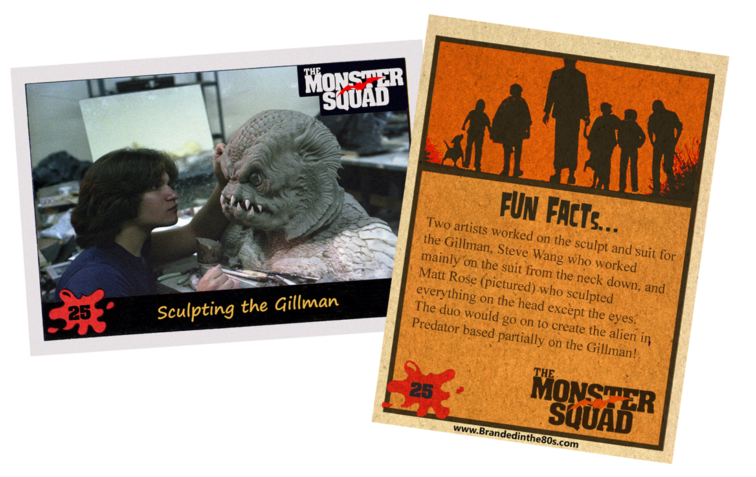
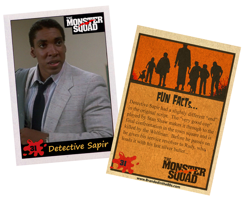
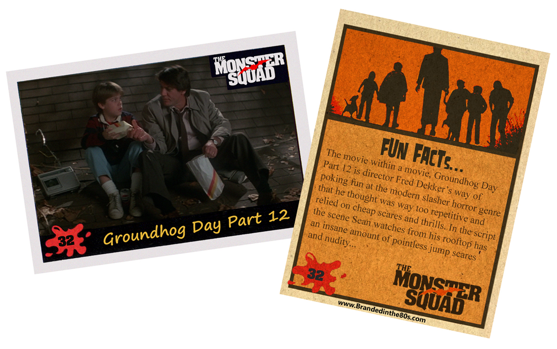
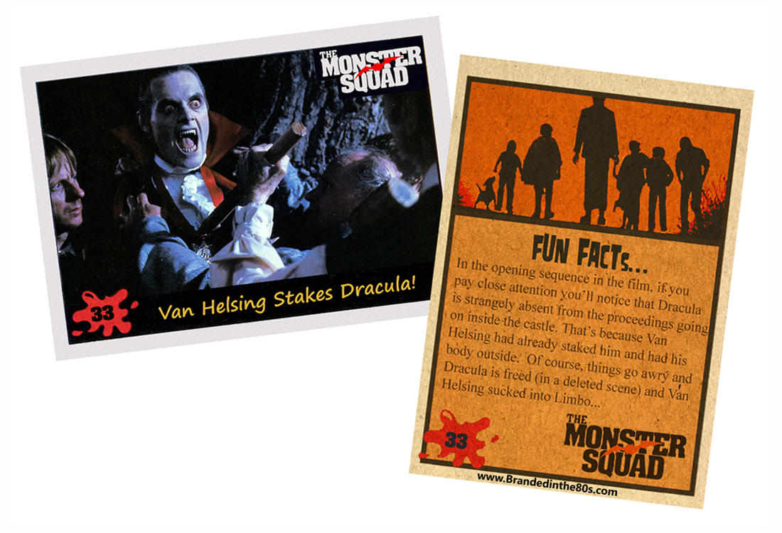
When I was initially working on this set the project started very small and then day by day it ballooned as I realized that what I wanted was going to take a whole lot more work. At first I was only going to mock up the card-fronts as a way of ensuring that there would be something to share every day for Halloween during that year’s blog-a-thon. But after creating the template for the front, something really felt like it was missing. I based the design of the set on the late 80s Topps Dinosaurs Attack cards and that seemed to work pretty well for what I had in mind. But without the card-backs and the accompanying flavor text, the set just felt very hollow.
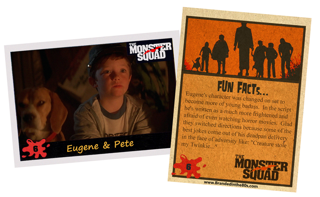
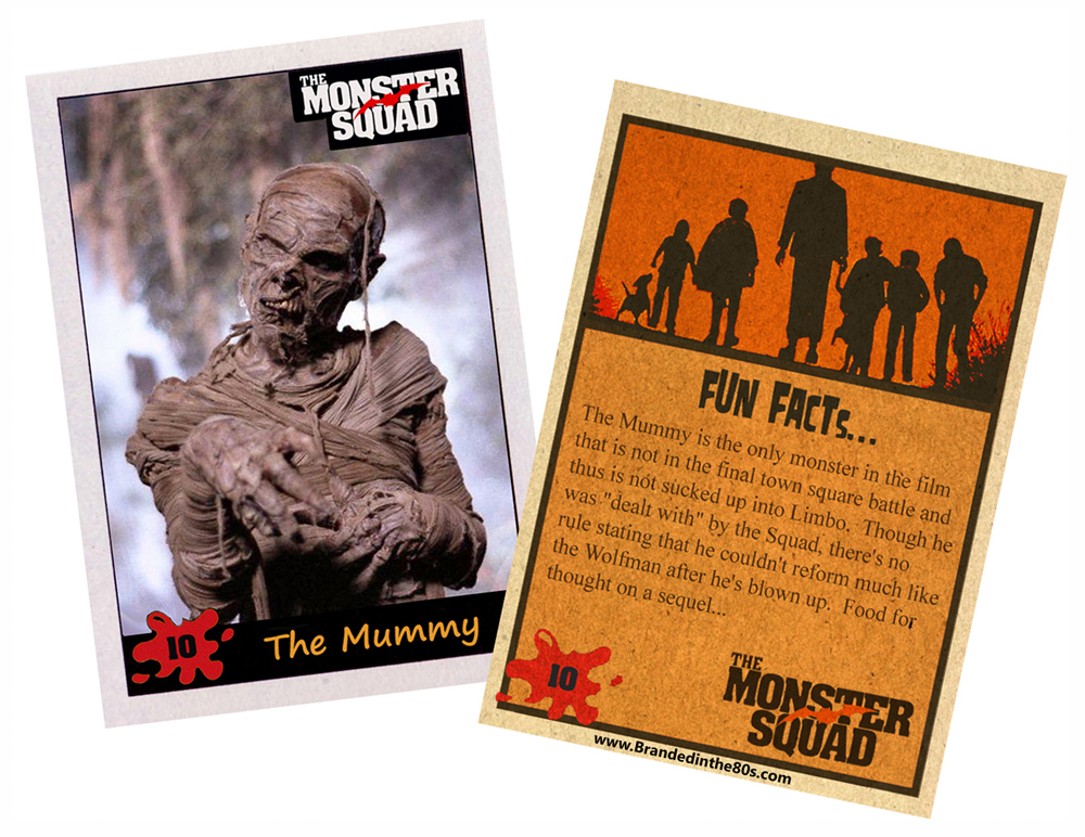
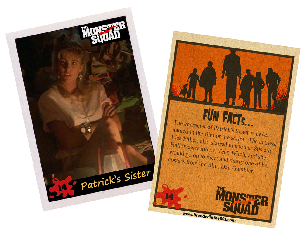
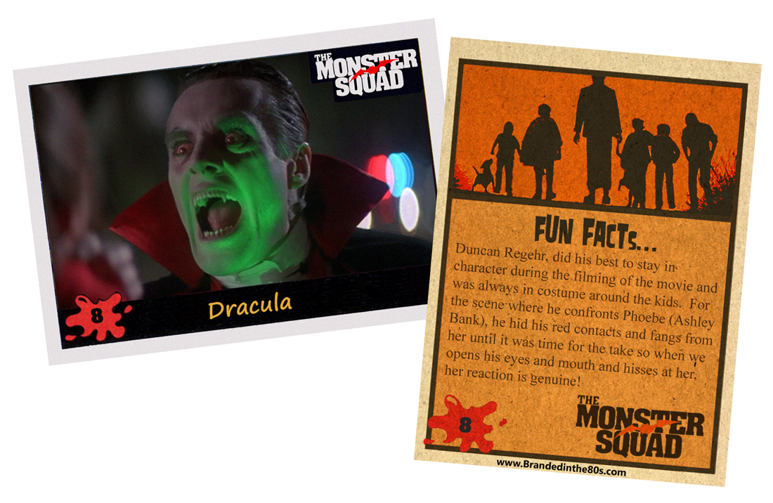
So about halfway through creating the card-front set, I started tinkering around with the design of a card back. Whereas the card front is utilizing a Dinosaurs Attack scan that I’ve augmented into a template border so that I can just slip an image into the frame, the card back was a much trickier wicket. I really wanted these cards to look real, like they were a vintage set that I’d just scanned to share. So I wanted to be about to see the tooth of the cardboard on the card-backs, and I really wanted the imagery to look like semi-transparent ink printed on said card stock. To get that look I couldn’t just scan an actual Topps card as I wanted the texture to shine though and give that sense of realism. So I ended up creating the card-back from scratch and layered everything on top of a scan of actual light cardboard. I had to play around with the various layers a lot, but at the end of the day I was (and still am) very happy with the outcome.
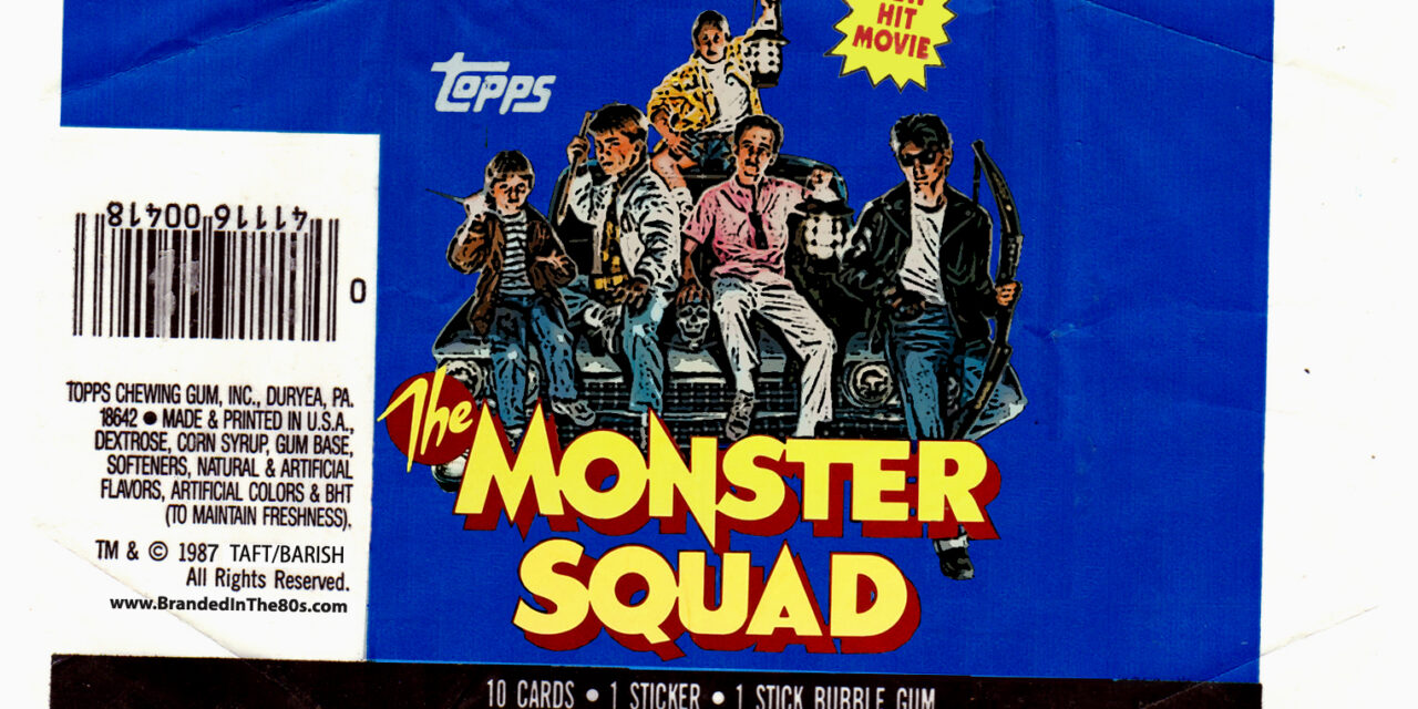
After I had finished templates for both the front and back of the cards I was feeling pretty good about the set. But there was still a piece missing. What’s a set of old school trading cards without a wax wrapper? I already had a very large collection of wax wrappers, and most of them have been scanned and shared on this very website. So I had a good set of bases to start with. I leafed through all of the wrappers to find one that was in the correct shade of blue (what I wanted for the base color) and proceeded to play around with that scan in photoshop in order to “scrub away” the original imagery while keeping the integrity of the wrapper scan. Again, I really wanted to make this wrapper look real, so it was important to retain all of the creases and scuffs so that it looks like it was unwrapped and scanned in.
The final version of the wrapper that I ended up with felt like it was about 75% there, but no matter how much I futzed around with it, I just couldn’t get it to a place where I was completely happy with the look. Looking back, this is probably one of the things that stands out the most to me as something that I’d like to change as I’ve learned a lot in the five years since I created it. I think I might actually tackle it after I’m finished with the current set I’m working on.
All in all though, I think this set is still fairly decent and barring a few spelling errors here and there I’m still proud of the work I put into it.
Maybe someday I’ll revisit the actual cards and rework the design from the ground up to create something that is more mine, and less augmented Dinosaurs Attack cards. I’d also love to make a small print run of these to sell through the site. I’m imaging the signed chase cards I could design as well as more cards to flesh out the set into a true 60-90 card collection. Maybe even stickers!


