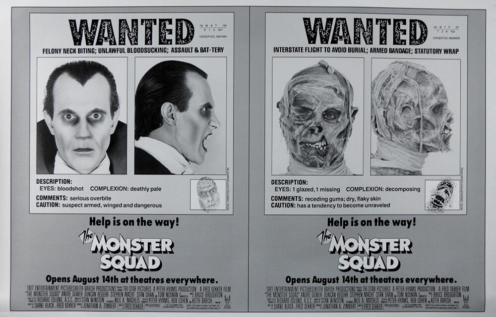
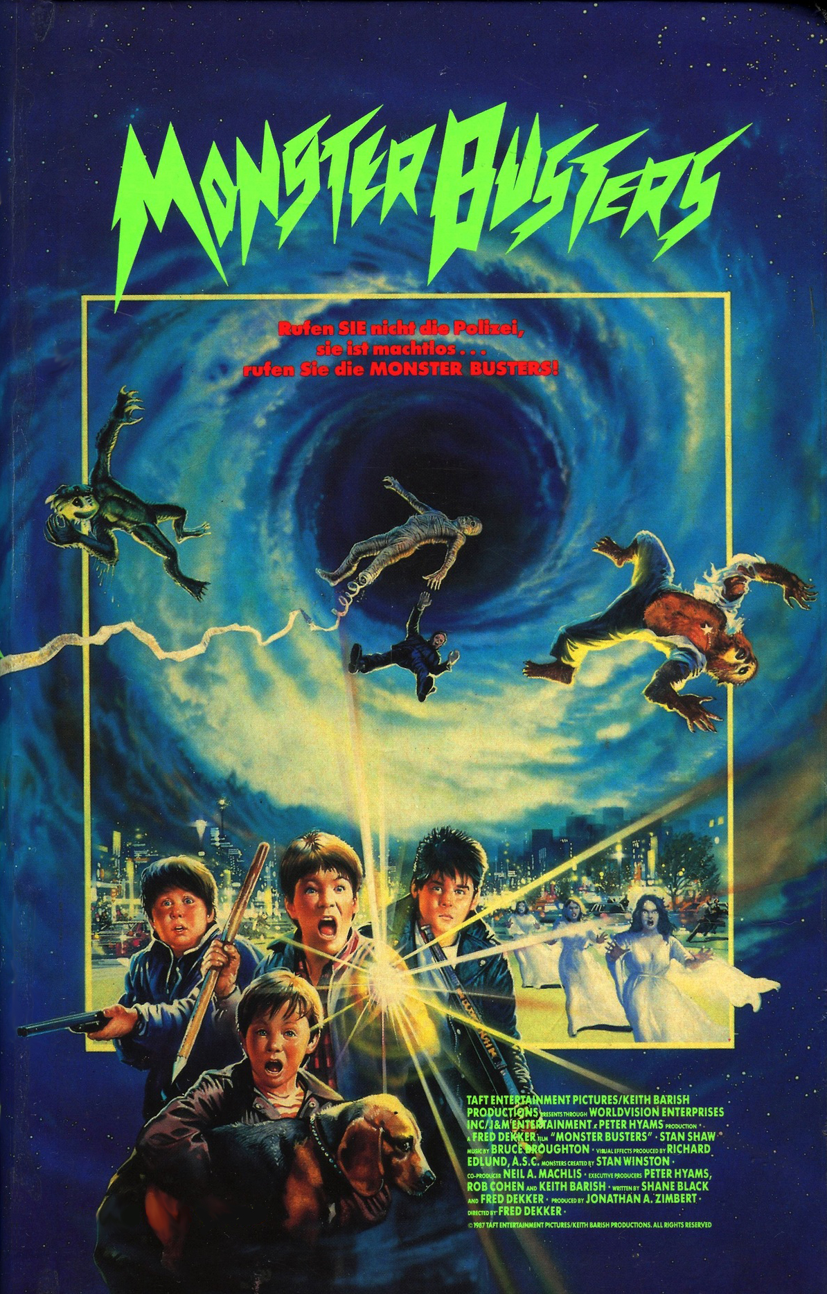
 Yesterday I took a look at the main US poster artwork for The Monster Squad (painted by Craig Nelson) as well as some alternate roughs that were potential candidates. Today I’m going to take a look at the rest of the posters that were released around the globe. Let’s start by taking a look at a super rare US black & white one-sheet that used a Wanted Poster theme and seems very much in line with the Nelson concept rough with the suction dart…
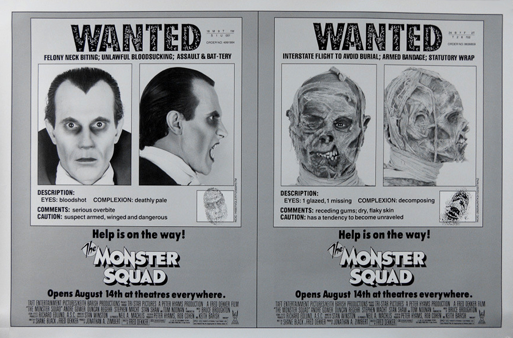
Straight away this poster seems like a misfire on a couple of levels as it doesn’t feature an image of Duncan Regehr as Dracula, instead a wide-eyed model with a severe widow’s peak. Eschewing Regehr is bad enough, but invoking the vampire’s widow’s peak was actually something the production was striving to avoid as that is an aspect of “Dracula” that I believe is copyright Universal Pictures. I know that Stan Winston’s team worked hard to avoid the Universal-owned aspects to the monsters so it’s strange to see it pop up so randomly in the marketing. It might also speak to the rarity of this poster as it potentially infringed on copyright. That being said, I do think the idea is pretty neat, especially when geared towards the younger audience that the movie appeals to. I love the distinguishing characteristics of the finger prints too, in particular the weird detail that Dracula’s visage is embedded in his. Though something that’s a little questionable is the Statutory-Wrap pun on the Mummy side of the poster. I mean, that is funny, but wow, a little much for a tween film I think. I wonder if there’s a variation of this poster with the rest of the monsters? I’d love a set of wanted posters for all five honestly. For the record, these were posted in subways and on bus stops around the country in 1987…
Alright, leaving the US, let’s take a trip all the way on the other side of the globe, way down under in Australia…
This poster was painted by Aussie artist Brian Clinton and is one of my favorite alternate posters for the film. He’s also done work on films like Crocodile Dundee and Razorback. Aside from the spot on likenesses and the inclusion of the ENTIRE Squad (yes, Phoebe is a member in good standing), I really love the way he added the monsters as shadows at the bottom of the frame. Granted, Rudy is missing his rolled up pants legs and the Frankenstein Monster’s bolts are back on the neck (another Universal flourish), but the concept is rad. This Poster also features a logo variation that ditches the italicized, rounded mini “The” in favor of keeping the work in a consistent font. Also, the image of the Squad here was taken from some of the promo photos that were done to market the film…
Now let’s take a trip over to Europe, specifically Germany and take a gander at that poster…
In the tradition of never featuring the entire Squad on any one poster, this German design nixes Patrick and Phoebe in favor of Pete the dog. Not a bad deal for Pete! I also love that this one features the vampire brides and is one of the few posters that nixes Dracula in favor of the other four monsters. I will say that the poster features a bunch of spoilers, whether it’s the Mummy unraveling, Horace wielding a shotgun (okay, he’s holding it in the Australian poster too), or Frankenstein’s monster waving goodbye as he’s sucked into Dumbo, er, Limbo. Still though, one of the better international posters. Also, now that I’m thinking about it, I wonder how the segment of the film where Patrick’s sister sucks at reading/speaking the language works in the German dub?
Hanging around Europe for a bit, let’s take a stroll over to Italy, home of the weirdest and, um, sexiest Monster Squad poster of them all…
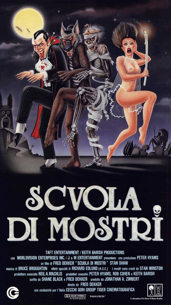
Sooo, the artwork on this poster was either re-purposed from another project or the artist/distributor didn’t give two flips for accuracy. Actually, in all seriousness, I wonder if this design was intentional in that “illustrates” the horror comedy tone of the film. There are a lot of posters out of the 60s that are similarly wacky but are more about conveying tone than story. It’s just a guess. Either way, WHOA, look at them hogans on the Bride! Ha cha cha. So what if they substituted the Bride of Frankenstein for his Monster? Also, the keen observer will notice the silhouette of the Gillman in the background on the bottom right, so the gang’s all there (kind of.) Last, thank goodness they’re doing the Rockettes dance number because that pants-less Wolfman leg is saving us all from having to look at his wolf dork.
How about we head back to western Europe and check out the poster that hails from Spain…
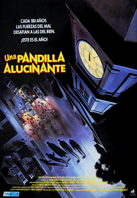
This poster wins the award for the most dynamic perspective hands down. I love the way the artist decided to zoom up and away from the action, highlighting the monster’s attack on the town as almost a western-style standoff! If you look closely all the elements are there from the clock tower (this scene was filmed on the Warner Brothers back lot) to the Squad (you can see four smaller fold out in front of the townspeople that I assume are Sean, Horace, Rudy and Patrick), as well as Scary German Guy’s truck in the back left (where I assume he, Eugene and Phoebe are milling about.) All in all a really neat design…
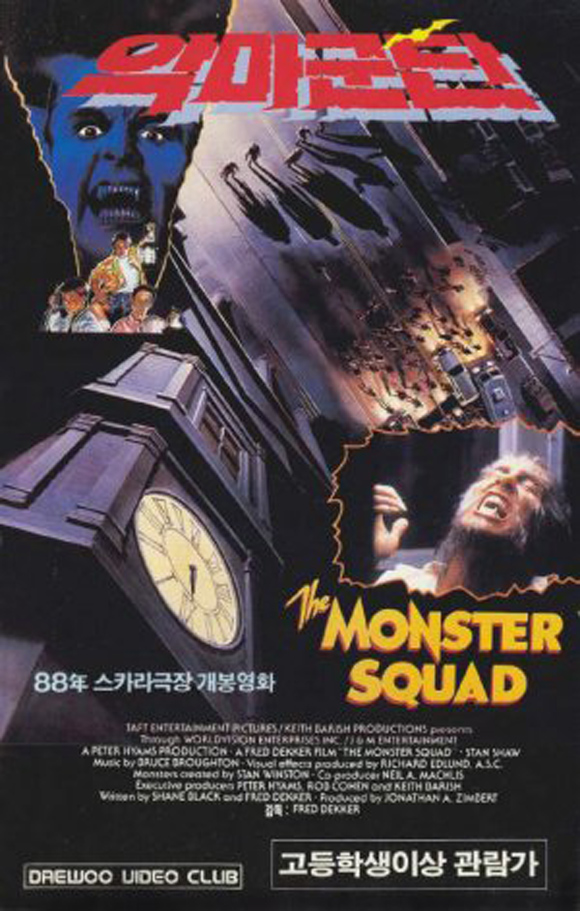
How about we dip back into the weird and cross back over the Atlantic to take a peek at the poster from Mexico…
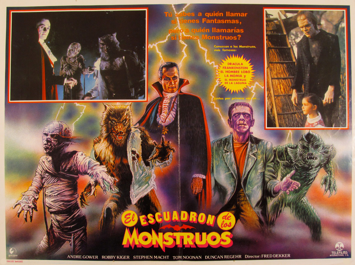
Probably the most colorful poster, to a level of gaudiness that even the Italian poster doesn’t achieve, it’s still only about 80% off model so Italy still wins on that front. I find it fascinating that the artist took suck pains to accurately depict Duncan Regehr as Dracula, but then threw the idea of avoiding Universal copyrights out with the bathwater by casting Boris Karloff as the Monster. This is also the first poster to work in publicity stills, which I think is kinda neat. FYI, if you need the tagline to the film translated into Spanish, it’s up top. Also, The Squadron of the Monsters sounds like a movie that I need to see post haste!
For this next poster let’s hop over to the UK for our first re-purposing of Craig Nelson’s US art…
The UK marketing campaign is sort of like the US one on steroids, what with their amped up logo and all the little flourishes they added to Nelson’s artwork (the lightning around Dracula’s hearse, the red eyes on the monsters and having the headlights of the car blazing.) I also love that they added the logo to Horace’s shirt. Can’t quite make out the word they added to Patrick’s shirt (Rams?) though. Speaking of artwork reuse, let’s hop on over to Asia and check out a couple posters, the first from Korea…
This one features both the Spanish poster and a chunk from the American one as well as utilizing a still of the Wolfman in mid-transformation. I love that the yellow bat in the logo is the same bat from one of the alternate US logos (that bat also pops up int he logo of the Mexican poster too…)
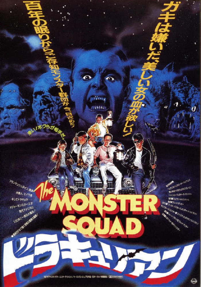
The second Asian poster and final one that I have is the one from Japan. Unfortunately the image is shit quality as I’ve only ever seen it pop up on ebay from time to time and all the sellers just use the same image that’s floating around the internets. Yes! Thanks to Michael Jones at My Two Yen Worth for providing the kanji of the title (ドラキュリアン) that enabled me to find a much better quality version of the Japanese poster!!! Also he’s doing a rad Halloween Countdown that is from a uniquely Japanese perspective, so check out his site!
Basically a retread of the US poster with a million and a half font flourishes. At least the bat pops up again in the kanji at the bottom…
So there you have it, all of the posters that I am aware of for The Monster Squad across the globe. Which one is your favorite?
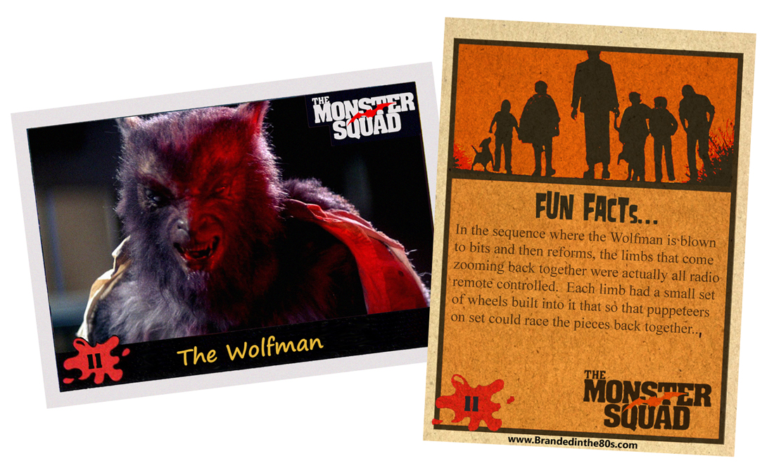
Now for today’s trading card…
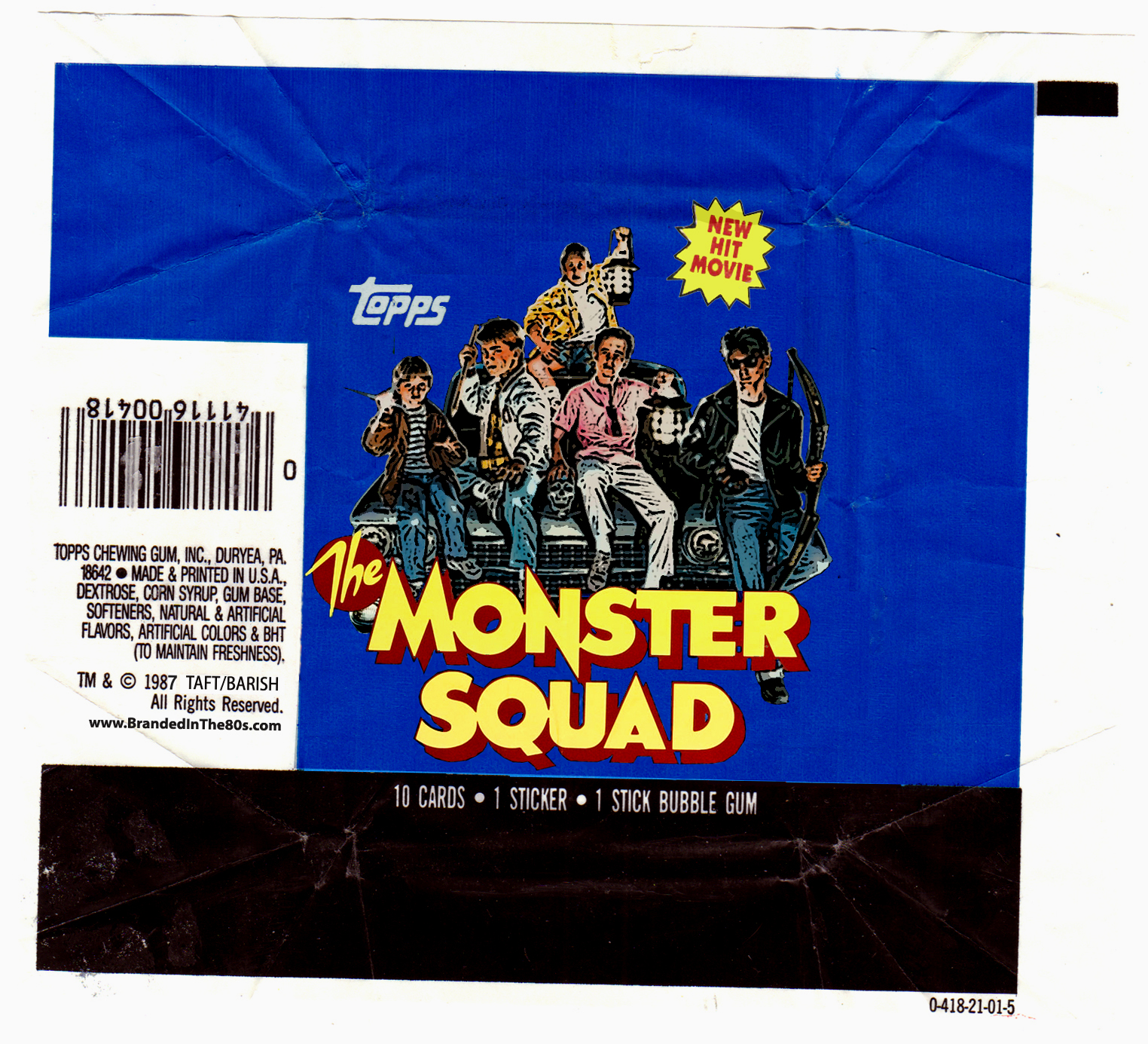
Today’s card is #11, The Wolfman!


