
Well, in case you’ve been living under a rock, which basically describes my living situation (being without local or cable TV, not to mention avoiding magazines and newspapers), you might have noticed that a little film called Transformers came out this past week. I haven’t seen it yet and honestly I’m probably going to pass on it, though I may break down and catch a matinee this weekend. It’s kind of weird for me since of all the summer movies this year, this one seems to be tailor made for me, I mean I love the original cartoon and toy line, and I’m into reliving 80s properties, but for the first time it seems like this dip into my childhood nostalgia really isn’t aimed at me.
A few years ago there was a big resurgence in the whole Masters of the universe line with a new cartoon (as well as DVD release of the original), re-issues of some of the classic toys, and a new toy line that was both faithful and yet also very re-inventive. To me this was a great example of re-launching a property to a niche fan market while also broadening the scope to encompass a new generation of kids. Unfortunately I don’t think this was a very profitable re-launch, and it seemed to more or less disappear from TV and store shelves after a year or two.
This time, with Transformers, I believe a new tactic is being used, which mostly ignores the niche market of the fans, and is keeping its sights on reinventing the concept from the ground up. The producers, writers, and the director of this new film are looking to capture the widest audience possible, which means making a lot of concessions in the story telling process to please so many different expectations. I think for me, this is the largest turn-off for the film, and not the fact that the robots look nothing like the G1 designs, or that the characters seem so different. When I look back on the first Transformers movie, a very similar tactic was chosen, at least on the surface, where for the most part all new characters were introduced, and the ones that remained were killed off or drastically changed (I mean Insecticons and seekers changing into Cyclonus, Scourge and the Sweeps for crying out loud.) I think the difference though was that even for its divergence from the original show (including adding a whole new continuity), it was still aiming at a specific audience, or at least it was written in such a way that it was suitable for many audiences, but directed toward one. Being suitable for many and being written for the broadest audience possibly are two completely different beasts, and I think broad just isn’t for me.
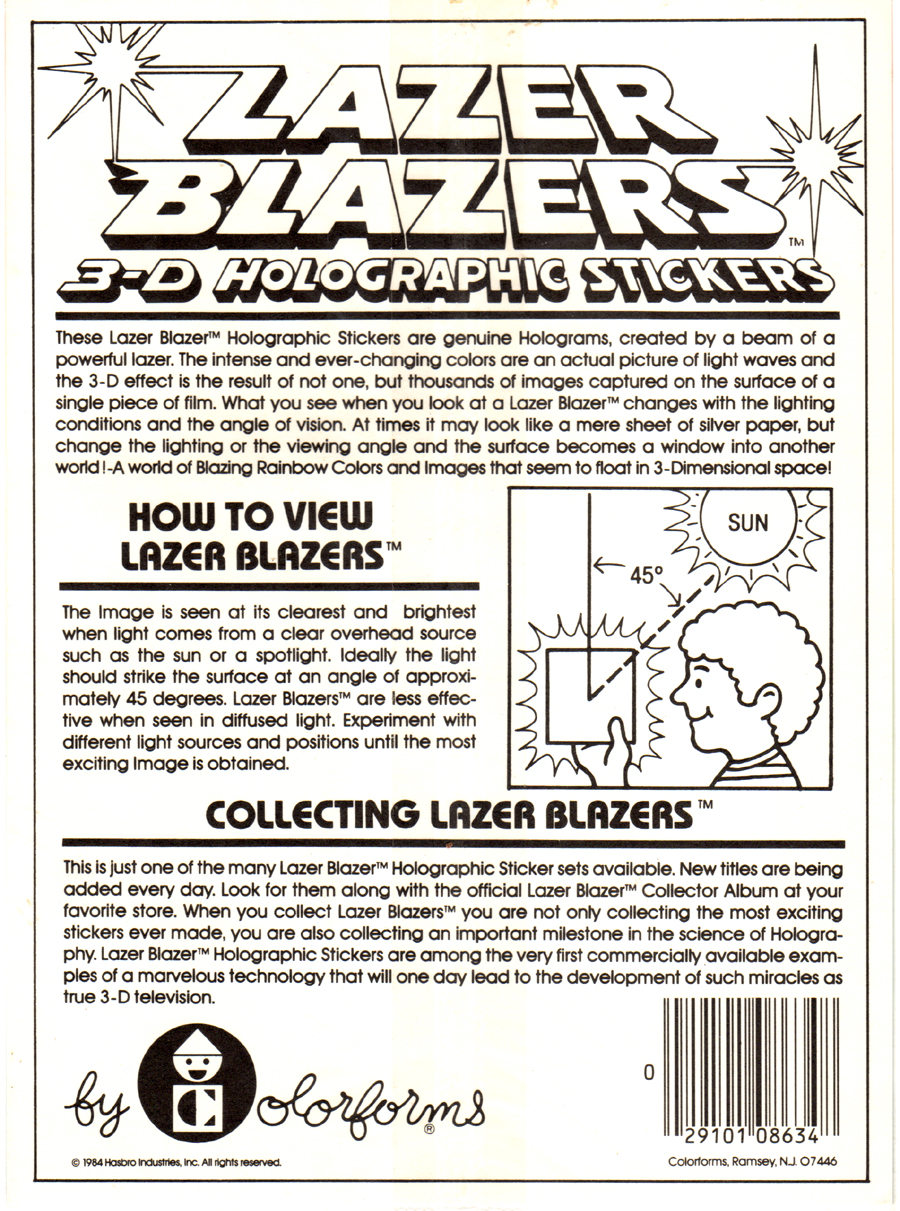
Anyway, since this has been on my mind a bit lately, I thought I’d share my other small bit of Transformers sticker goodness that I have in my collection to sort of bookend one of the first Peel Here columns I posted back in November. When I started searching for Transformers stickers I sort of hit a wall in terms of what was made vs. what is still available. Other than the lenticular stickers (which also doubled as puffy stickers) and the Panini sticker book that was produced after the movie, there weren’t a whole lot of other stickers, at least that I know of. I couldn’t find any basic puffy stickers or hallmark sticker sheets (though I believe there has to have been some produced), and though there were stickers issued as chase items with a set of cards, their very expensive and kind of rare. The only other example that I’ve found so far is the Colorforms Lazer Blazers hologram sticker set from 1984. 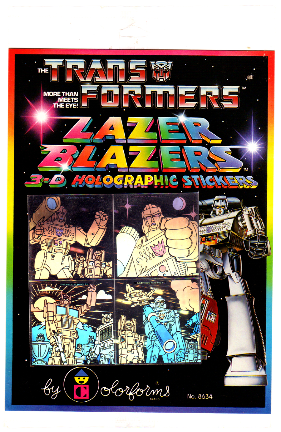
Like many of these Lazer Blazers sets, these Transformers stickers seem like they would be part of a series since it’s rare to see merchandizing focusing almost strictly on one character, let alone that character being a villain, but I think that these are it. As I’ve mentioned before, I am very partial to the Lazer Blazers stickers even though I’m not a huge fan of holograms in general. There’s something awesome about the dichotomy between the mostly black background and the very large rainbow-tastic font and border, compounded by the rainbow shimmer of the holograms that makes them very attractive to me. It doesn’t hurt that Colorforms chose to take advantage of the great painted artwork from the Hasbro packaging either; all told the design on these stickers and the packaging just pops.
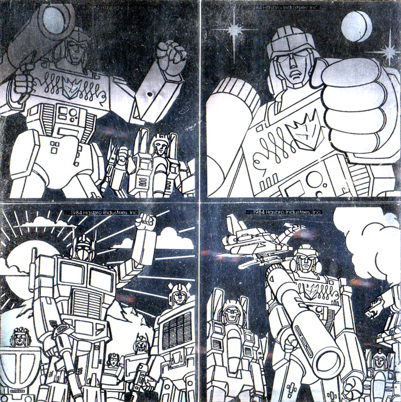
When I was trying to get the best color effect in the holograms while scanning them, I noticed a weird effect that would happen when the light from the scanner was passed across the stickers from side to side instead of top to bottom. It actually negated all of the color and left just the blacks and whites hidden inside the hologram. It’s sort of like the pencils and inks in a comic book minus the color. Unfortunately this also highlights the years worth of scratches that the holograms have taken, even through the intact outer cellophane wrapping.
What also sort of cracked me up a bit was that when I was looking at just this line art I noticed that none of the background Autobots in the bottom left sticker seem like actual characters. They all seem to be weird generic amalgamations of characters, so you have the one on the left that has some aspects of Wheeljack’s appearance, yet he’s got a pretty normal face instead of the weird cheek protrusions that would light up when he talked. Megatron, on the other hand, is surrounded by the Decepticon seekers, Ravage, and Laserbeak, so I guess the artists and designers were only paying attention half of the time.
Next week on Peel Here I’m gonna put on my white sequined glove, let the llamas and monkeys out of their cages, and set my hair on fire while I dance in front of a huge neon Pepsi sign as I break out my embarrassingly large collection of Michael Jackson stickers.


