
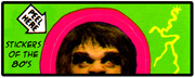
As I mentioned a few posts ago, I thought it would be fun to spend the next couple months concentrating on my collection of Topps Garbage Pail Kids sticker cards for the Peel Here column. Far and away these were my favorite stickers growing up easily edging out scratch and sniff or puffy stickers and I’ve had a collection going for awhile, so I have plenty to share.
I thought it would be fitting to share the set in which I was introduced to the cards back in 1986, which was the 3rd series. I don’t think I ever managed to complete a full set of cards growing up, but I came pretty close with the 3rd and 4th series. It wasn’t until I first moved in with my girlfriend (now my wife) back in 2001 that I finally managed to score a complete set of the entire 3rd series thanks to the wonder of eBay.
Before I get into the set proper, I thought I’d mention that even though these are essentially stickers, as a kid I pretty much never ever peeled them off of their backing. Collecting GPK felt a lot like collecting baseball cards, though I hadn’t discovered anything as organized as mylar pages or card boxes (plastic or cardboard) yet. I kept the collection in a few Ziploc bags, one for each series and a couple for my doubles. My adult collector’s mind completely reels at the thought of a naïve younger version of my self, bopping around the neighborhood with a Ziploc bag full of stickers. I’m sure all the corners were rounded or bent, and I imagine a little dirty from my handling them all the time. I wouldn’t get an anal collector’s awakening for a few more years, not until I started collecting comics and I learned the art of bagging and boarding.
Anyway, I’d also like to mention that there are a few really great GPK resources out there in interwebnetsland, one of the best being Barren Aaron’s Garbage Pail Kids Reference Guide. Aaron has done a pretty exhaustive job cataloging and annotating all of the GPK releases, from tracking down which artists did the cards to the various miss-printings and print run variations. Here’s his page on the third series.
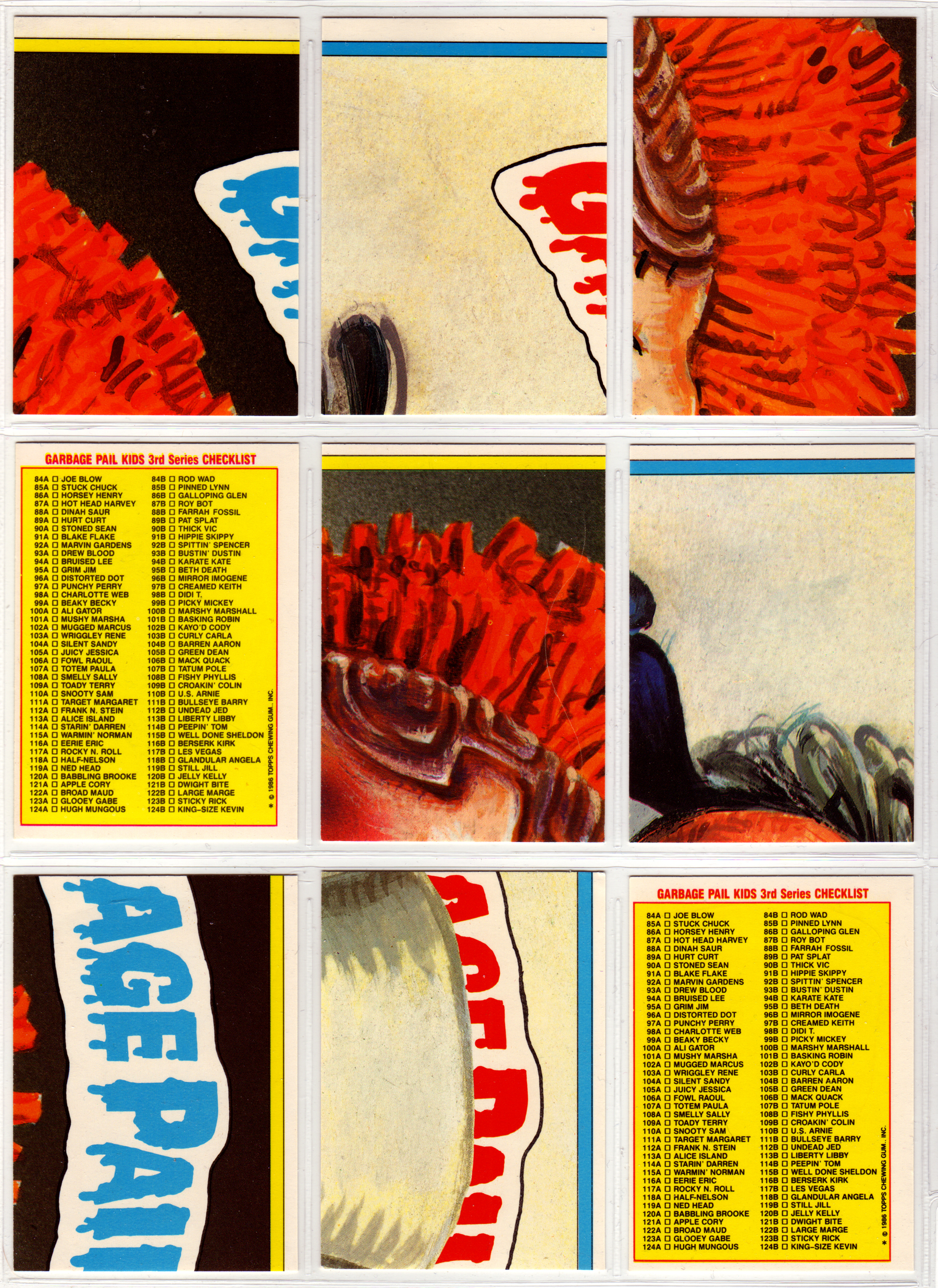
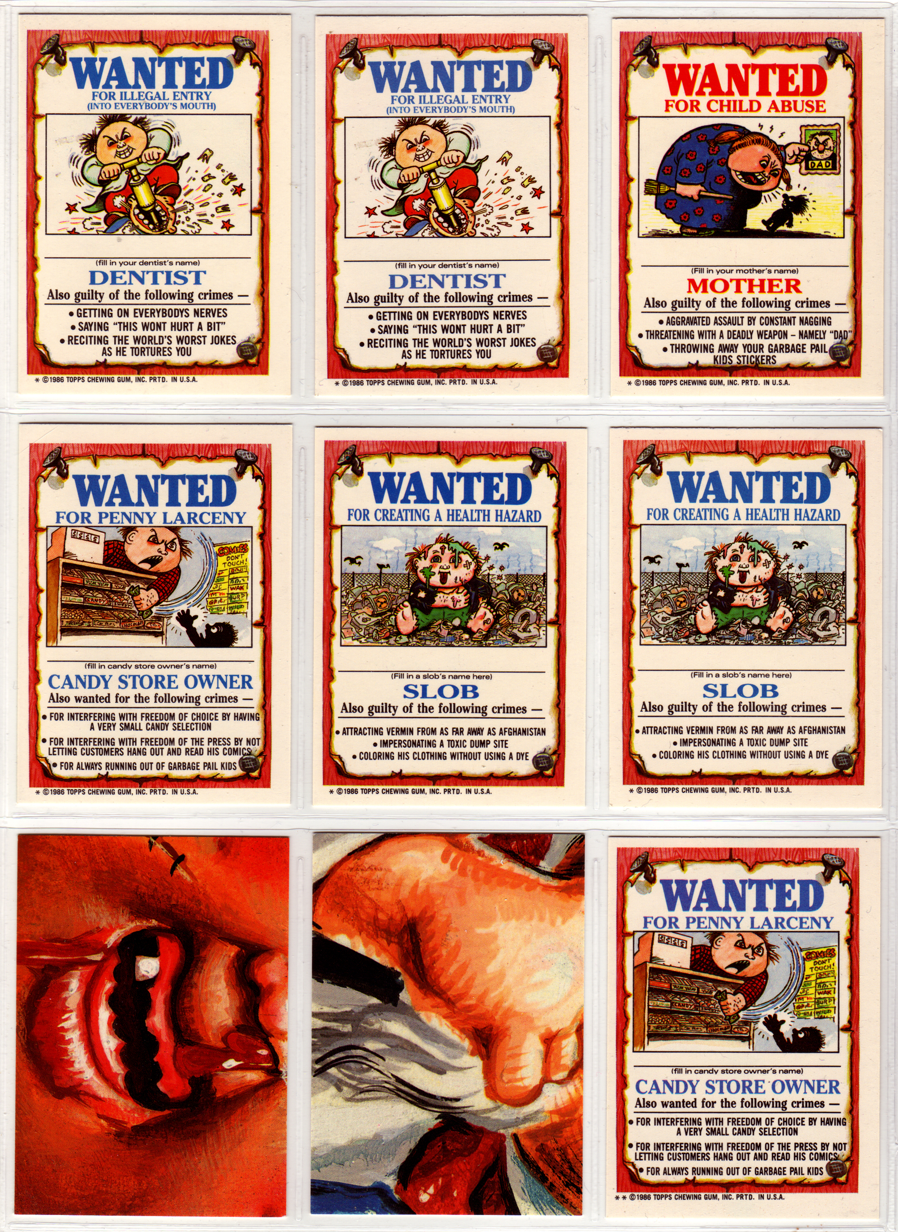
So, on to the actual stickers. There are 41 separate pieces of artwork in the set (for a total of 82 cards), which also featured a couple different variations on the card backs. There were two different card back puzzles, and 18 different ‘Wanted Posters’ (which I’ll talk about later.)

One of the aspects of GPKs that I love the most is John Pound’s great artwork. He was the main artist on the series up until this series, painting the entire 1st and 2nd series sets. On this series he shared the load with fellow GPK artist Tom Bunk (which did all of the artwork for the card backs in the first three sets.) Also, if you are unfamiliar with GPK, all of the cards come in pairs (though later on there would be some triplets), each of which features a different pun-y name (and assigned either an A or B by the number.) John Pound was responsible for these first five pairs, one of which is probably in my top 10 favorite GPKs (Hot Head Harvey and Roy Bot.) Also, all of the cards in the initial run of GPK series in the 80s were numbered consecutively after the last set, so this set starts off where the last left of with card numbers 84 A&B.
One of the things that I love about these cards is that I didn’t get all of the jokes when I was a kid, so now that I’m older there are a lot of references and gags that I can appreciate now. The first time I realized this was with the Hot Head Harry and Roy Bot cards. I’ve mentioned before that I really didn’t watch any of the Robotech cartoon growing up because it came off as way too soap opera-y and boring, but later on in high school I was addicted to the show. It was then that I had a eureka moment one day, realizing that these GPK stickers weren’t just a gag on robots, but that they were modeled off of the Veritech fighters from Robotech (specifically the super armored version.)
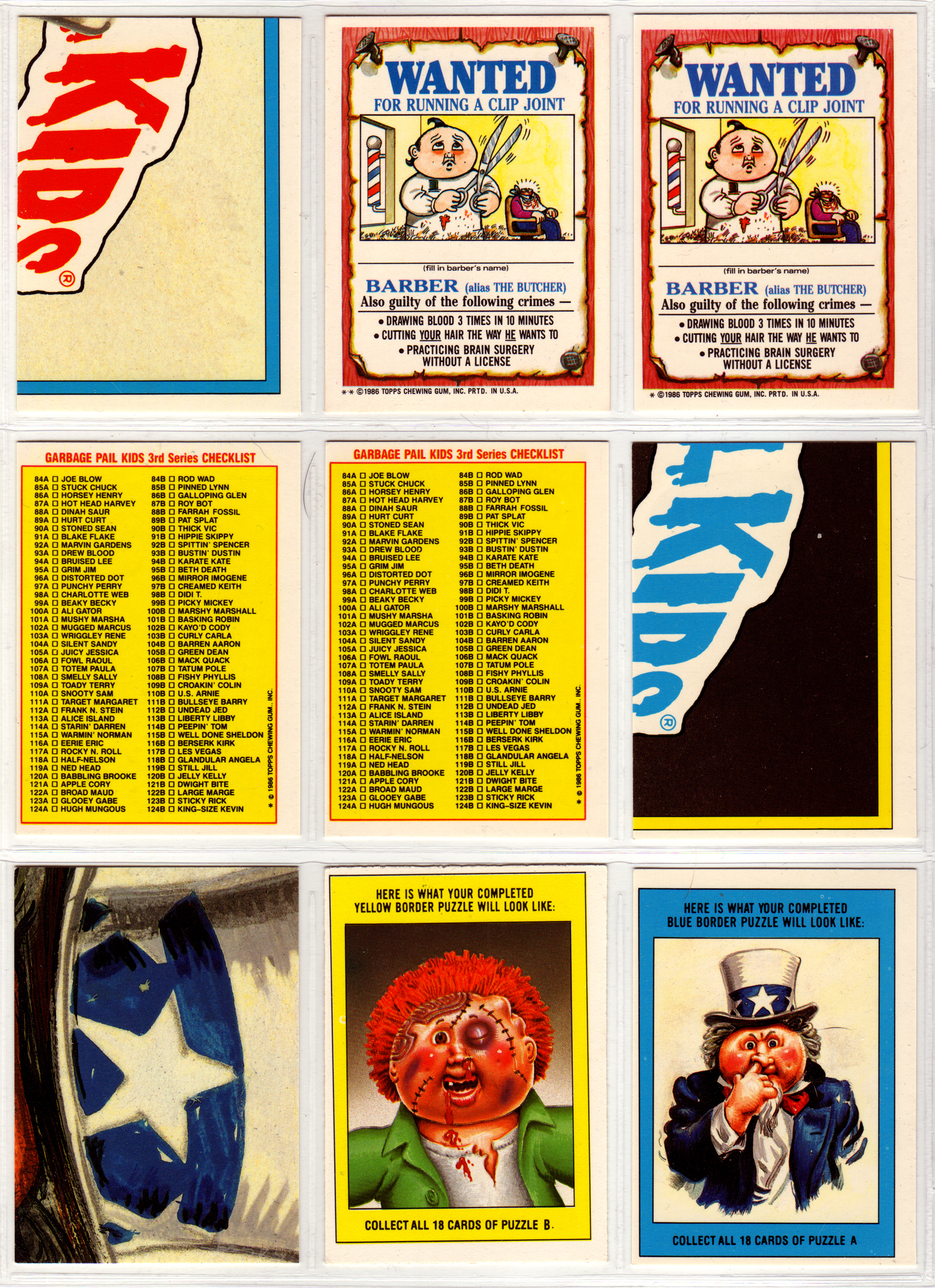
As far as the card backs go, like I mentioned above there are a few different variations. There were two sets of puzzle pieces, a handful of checklists, and these Wanted Posters (with art by Tom Bunk, and which were written by Mark Newgarden and Art Spiegelman, yup the Maus Spiegelman.) These Wanted Posters are actually reworked versions of a set of Topps sticker cards from 1975 called Wanted Stickers. All of the art was re-worked by Tom Bunk and the text was beefed up a bit.
These sorts of card backs (the Wanted Posters) were always a little weird to me. On the one hand it was cool to see sort of adult versions of GPK-like characters, but the concept of the blank spot to write in a name bugged me. This was always something to look out for when trading, making sure no one had written on the cards (now that I think about it I guess I always had a little bit of the anal collector in me.)

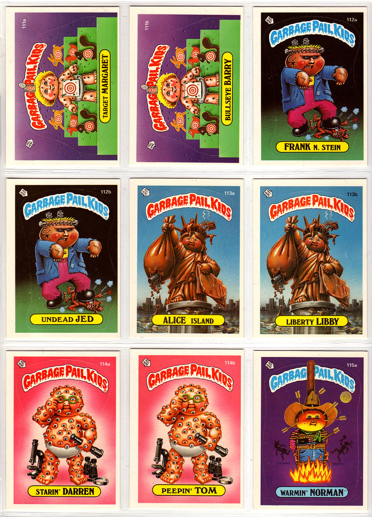
The majority of this next group was done by Tom Bunk (with the exception of 92 A&B which was done by Pound.) Though they are working in very similar styles (no doubt due to the idea of staying On-Model), there are slight differences, little flares that point to one or the other. The biggest difference that I can point to is that Bunk’s artwork comes off a little harder, with a little bit more of a hard plastic feel to it whereas Pound’s paintings are softer. This is probably getting way too deep into the ideas behind the series and stuff, but I’ve always felt that Pound was playing off of the Cabbage Patch Kids parody a little more, yet also giving a little more life to the figures. Bunk on the other hand seems to be achieving a more fake hard doll kind of feeling, which in the later series would take over as the dominate model for the characters (so much so that almost every character for awhile featured cracks in their shell, an aspect that I believe was settled on after a lawsuit between Topps and the Cabbage Patch Kids company to differentiate them from each other.) Bunks artwork also tended to be a little sparser, with either a two toned background separated by a gradient shift, or some simple set pieces, while Pound’s cards were set in very detail rich environments for the most part.
The cards above are also a great example of how varied the GPK sets used to be. None of these concepts feature any blood, poo, pee, snot, or puke, all of which are present on most of the new series cards, and typically combined in every card. Also, only one of the five features any sort of violence, the rest are as varied as varied can be. This is something that would slowly be worked out of the sets as time went on.
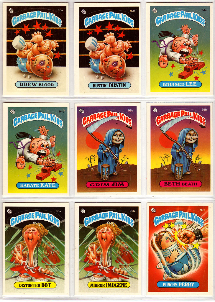
Here’s another great example between the two artists with cards 93 (Pound) and 94 (Bunk.) Though it’s worked into the concept with Bunk’s, you can really see the hardness he brings to the set, while Pounds is much more elastic.
Now another aspect to GPKs that I adored as a kid was all of the cards that fit into the horror genre. Beth Death here is an example of the type of card that I loved.

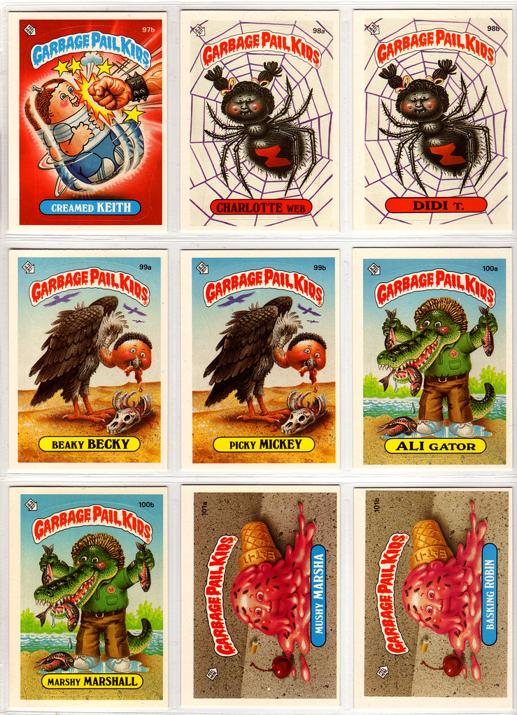
Sort of going along with that idea are all of the creepy cards as well. Though I suffer from an incredible arachnophobia, I always loved the cards featuring spiders. This set also features Ali Gator who would later make it into the cast of the GPK movie.
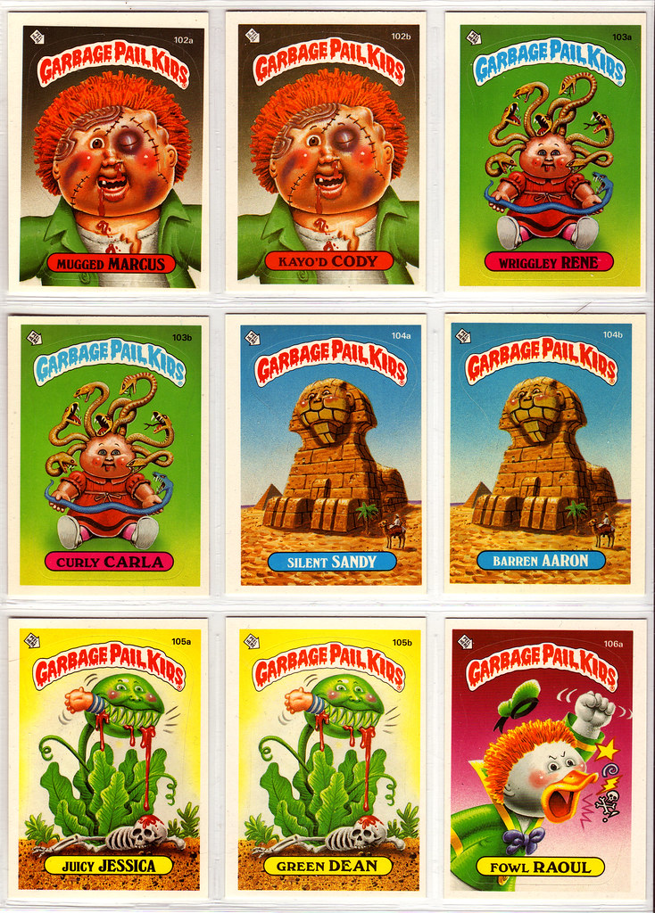


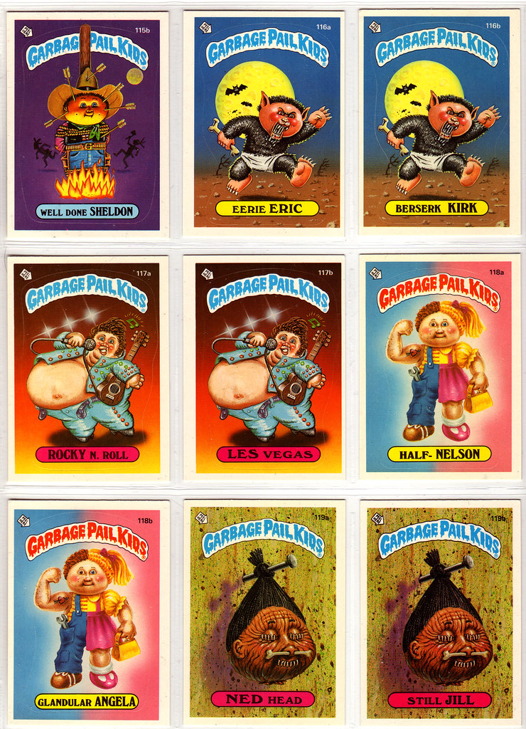
According to Barren Aaron’s Reference site, two of the cards above (117 & 118) were worked on by a third artist Mia (whose last name is unknown.) I can certainly see it in the artwork for 117 as it’s one of the most off-model cards in the set.
Back 8 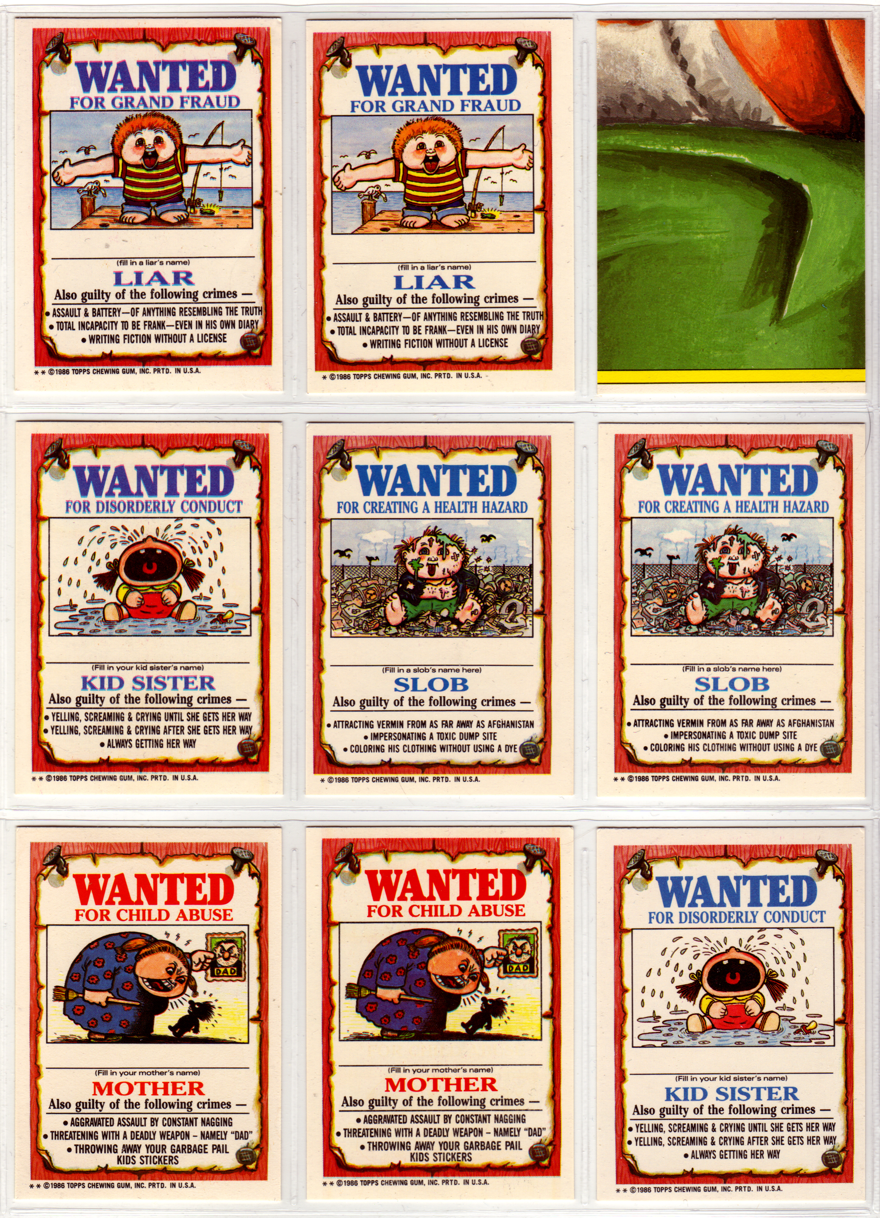


All in all I really love this set (though it’s the beginning of the decline in interesting concepts after stellar 1st and 2nd series.) As a kid I ended up getting most of my 3rd series cards through trading as I was relying on my mother and father to pick up the odd pack for me, which was only every so often. There weren’t any stores by me that carried GPKs, something that bugged me the entire time I collected them.
Next week I’ll be tossing up scans of the almost complete 4th series.


