**Update 11-7-2012** I believe I’ve finally found the name of the artist that worked on these crazy extreme 90s ads, Mark Fredrickson! Tipped off by a comment in my Flickr feed, I was pointed to this ebay auction for the original artwork to one of the “No rules!” Mead Trapper Keepers featuring some crazy iguana volleyball action. So glad I could finally attribute a name to the art!
This post was supposed to consider and defend why I choose to more or less stick to covering 80s era stuff here at Branded. Sure, 80s is in the title, but the concept of being branded in the 80s is more about defining the time period of when I grew up (which had a big part in shaping my adult outlook.) It’s not like I didn’t live through other eras of pop culture, a lot of which I like (I’m looking at you early 90s era skit comedy & cartoons.) I do however enjoy the general climate of the 80s more so than the 90s, though when it comes to decades and pop culture it’s never as clear cut as the numbers make it seem. 1987-89 feel like a completely different decade than say 82-86, and 1980 and 81 might as well be tacked on to the 70s. Hell just looking at how I dressed in 83 (ringer T-shirt with an iron-on, shorts with stripes down the sides, knee-high socks and Roos on my feet) versus 1987 (T&C Surf T-shirt, loud neon green and pink shorts with a tiki pattern, ankle socks and Airwalk skate shoes) there was a world of difference. It might sound similar at first glance, but it really does look and feel different. And the 90s, don’t even get me started on that.
So even though we’re crossing over into a new decade and the 90s are diminishing from sight in the metaphorical rear-view mirror, I’m still not ready to start thinking about that era yet. Again, this post was supposed to be an example of why. While flipping through some late 80s and early 90s issues of Boy’s Life I stumbled upon some Levis advertisements that seemed to epitomize the early half of that decade, illustrating a mind-numbing proclivity for what we’ll deem The Extreme. Anyone who was collecting comics at the time will no doubt remember an almost uniform shift in the tone of artwork which inflated what were once “normal” body types to gargantuan proportions. Remember when Scott Summers, aka Cyclops of the X-Men, was referred to as Slim by his teammates and friends? Well after Walt Simonson’s tenure on X-Factor was up, all bets were off and Scott got pumped. The same happened to the Punisher (if ever a character didn’t need to look like a Schwarzenegger clone), and practically every other character in both the Marvel and DC Universes, not to mention most of the independent super hero books from companies like Valiant, Malibu, or Image.
Stuff wasn’t cool unless it was pumped, in your face, and most importantly, Extreme. Our tennis shoes were pumped (literally), pop music had to be hard or edgy to be considered cool, and advertising went through a period of sharp angles, neon, and mixed incongruent fonts that made everything seem loud and obnoxious.
So when I stumbled upon the below ad for Levis (circa 1990) I thought I had the kernel for a 90s era Extreme rant…
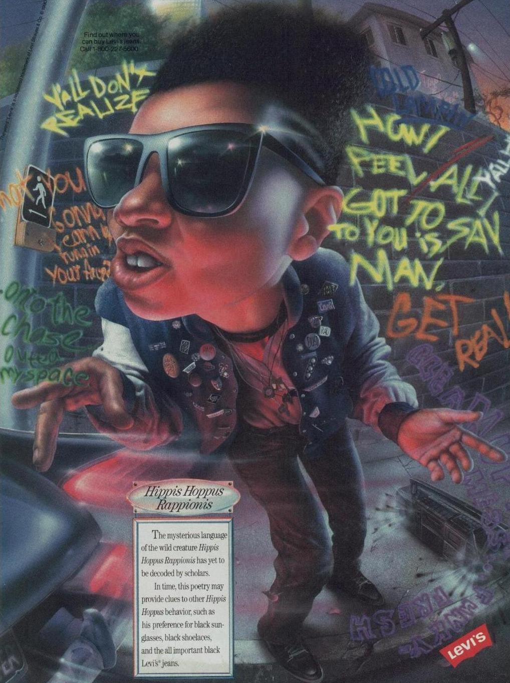
I mean Ho-ly crap! This ad has some off-the-chart air brushing, insane fish-eye “camera angle” perspectives, an insane sense of movement, and fiercer than fierce facial expressions! The only things missing from this ad are a few more fonts and neon pink. Just looking at it makes me feel like four body builders are surrounding me and screaming in unison that I need to buy some Levis, like right NOW! This is in-your-face advertising taken to the proverbial extreme. So lets step back a second and take a look at what I’d consider your run of the mill bad 90s era ad design…
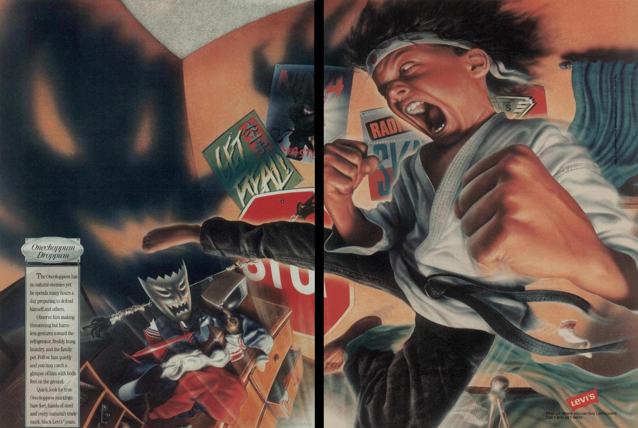
See what I mean about the neon and the six million fonts? Also there are weird clashes between curved simplistic landscapes, sharp wavy lines, dot patterns, and way too many overlapping and slanted pictures. Looking at this thing makes me think that all this loot is about to fall off the magazine page. So when I saw the above karate-inspired jeans ad, it was like taking this second ad and turning up the volume to eleven.
I was already to start typing up a critique of 90s design philosophy when I realized that there were more examples of this 1990 Levis ad campaign…

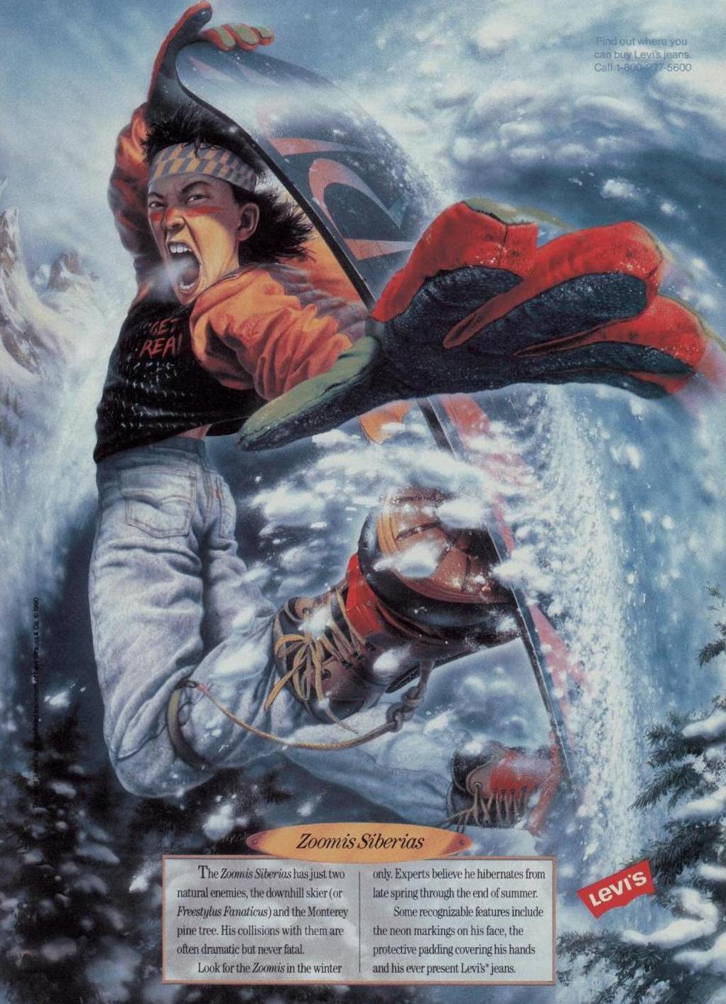
For a second I was awestruck, but the more I examined these insane images, the more and more I was being sucked into their aesthetic. In some ways I think these pieces are so over the top that they’ve come back around to brilliant. They function as a sign of the times (in terms of tone and attitude), while simultaneously lampooning that very attitude and tone. They’re incredibly intricate and realistic in their rendering while also being insanely over-exaggerated cartoon-y caricatures. These pieces are like the visual representation of irony, and I think that’s amazing.
My favorite in the series cranks this up to another level by ditching the extreme sports and lifestyle elements and wrapping this boy’s-jean-ad-campaign around a mad scientist theme!
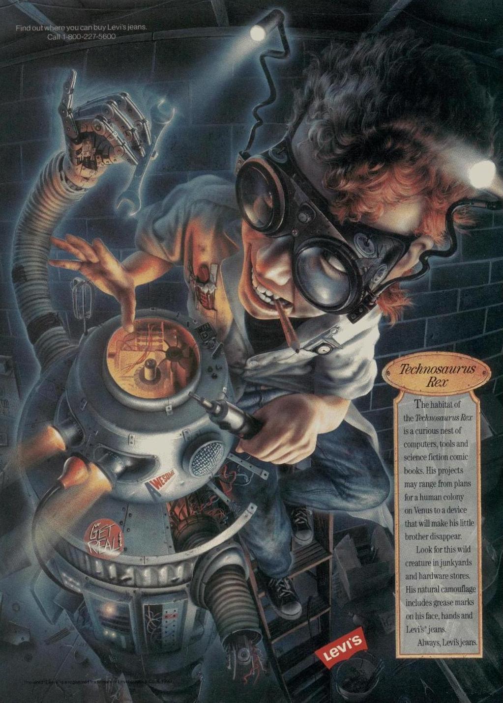
What in the hell do jeans have to do with crazy kids building robots? I love it.
I’ve become so won-over by this artist and these ads that I feel like I’ve completely lost that original idea for a rant on 90s design. In mid-draft I’ve gone from complaining to loving 90s extreme ad design. Not only that, but after stumbling upon a couple more ads from 1991 (which I believe have to be the work of the same artist or production studio), I almost want to create a whole section of Branded dedicated to examples of awesome extreme 90s advertising. I think I’ve managed to regain enough of my composure to brush off that idea, but I will share the other ads that I found.
The next example is an ad for Mead “No! Rules” branded Trapper Keepers from 1991…
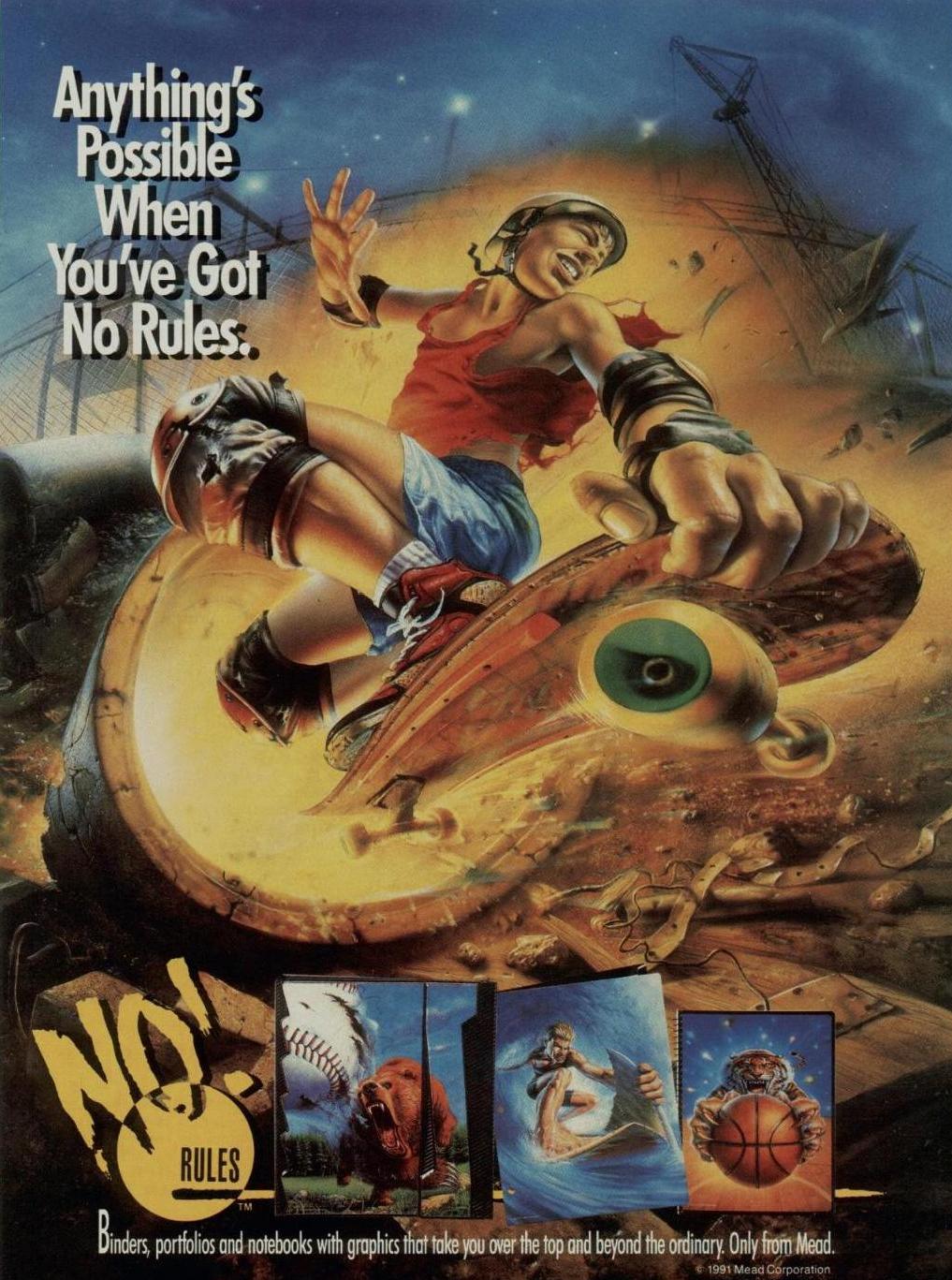
Pitting kids, sports, and really pissed off and violent animals against eash other is crazy. I totally missed out on these binders back in the day as I think at this point I was just entering high school and I’d adopted a no-bookbag, no-organized folders mentality only carrying around the bare essentials to classes. I kind of wish I was still into Trapper Keepers at that time though, because I’m sure I would have had some of these.
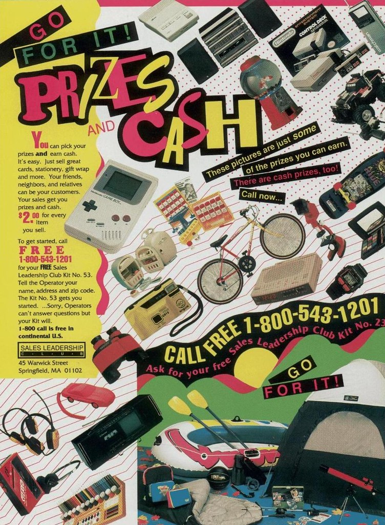
The last example of this unknown artist’s work I found is from a 1991 Donruss baseball cards ad…
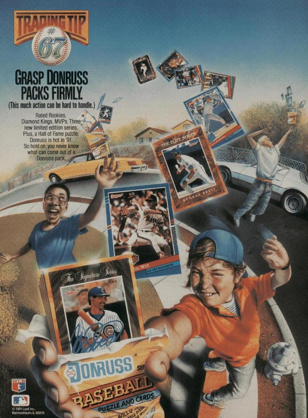
I would love to find out who did all these ads, and if it is indeed the work on one artist as I believe.
Overall though, I guess that old adage is true. If you just stop and walk in someone else’s shoes (or stare at a bunch of ads from a specific era in time), you’ll develop an appreciation for that journey. I still hate mixed and messy fonts, not to mention extreme tonality for its own sake though…