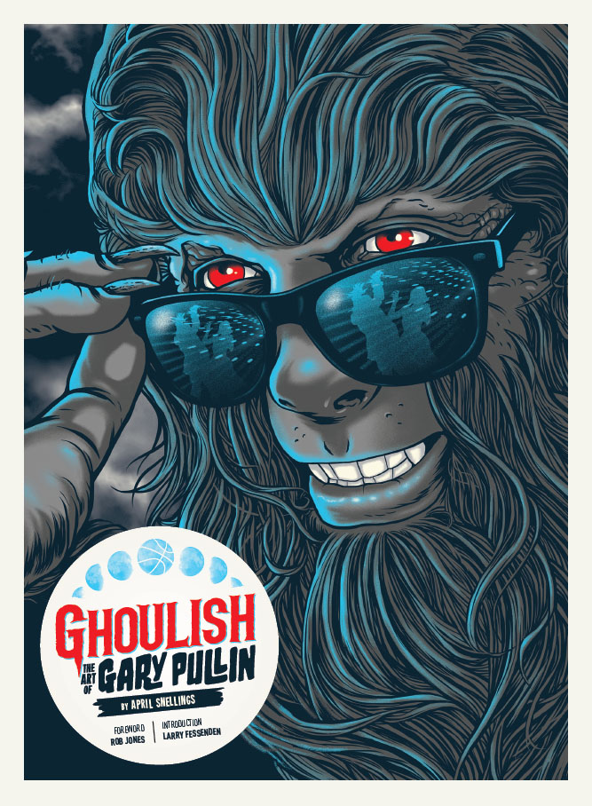
I first stumbled on the work of Gary Pullin a few years ago when we crossed paths on social media (I don’t honestly remember what platform, though I have a feeling it was on Instagram.) I had seen a Teen Wolf piece he had illustrated for a limited edition Skuzzles screen print and it stopped me dead in my tracks. I was crushing hardcore on this illustration, lost in the intricate beauty of the linework. The piece features a close-up portrait of Michael J. Fox’s Scott Howard, fully wolfed-out, and ready to party at the high school dance. What initially comes across as a simple illustration is actually layered with homage and film references, but what initially drew me in was Pullin’s deft hand at painstakingly illustrating Scott’s hairy visage. I mean, Scott’s a werewolf and there are hairs all over the place. Having spent my fair share of time as an illustrator I can attest to the madness that lay within a piece like this. There’s this insane balance of detail and suggestion of shape when drawing hair like this, and it’s something that is painfully hard to make appear natural, flowing, and full. As an artist, I find this poster mesmerizing.
So it came as no surprise when I found out that 1984 Publishing was releasing an art book dedicated to Gary Pullin’s work that the decision was made to use this piece as the cover of the book.
Ghoulish: The Art of Gary Pullin is set for release next week and I couldn’t be happier to see such a beautifully handled collection of Gary’s work. Pullin is on the forefront of a new generation of artists and graphic designers that are taking back the commercial side of pop culture art. For the past 20 years commercial art has been in a massive slump due to corporations, studios, publishers, record companies, and ad agencies favoring heavily Photoshopped stock photography or obnoxiously digitally-manipulated artwork, in lieu of creative illustrations and paintings. The era of collectible mainstream album artwork, beautifully rendered movie posters, and painted magazine covers seemed to be long dead. But over the last few years boutique distributors, independent poster and t-shirt companies, and a handful of smaller magazine companies have been ushering in a new era of commercial pop art, and Gary is one of the most creative talents in the movement.
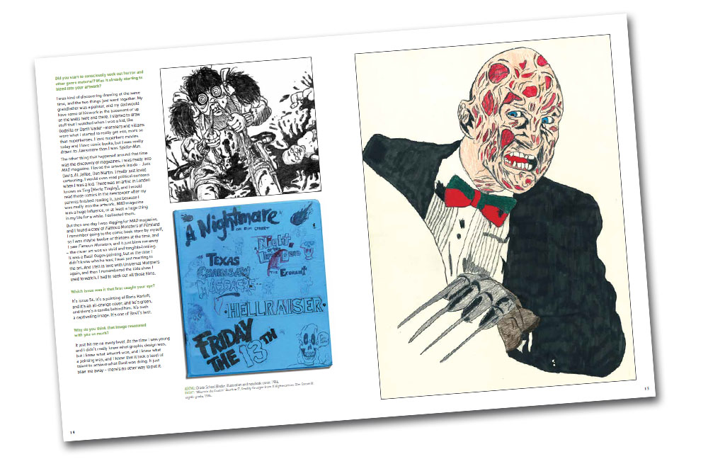
1984 Publishing was kind enough to send me a copy of the book to scope before its release next week. The hefty volume covers the bulk of Gary’s career from the earliest roots of his influences in classic monster movies and Saturday morning, live-action television shows (The Hilarious House of Frightenstein), his decade-long stint as contributing artist and art director for Rue Morgue magazine, on to his expansive portfolio of freelance work for numerous record companies, home video outlets and publishers (including a bevy of album and DVD covers, posters, and other merchandise.) The book showcases well over a hundred pieces of Pullin’s artwork, many of the pieces complete with color variants (posters), concept artwork, rare exclusives and previously unpublished alternate illustrations. I love that the the volume even makes room for his work in the enamel pin collecting community, a nice touch in a genre that doesn’t get much coverage in books like this.
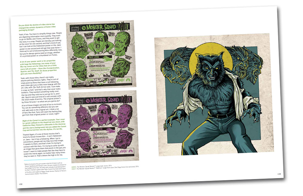
Speaking of exclusives, I was so stoked that the book cover’s Gary’s contribution to the Mondo limited edition 45 records that were released a little over a year ago. Of the 4 variants, Gary’s was the hardest to get a hold of (it was a Texas Frightmare Weekend exclusive) and is still a hole in my collection. At least I can stare longingly at his Wolfman sleeve artwork now…
Scanning through these pages I’m struck by how complex Pullin’s illustrations are in terms of mashing up disparate textures, as well as his ability to playfully mix many layers of concepts and storytelling withing a single piece of art. Gary’s eye for story and design is super fun and he manages to cram in a ton of different ideas without muddying the waters, so to speak. Theie is a lot going on, but the work never feels cluttered. For instance, there are a couple of A Nightmare on Elm Street pieces in the book that look deceptively simple in execution, but as soon as you really take a look at the illustrations you’ll notice that there are layers, upon layers of imagery hidden within the pieces. The way Gary manages to utilize the blades from Freddy’s glove to serve both as the literal blades as well as doubling for the stripes in his iconic sweater was pretty much genius use of space.
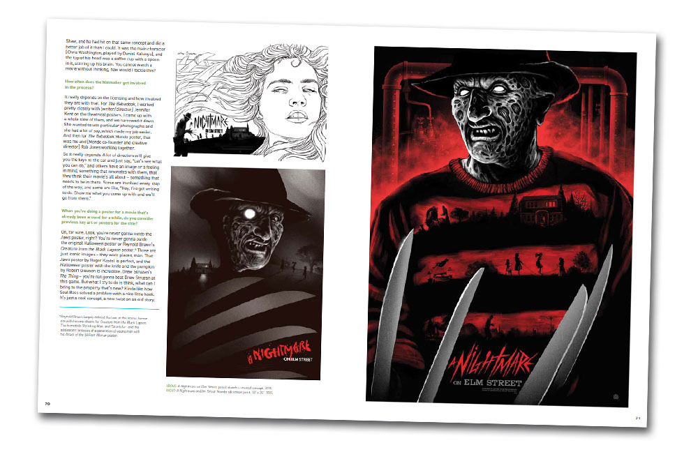
This is a theme repeated in Pullin’s work where he finds so many creative ways to layer his imagery. On top of this, Gary never seems to lean too heavily on establish classic imagery from the films he works from. His posters very rarely evoke classic movie poster artwork or famous production stills, so even though he wears his influences on his sleeve his take on the material is highly original and Pullin’s style shines through. Yet all the same, you only have to glance at one of his posters for a moment to fully recognize the film he’s illustrating. In fact, as rich and layered as his artwork tends to be, Pullin has also mastered a subtlety of reference and wickedly deceptive simplicity to evoke a movie with the least amount of detail. Just look at these two pieces below for George Romero’s Dawn of the Dead and Walter Hill’s The Warriors…
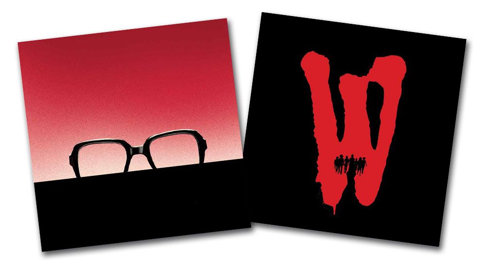
The brevity and extremely on point designs barely need to feature much in the way of detail to convey exactly what they represent. This is amazingly hard, this ability to boil down story and design to the bare essential. As someone whop dabbles in graphic design myself, I’m gobsmacked.
The glue that binds this book together is provided by April Snellings, who infuses the chapters with thoughtful interviews with Gary that drill into his influences and process. Her ability to tie together the threads of his experience, his passion and his work makes the book a very interesting read for any fans of horror, movies, or just graphic design, illustration and painting. Though a lot of artist spotlight books are typically just heavily illustrated collections, Ghoulish: The Art of Gary Pullin is a much richer, more layered examination of a very talented creative, which somehow manages to perfectly reflect Pullin’s style.
Again, the book is set for release on May 8th, and can currently be pre-ordered through Amazon in two different packages…
If you just want the hardback book, you can find it here.
But there is also an Amazon exclusive set that features a signed book, an 8×10 signed 3-D print of the film House, and branded 3-D glasses as well for just $10 more. This set is limited to just 250 pieces, so you might want to snag this one fast.

