 I’m not sure if anyone in the world besides me finds pop culture lettering and logo design variation interesting, but for all of the font nuts out there that are also Monster Squad fans there are a bunch of different title designs that made the rounds before and after the film was released. If you’re familiar with the standard US poster then you’ve seen the main design of the logo…
![]()
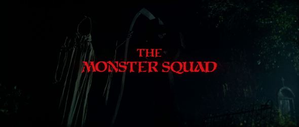
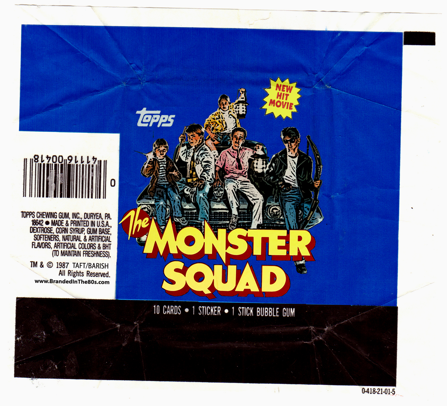
This was the main one I was familiar with for years as it was used on the one-sheet posters, the VHS, and the laserdisc releases of the film. It’s not the title that pops up in the actual film, but then again it’s kind of rare that advertising logos make it into the films as it’s usually two separate departments that handle those designs. Regardless, this is the “standard” logo and it’s a design I love. Though I’m not a fan of mixing fonts, I actually really like the use of a rounded, italicized font for the “The” portion which offsets nicely from the sharp, rigid, 3-D sans serif of the main title. The whole thing has a slightly late 50s, early 60s era appeal to fonts which plays nicely against the tone of the film and the greaser punk fashion of Rudy.
But, this wasn’t always the main logo, in fact, there was another that was used heavily in the US non-poster advertising…
![]()
This was used as the official logo for a series of magazine articles (namely Fangoria), as well as the branded on the official media press kit. So it pops up on the bottom of press photos and on the cover folder of the kit. I really like this one even though it’s not as stylized as the main poster and VHS logo. The bold serif font evokes a slightly military design that plays into the “Squad” aspect of the title for one, but I also like the flourish of the bat emblazoned across the logo. It’s simple yet effective. Also, as we’ll see later in the month, that bat pops up in a lot of the international posters…
As for the film itself, there are a couple of logo designs. There’s the main title screen which features a pretty standard Gothic-styled font…
…but more exciting is the hand drawn logo that Patrick makes for the Club during the awesome montage sequence…
![]()
Granted, this is super crude, but I still love if because it’s the only “official” logo in the actual continuity of the movie. Besides, I love that the kids had the presence of mind to start building branding for the club, it’s something I know I would have done as a kid for sure…
Outside of the US there were a number of different marketing campaigns for the international releases of the film, most of which used the font from the main US poster above, though not in such a finished stacked word/final logo fashion. That includes Spain, Mexico, Korea, and Japan, but there were a couple of countries who diverted pretty wildly. Germany for instance not only ditched the various US fonts, but they also renamed the flick to riff off of the Ghostbusters a bit calling the film Monster Busters…
![]()
This logo is way more modern (for the time) with a really fun electrified font that looks like it would have been ripped right out of an MTV commercial (the “M” has a slight Metallica font vibe as well.) They also ditched the red/white/deep yellow color scheme of the US advertising campaign too and went with a lime green (which plays into the color of the German poster artwork so it makes a little more sense when you seen the overall image.)
Probably the most distinct departure from the US ad campaign is the logo used in the United Kingdom to promote the film…
![]()
Again, this is a design that vastly different, but one that I dearly love and am surprised that it wasn’t more widely used over the years. I love the circular club badge aspect to the logo as well as the generic monster hand gripping the center title, not to mention the vampire tooth “M”. This logo would make for an awesome t-shirt and would be rad on a pin-back button.
There’s one additional version of the logo that I’m aware of, but have yet to find a decent photo for illustration which is the logo that was designed specifically for the official movie crew jackets that were given out to everyone who worked on the picture. The best photo I could find was this picture of Andre Gower wearing his jacket…
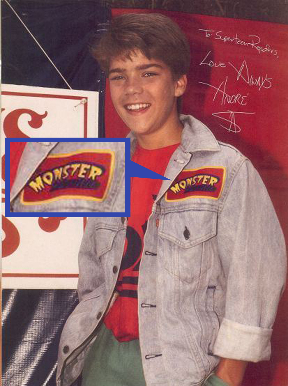
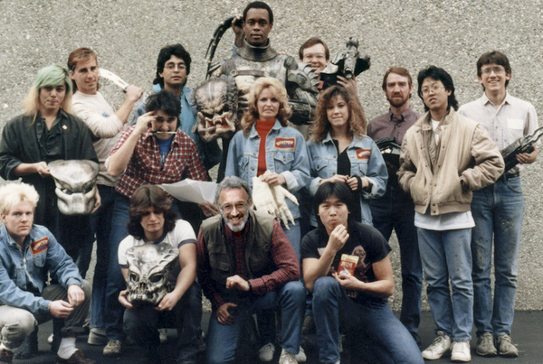
You can see another an example in the below photo of Stan Winston’s effects crew during the Predator shoot. There are a few folks proudly wearing them, namely the two ladies in the center and Shane Mahan at the bottom left (who was responsible for the Mummy’s creature effects…)
Anyone have a better picture of that Monster Squad crew jacket patch?!?
So, what’s your favorite Monster Squad logo?
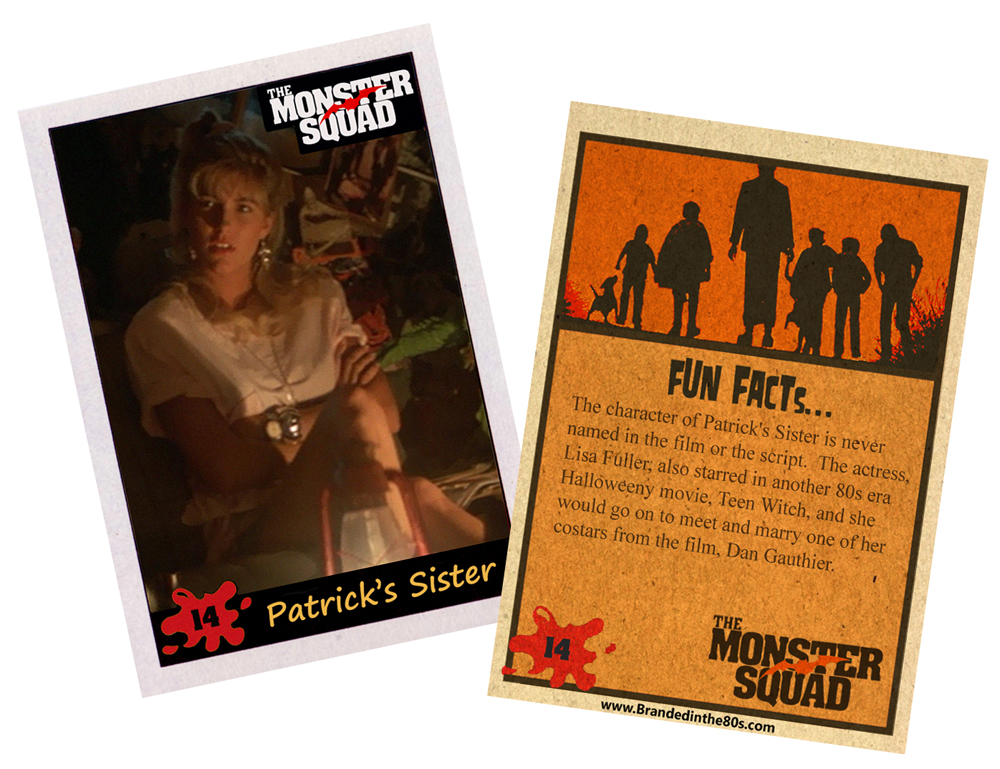
Alright, now for today’s trading card…
Today’s card is #14, Patrick’s Sister!


