
While flipping through images of my sticker collection recently I realized that I never posted my collection of Grossville High sticker cards. Well, here’s to rectifying my overlooking of this small bit of 80s sticker nostalgia. The set was released in 1986 by Fleer as their answer to the phenomenon of Topps’ Garbage Pail Kids. I find it very interesting that Topps had such a strangle hold on the non-sports card/sticker market through out the 70s and 80s considering that they’re peddling a very simple item. Tiny thin squares of cardboard and stickers don’t really scream revolutionary proprietary product to me, and I wonder why the other companies like Fleer and Donruss had such a hard time competing. Granted, Topps managed to snag the licensing rights to a lot of established film and TV franchises (including Star Wars, Buck Rodgers, Rambo, Mork & Mindy, and the Incredible Hulk just to name a few), but what I’m more interested in were the new ideas and exclusive properties that these companies created. Even while maintaining all of its TV & film licenses Topps was also creating great in-house sets like Monster Initials, Ugly Stickers, Weird Wheels, Wacky Packages, and Garbage Pail Kids. Fleer and Donruss on the other hand weren’t putting up much in the way of competition, though Donruss did have a couple fun sets with Zero Heroes and Awesome All Stars. Fleer’s main entry into the this world of artist driven non-sports sticker cards was this Grossville High set…
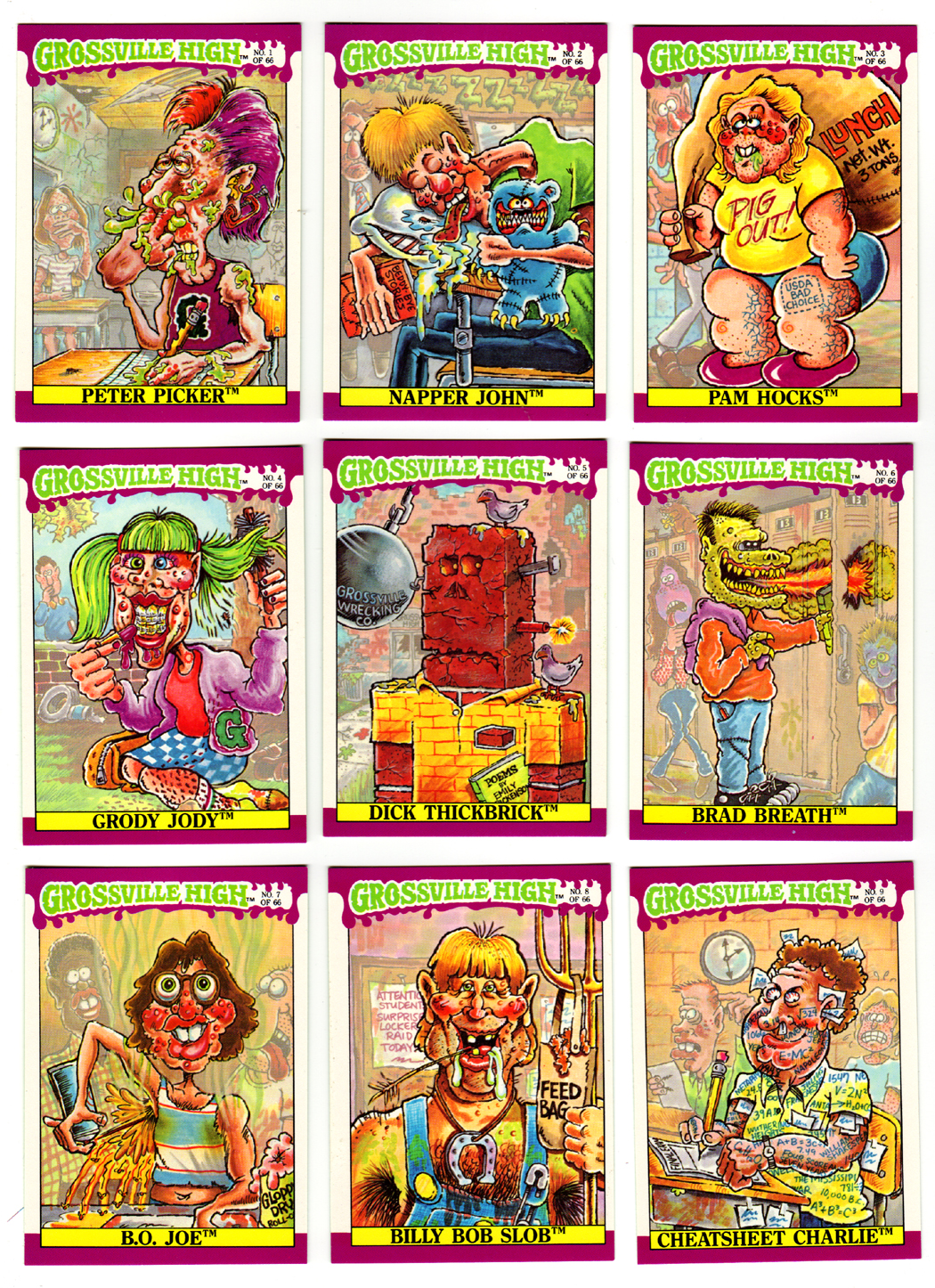
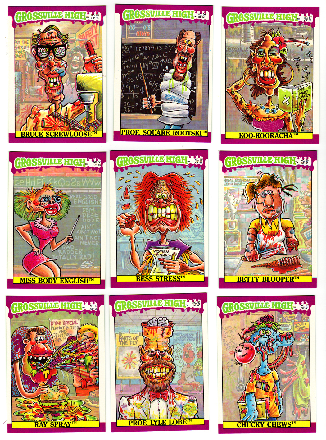
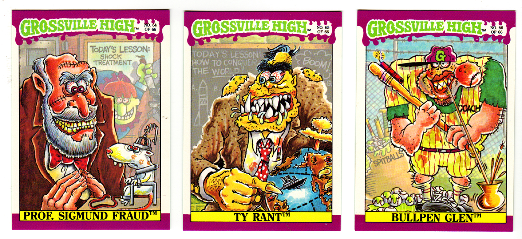
Playing directly off of the design and content of Garbage Pail Kids, these sticker cards featured a bunch of disgusting gross-out caricatures of the denizens of the stereotypical high school environment. Unlike GPKs they were no twin cards, and the concept wasn’t parodying another product or franchise (unless you count GPKs themselves), but the characters still featured pun-y alliterative names and were exuding almost every bodily fluid imaginable. These stickers were also pulling a lot of artistic influence from MAD magazine, in fact one of the cards above, #8 Billy Bob Slob looks strikingly like Alfred E. Newman. All said and done, I think the creative team over at Fleer misinterpreted the level of gross-out humor that most kids were responding to, much in the same way that the later Garbage Pail Kids sets did. There’s just too much going on in these cards that it ends up making every card look way too similar and really most of the jokes end up being too repetitive. There are just too many pimples and way too much drooling going on that it obscures most of the gags. When GPKs first hit the scene, one of the strongest aspects of the sets was the diversity in concepts. It also doesn’t help that the overall color scheme is so uniform. The purple, yellow and neon green in the boarder part of the card design permeates the art on each card. It all blurs together to form on giant garish image.
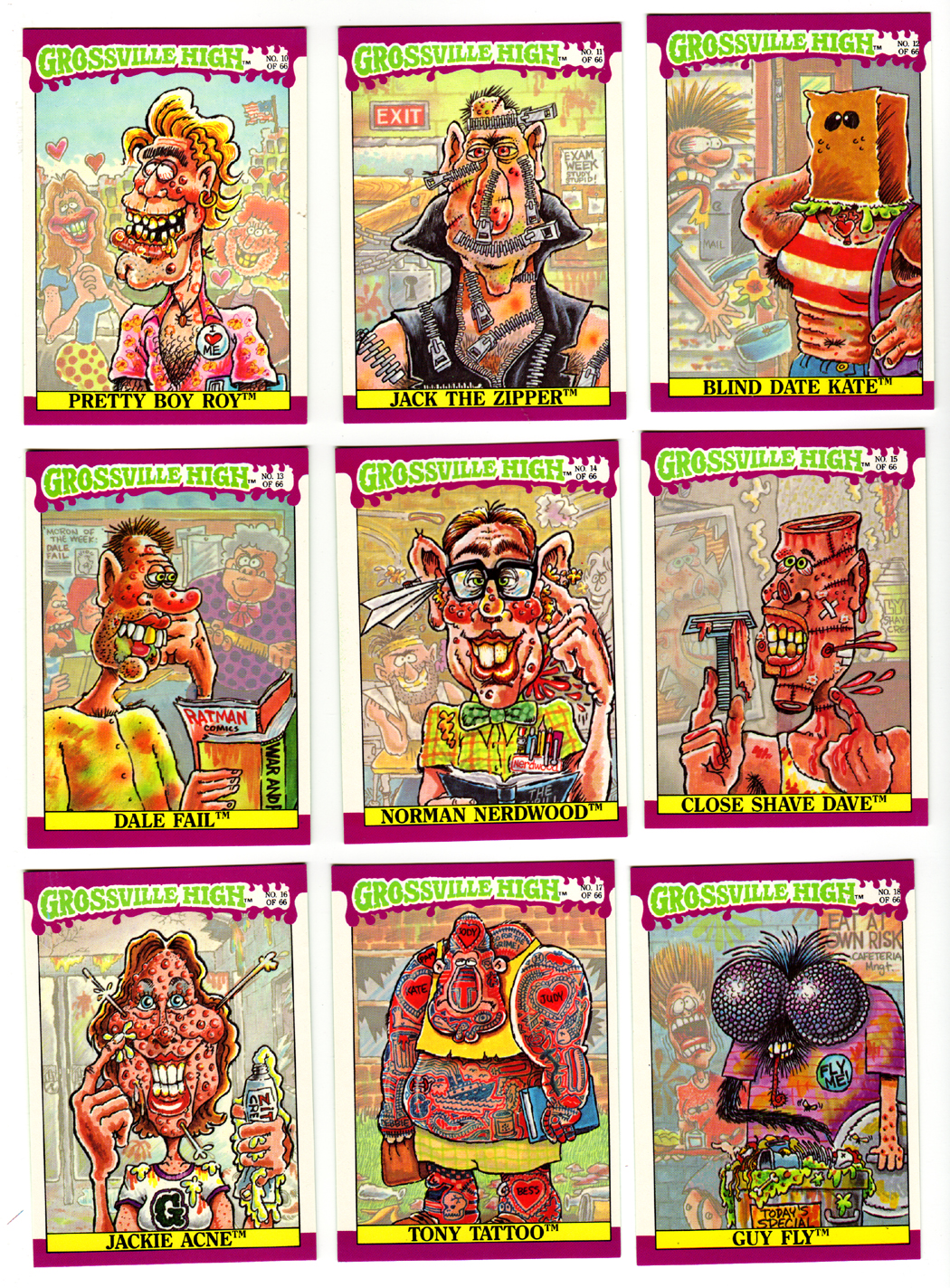
That doesn’t mean there aren’t some stand out cards in the set though. I really like the Jack the Zipper card, probably because it’s so focused on the gag at hand and isn’t strewn with yellows, purples, and greens. I also dig the Fly Guy sticker even though the name is so straight forward it’s painful in its non-creative simplicity. Hell Brundle Boy would have been a better name. I do like the nod to the original Fly film where this unfortunate kid is only half fly, with one human arm and a fly head. It feels like some thought was put into the design.
Also, even though the design of the cards is monotonous in its repetition, I do like some of the reused elements. In particular the obscuring of the background in the art is nice. It adds a nice repeat-viewing aspect to the set which makes it fun to go back and pour over the cards at least a second time to try and catch all the little details.
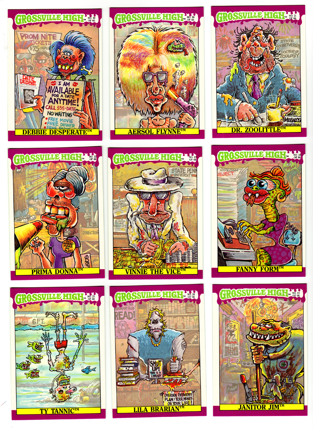
It is kind of interesting to see how crazy or off the mark some of the gags are though. This set appears to use the same artist throughout and I’m sure it was difficult trying to come up with a visual gag for all the names. Take Fanny Form above. What exactly is the joke here? From the name I would have assumed a big butt joke, but the artist chose to go with a bug-eyed serpent motif. Or take Lila Brarian, who doesn’t even look female as the name would imply. I guess I’m just glad the artist chose to side step the overly repeated library barbarian jokes that was so common in the 80s, and instead chose a pseudo-zombie caricature.
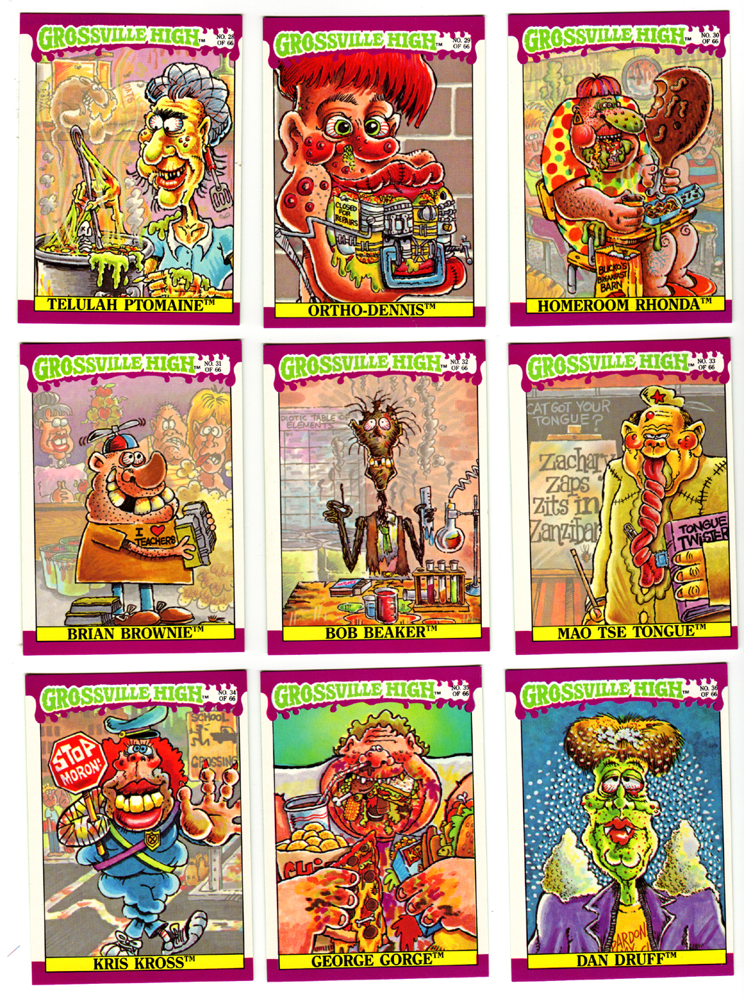
I’m also kind of enthused to see some weirdly out of date political references in this set in the form of Mao Tse Tongue, which is a great pun-y turn on Mao Zedong (Tse Tung.) Granted we were still at the end of the cold war communist scare, but he was hardly an imposing nemesis having been dead for a decade at the time. Maybe it was a weirdly placed 10-year anniversary kind of thing?
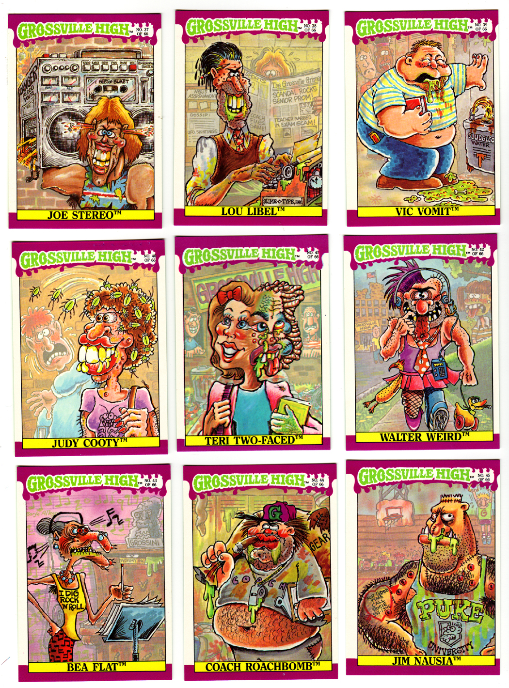
It’s interesting to see Grossville High also take a direct hit/rip at GPK with the Walter Weird sticker card (which is lifting a combo of Split Kit from the 2nd series and Half Nelson from the 3rd almost verbatim.) Well, there are those added rubber ducks and chickens…

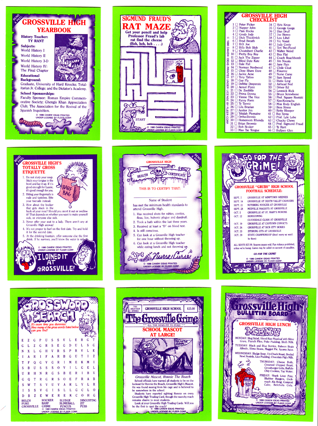
All in all, the set is lacking the focused attention and quality of the earlier GPK sets, but if nothing else it was Fleer’s shot at taking on a giant so I have to give it some credit. Maybe if they hadn’t cut & pasted all the borders or varied the coloring a bit it would have been a more effective set of sticker cards and it could have gotten an additional series or two. Who knows…


