If I had to pick my favorite scary, creepy, Halloween-y character ever, it would most likely be Frankenstein’s monster. There’s something about his sad, lumbering, misunderstood figure that I can identify with. Over the years I’ve amassed a small collection of Shelley’s book, as I’m always willing to pick up a new copy when I find a cover I really like, or (gasp!) if it’s illustrated. One of my favorite permutations of the book is the 1988 Step-Up Classic Chillers adaptation by Larry Weinberg (published by Random House.) It’s not the adaptation that I love, but the creepy cover (painted by Lisa Falkenstern), and the interior pen and ink illustrations by Ken Barr…
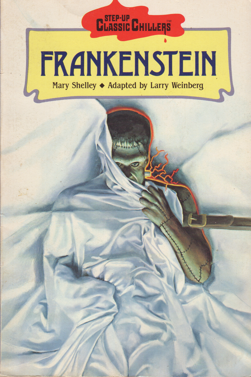
There’s something very menacing about the way the monster is pulling back the shroud on the cover; there’s a bit more of the spark of life in the character’s face and intent in his posture.
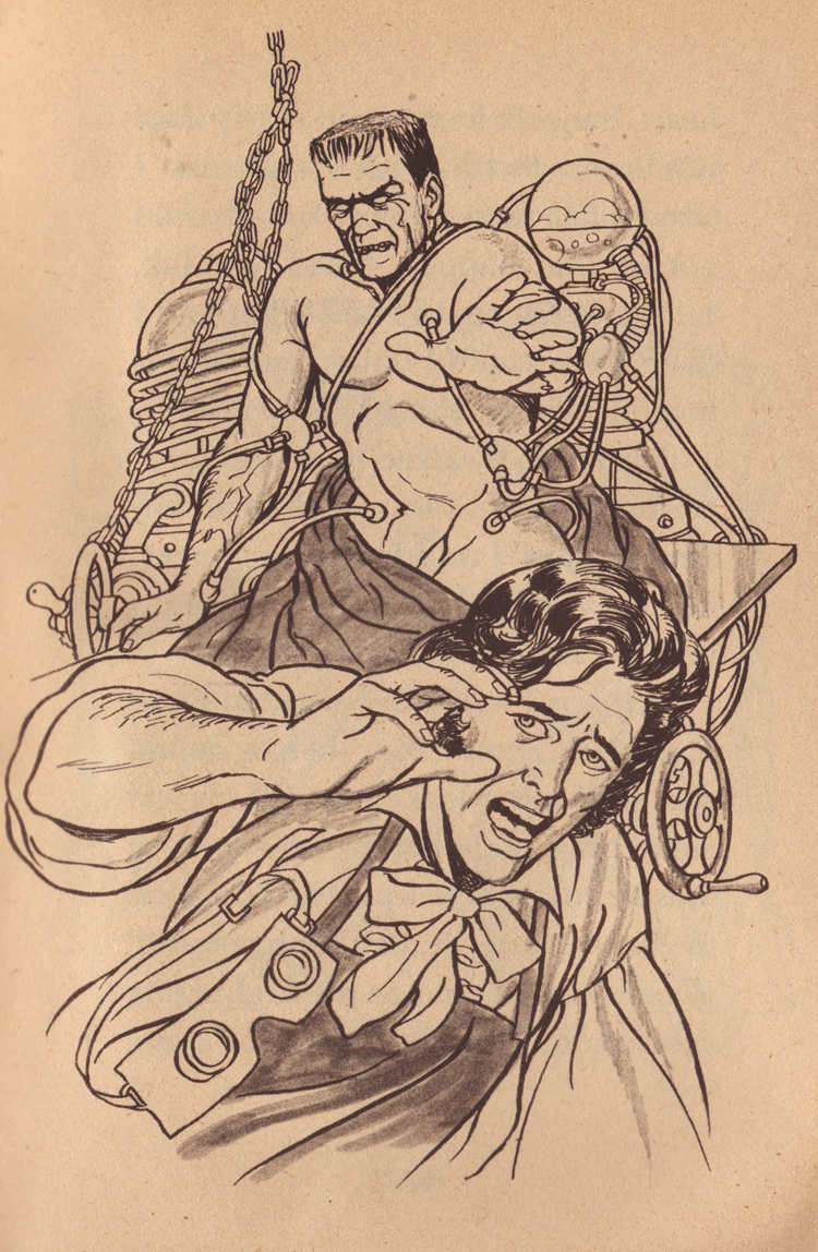
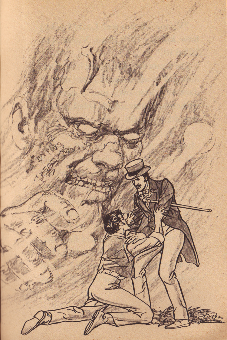
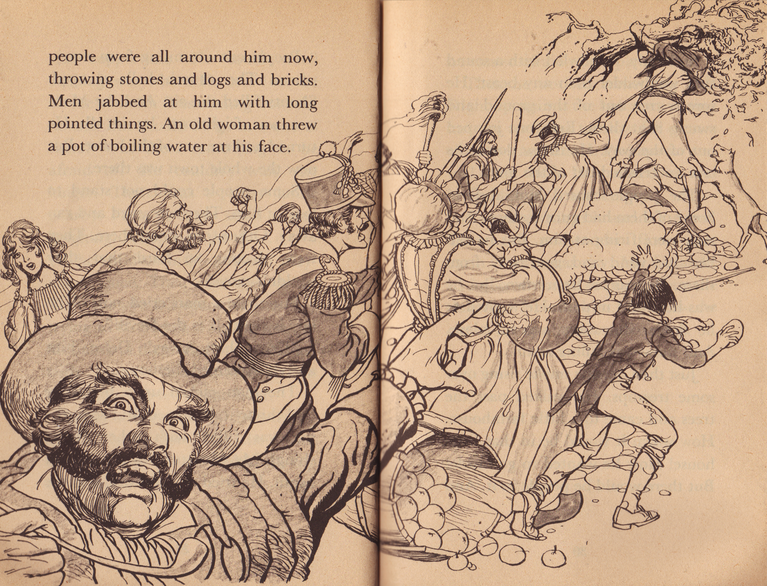
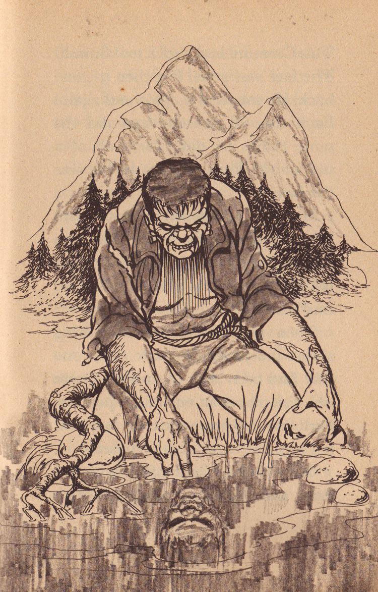
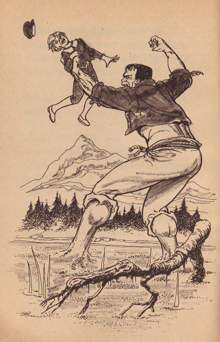
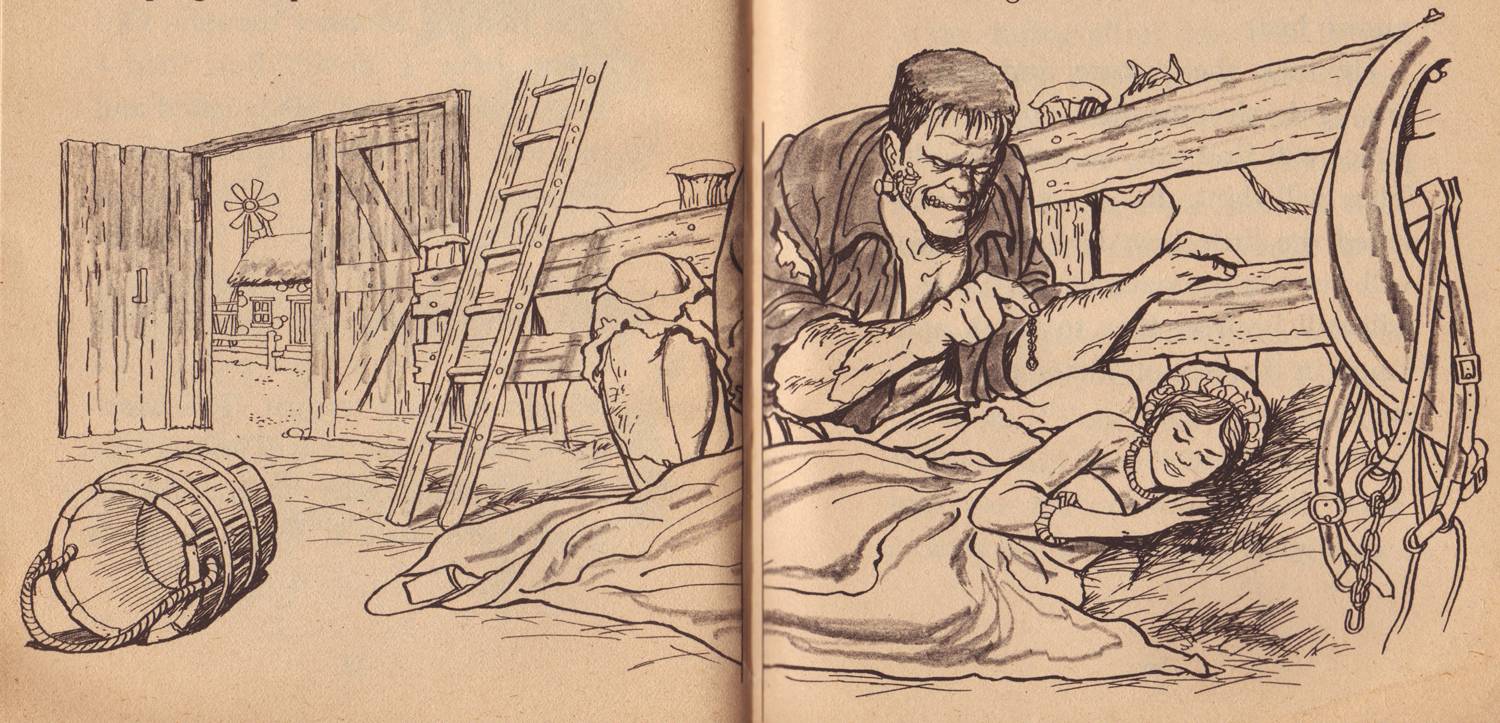
As far as the interior illustrations go, I was surprised by how influenced they were by the classic Universal version of the creature’s visage (I always thought that Universal was pretty litigious when it comes to squared-off, flat-topped interpretations of the monster.) Ken Barr’s illustrations are really fun and are in the vein of 70s and 80s era comic book art (which makes sense considering Barr did a lot of work for Marvel and D.C., as well as men’s adventure magazines.) If I’d have found this particular version as a kid I would have flipped for it…

In particular I love how aged and weather beaten the monster’s face appears, with the hard worn wrinkles and deep crags around his eyes and the evil looking laugh lines around his mouth. Granted, I also love the more standard vacant or innocent look the creature is given, but every once in awhile it’s refreshing to see the seething anger just below the surface of the monster, if not outright as it is in this book…