I wanted to do a quick follow up to last weeks Target rant. I’m still disappointed with Target’s overall vibe this year, but looking a bit closer there are some interesting things going on. First though, I wanted to thank everyone for the feedback on last Friday’s post, in particular AllHallowSteve who pointed to some overall Halloween sales trends for the last few years that helps to predict and explain this year’s bottom of the barrel offerings from most if not all of the big chain stores.
The wife and I stopped back in our local Target for some odds and ends when we noticed that their Halloween section seems to be fully up. Lo and behold we were greeted by the following signage…
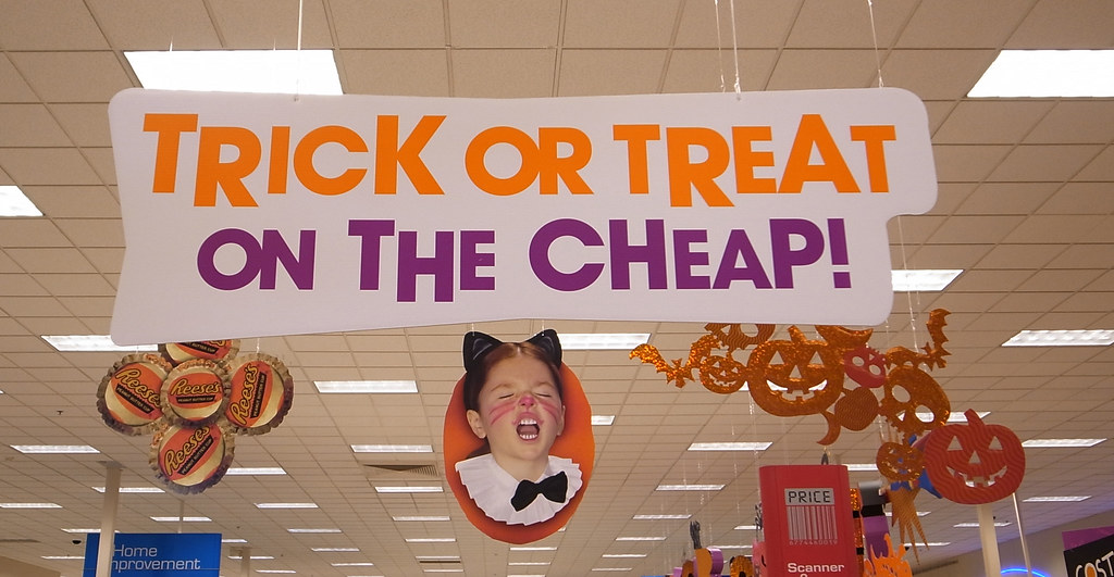
“Trick or Treat On the Cheap” indeed. So the intentionality is to pare down the section and focus on spend-thrift customers, but I’m still confused as to the design decisions that were made with what was presented. Before I get to that though, can someone explain to me what the hell is up with that sign featuring the girl in the cat get-up? Is she yawning? Meowing? Or perhaps pissed at the slapdash section she was modeling for?
Seriously though, outside of the cost-conscious nature exhibited, it’s evident that Target did spend some time and money on their Halloween branding this year, but what gets me is how restrained it appears. When the wife and I first walked into the section we were having a hard time picking out the themes. We got the kidified monsters and their slightly more adult counterparts, but everything else just seemed boring and generic. Taking a closer look we realized that one of 2010’s themes was apparently a callback to the 50s and 60s paper cut-outs…
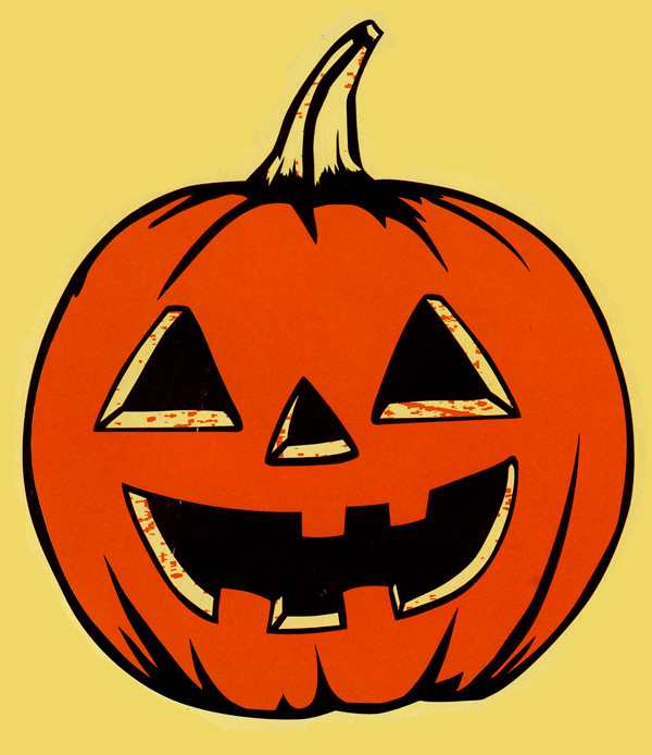


You can see it in the color scheme of the above jack-o-lanterns, the deep oranges and the yellowed-paper-tans, not to mention the intentional miss-registered color flats and spotting. There’s also the jack-o-lantern on the end with the witch’s hat that kind of speaks to some vintage Beistle designs (like the jack-o-lantern with the bowler hat and pipe.) There are a handful of products, mostly dinnerware, some decorations and bathroom accessories, that feature this theme but it’s not prominent enough in the branding to really stand out or communicate the intent of the homage (though they sort of tried with the bath towels by having some misplaced “bad newspaper printing” accents.)

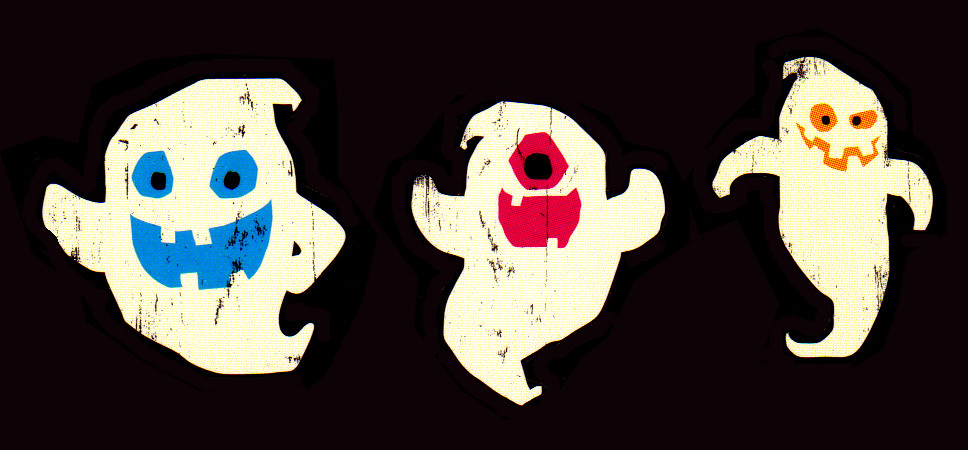
This concept was further diluted by mixing it in with three other themes in the Halloween section, the in-your-face cheap looking glitter skulls, the last vestiges of the “adult” party favors (a tiny offering going with a Grey’s Anatomy medical illustration theme this year), and another odd and under-used UPA inspired cartoon modern theme (which is another of the themes that slightly peaked my interest.) These 60s era cartoony renditions of the classic monsters are pretty neat and feature a whole roster of cool designs…
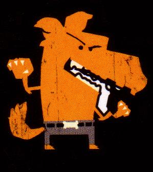
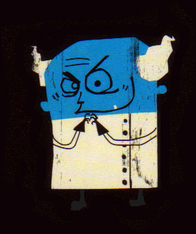
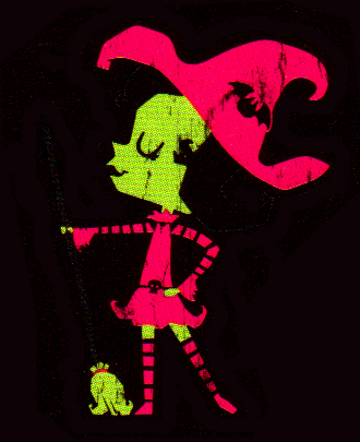

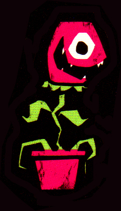
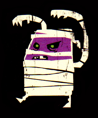
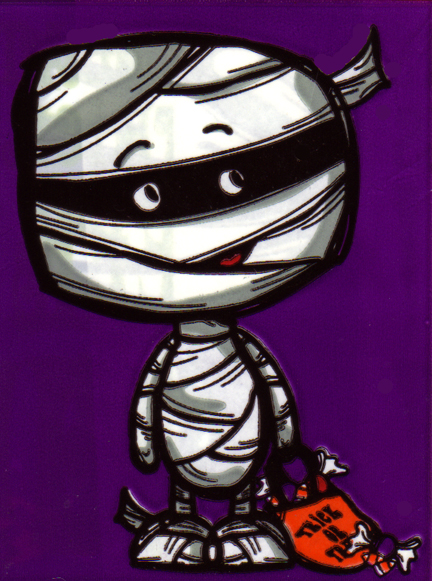
What kills me is that these characters are utilized very oddly in the branding. On the one hand they stick out loudly in some of the lawn decorations (and on some plush dolls), but on the other they tend to be very tiny in a lot of the other products they appear on. Also, none of them appear on any of the actual packaging, which instead is very generic looking with an orange background and white lettering. Why not pimp these characters out on the packaging as well and complete the branding? A good portion of these characters aren’t even featured on many the products, in particular the wolfman (who only really appears on a couple) and the Audrey II-esque man-eating plant which is pretty much only on a cheap set of bingo cards. Why go to the trouble of designing these characters if you aren’t going to use them? Confusing things even further is the fact that a separate, yet similar, set of characters were developed for the branding on their in-house candy and some of the baking products…
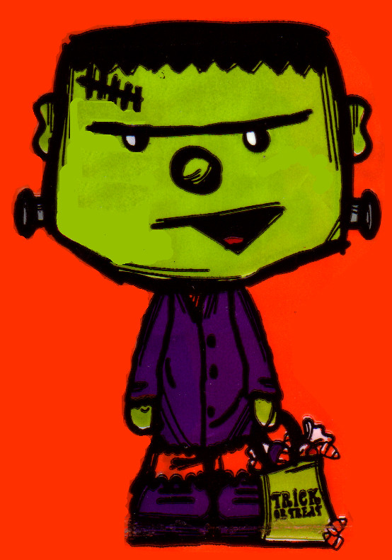
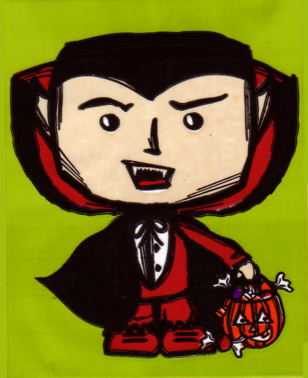
I mean, it’s not like the UPA inspired designs above aren’t kid-friendly already, so why did they go out of their way to way to also commission these more child-like trick-or-treating characters for the candy? They’re just butting heads with the other designs…
Again, it just muddles up the branding. Sure it’s not to the extent where it’s going to effect sales, but it’s also not everything that it could be either. I just don’t get it I guess.
To end all this Target-Schmarget stuff on a positive note, I have to say that I’m in love with their cartoon modern mad scientist character. You don’t see these little evil geniuses popping up on much merchandise. I mean there are a million bits and baubles with the Frankensten’s Monster on ’em, but hardly any with Dr. Frankenstein himself. I hate his name though, Dr. Cut-A-Rug. Shudder…

![]()
![]()